A Chemical Hunger – Part X: What to Do About It

[PART I – MYSTERIES]
[PART II – CURRENT THEORIES OF OBESITY ARE INADEQUATE]
[PART III – ENVIRONMENTAL CONTAMINANTS]
[INTERLUDE A – CICO KILLER, QU’EST-CE QUE C’EST?]
[PART IV – CRITERIA]
[PART V – LIVESTOCK ANTIBIOTICS]
[INTERLUDE B – THE NUTRIENT SLUDGE DIET]
[PART VI – PFAS]
[PART VII – LITHIUM]
[INTERLUDE C – HIGHLIGHTS FROM THE REDDIT COMMENTS]
[INTERLUDE D – GLYPHOSATE (AKA THE ACTIVE INGREDIENT IN ROUNDUP)]
[INTERLUDE E – BAD SEEDS]
[PART VIII – PARADOXICAL REACTIONS]
[PART IX – ANOREXIA IN ANIMALS]
[INTERLUDE F – DEMOGRAPHICS]
[INTERLUDE G – Li+]
[INTERLUDE H – WELL WELL WELL]

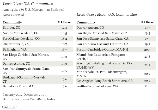
[INTERLUDE I – THE FATTEST CITIES IN THE LAND]

Assuming you take our main thesis seriously — that obesity is the result of environmental contaminants — what should you do about it?

Our suggestions are very prosaic: Be nice to yourself. Eat mostly what you want. Trust your instincts. 

Diet and exercise won’t cure obesity, but this is actually good news for diet and exercise. You don’t need to put the dream of losing weight on their shoulders, and you can focus on their actual benefits instead. You should focus on your diet — not to get thin, but to make sure that you have enough energy to do everything you want to do in life. This means eating enough and making sure you get what you need. You should exercise — not to slim down, but to gain strength and energy, and you shouldn’t get discouraged when you don’t drop 50 lbs fast.

Don’t be mean to fat people. If you’re fat, don’t be mean to yourself about it. Don’t be a dick.

Pancakes Good

And this doesn’t apply to most of our readers, of course, but just in general — we gotta stop spending money on circular nutrition research. It’s clearly not going anywhere. Other theories of obesity don’t engage with the observations that are out there about the obesity epidemic, and try to explain the wrong thing.

Most theories focus on the dynamics of individual weight loss, under the assumption that obesity is the result of the normal mechanics of eating, exercise, weight loss, and weight gain. But we think that the dynamics of individual weight loss have almost nothing to do with the real question, which is why obesity rates are so much higher now than they were in the 1970s, and the rest of human history. Individuals can gain or lose 15-20 lbs from their set point, but this is messing around within the range of control — we only care about the set point.

Let’s say it’s 50 °F outside. If your thermostat is set to 72 °F and you open the door, your house’s temperature will drop at first and then will go back up to the set point of 72 °F. If your thermostat is set to 110 °F and you open the door, your house’s temperature will drop at first and then will go back up to the set point of 110 °F (assuming your furnace is strong enough).

This is a standard feature of how homeostatic systems respond to major disturbances — the controlled value swings around for a bit until the system can get it back under control, and send it back to the set point. So all the diet and exercise studies we’ve done over the last 50 years have just been an exercise in who can create the biggest, most jarring disturbance — but the lipostat always finds a way to bring your weight back where it wants it.

So all these “punch the control system as hard as we can” studies don’t tell us anything about why the thermostat is set to 110 °F in the first place, which is what we’re really interested in.

Get It Outta Me

Bestselling nutrition books usually have this part where they tell you what you should do differently to lose weight and stay lean. Many of you are probably looking forward to us making a recommendation like this. We hate to buck the trend, but we don’t think there’s much you can do to keep from becoming obese, and not much you can do to drop pounds if you’re already overweight. 

We gotta emphasize just how pervasive the obesity epidemic really is. Some people do lose lots of weight on occasion, it’s true, but in pretty much every group of people everywhere in the world, obesity rates just go up, up, up. We’ll return to our favorite quote from The Lancet:

“Unlike other major causes of preventable death and disability, such as tobacco use, injuries, and infectious diseases, there are no exemplar populations in which the obesity epidemic has been reversed by public health measures.”

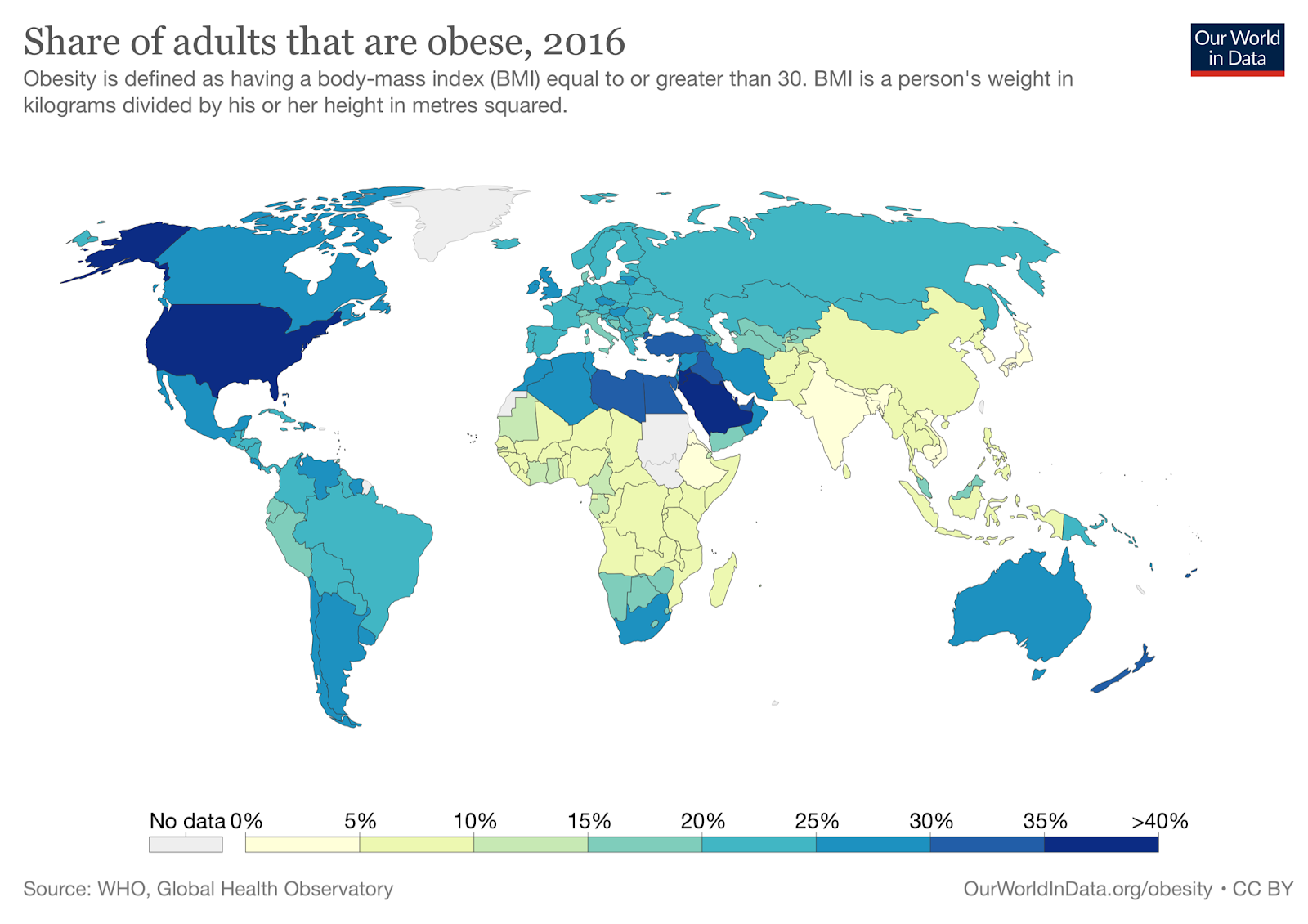
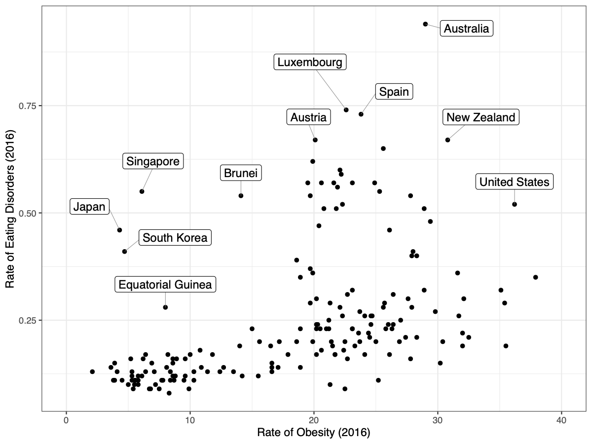
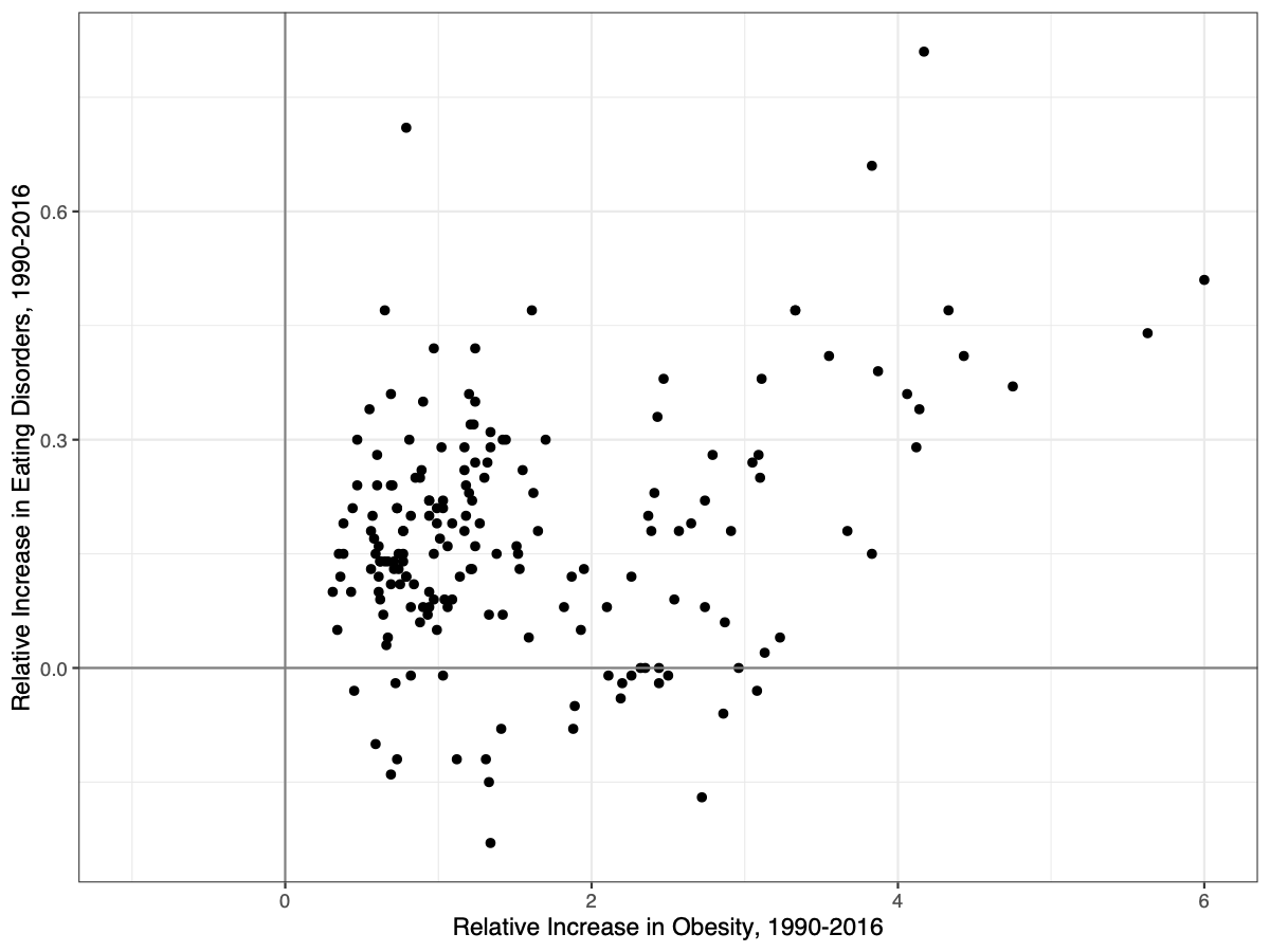
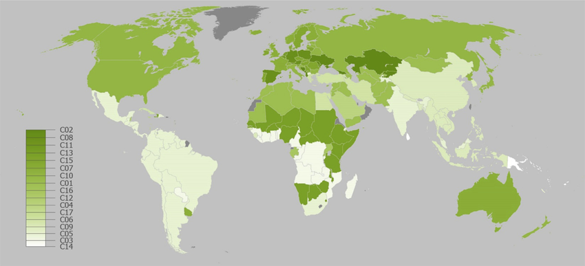
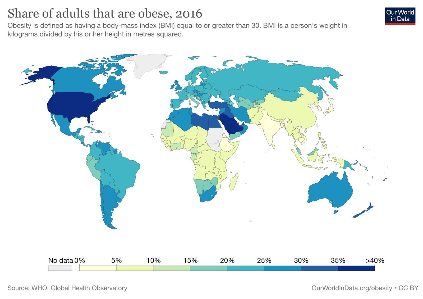
The nonprofit ourworldindata.org has data from the WHO covering obesity rates in almost every country in the world from 1975 to 2016. In every country in this dataset, the obesity rate either stayed the same or increased every single year from 1975 to 2016. There is not one example of obesity rates declining for even a single country in a single year. Countries like Japan and Vietnam are some of the leanest countries in the world (about 4% and 2% obese, respectively), but in this dataset at least, even these super-lean countries don’t see even a single year where their obesity rates decline.

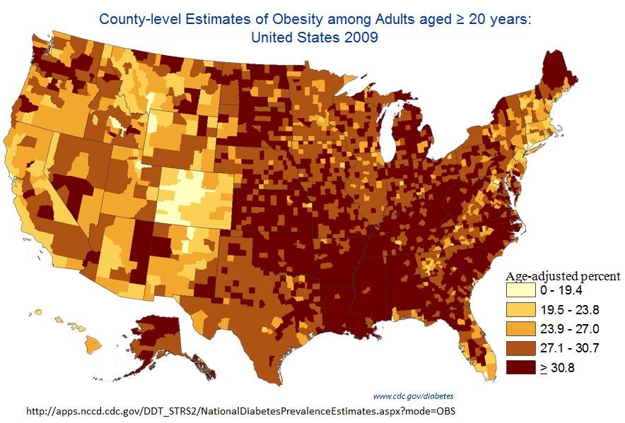
We see the same trend even for smaller-scale data. The Institute for Health Metrics and Evaluation (IHME) has a dataset of county-level obesity data from 2001 to 2011, which is publicly available on their website. Using this we can look at obesity rates across the United States, and we can see how much obesity rates have changed in each county between 2001 and 2011. We see that between 2001 and 2011, obesity rates decreased in zero counties, stayed the same in zero counties, and increased in 3,143 out of 3,143 counties and county equivalents in the United States.

The smallest increase between 2001 and 2011 was in Eagle County, Colorado, where obesity rates went from 20.0% in 2001 to 21.5% in 2011, an increase of 1.5%. You’ll notice that this is Colorado once again, and it turns out that the five counties with the smallest increase from 2001 to 2011 are all in Colorado. Of the 25 counties with the smallest increase, 13 are in Colorado. The take-home here is that Colorado really is special. 

If we zoom in a little further on these data, we can find ONE case of obesity rates declining — they went from 22.7% in 2009 to 22.4% in 2011 in Fairfax City, Virginia, a drop of 0.3%. There were also two counties where rates stayed the same 2009-2011. But this is one county with rates going down, two staying the same, and 3,140 going up. If population-level reversals are this tiny and this rare, it’s hard to imagine that there is much an individual can do to change their own weight. 

But that said, here are a few ideas, approximately in order from least extreme to most extreme.

First off, there are a few things that won’t change how many contaminants you’re exposed to, but that may have an impact on your weight anyways.

1. The first is that you can put on more muscle mass. This won’t affect your weight as it appears on the scale, but it does often seem to affect people’s body composition. The lipostat pays attention to how much fat you have, but it also seems to pay some attention to how much you literally weigh (see these studies in mice, and this recent extension in humans). So if you gain muscle mass, you may lose fat mass. For advice on how to gain muscle mass, please see the internet.

2. — The second is that you could consider getting gastric bypass or a similar, related surgery. Our understanding is that these procedures are very effective at causing weight loss in many cases. However, they are pretty dangerous — this is still a surgical procedure, and so inherently comes with a risk of death and other serious complications. If you consider this option please take it very seriously, consult with your doctor, etc.

Many of you, however, are not just interested in weight loss, or are interested in weight loss along with reducing how many mystery chemicals you’re exposed to — “You stupid kids I don’t want to lose weight I want to get these contaminants out of my body!!!” So here’s a list of steps you could take to reduce your exposure and possibly lose weight, again approximately in order from least extreme to most extreme.

1. — The first thing you should consider is eating more whole foods and/or avoiding highly processed foods. This is pretty standard health advice — we think it’s relevant because it seems pretty clear that food products tend to pick up more contaminants with every step of transportation, packaging, and processing, so eating local, unpackaged, and unprocessed foods should reduce your exposure to most contaminants. 

2. — The second thing you can do is try to eat fewer animal products. Vegetarians and vegans do seem to be slightly leaner than average, but the real reason we recommend this is that we expect many contaminants will bioaccumulate, and so it’s likely that whatever the contaminant, animal products will generally contain more than plants will. So this may not help, but it’s a good bet. 

3. — The third thing is you can think about changing careers and switching to a leaner job. Career is a big source of variance in obesity rates, so if you have a job in a high-obesity profession like truck driver or mechanic, consider switching to a job in a low-obesity profession like teacher or surveyor. For a sense of what careers are high- and low-obesity, check out this paper about obesity by occupation in Washington State and this paper about obesity by occupation in US workers. If you are already in a pretty lean career, then ignore this one.

We think this goes double if you’re in a profession where you’re working with lithium grease directly, or even around lithium grease. Do what you can to stay away from the stuff.

4. — The fourth thing you can consider is changing where you live. The simplest is to change where you live locally — stay in the same area, but move to a different house or apartment. This one is tricky, and sort of a shot in the dark. How will you know if you are moving to a more or less-contaminated house? But if you suspect your house is high in contaminants, it might be worth moving. If you find specific contaminants especially concerning, you can try having your local water tested for them.

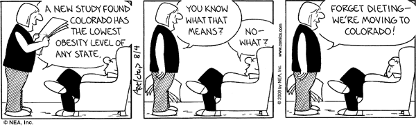
5. — A better option is to move to a leaner place altogether. If you’re in the United States, we recommend Colorado. Colorado is the leanest state, has exceptionally pure water sources, individual cities and counties in Colorado are extreme lean outliers, etc. Unbelievably, this comic exists: 

By Brian Crain for The Washington Post

If Colorado doesn’t suit you, you can move to some other state — Hawaii and Massachusetts are not far behind. To find your dream location, look at the CDC’s list of states, or one of the datasets of county-level data like this one or this one, and find a location with a lower rate of obesity than where you currently live. Or pick one of the places from the list of leanest communities in the US

6. — This may not be extreme enough. After all, even Colorado is more than 20% obese. So a more radical version of the same idea is moving to a leaner country altogether. 

If you live in the United States, the good news is that most countries are less obese than where you live now, even if you live in Colorado. Especially good choices seem to be Japan, South Korea, and Thailand, but there are many options — for the whole picture, check out the summary from Our World in Data

But don’t just take our word for it, listen to these happy customers. Like this person who lost weight over five months in Vietnam, this person who moved to Vietnam and lost 112 pounds in ten months, this person who lost about 4kg (9lbs) after about two months in Japan (and similar stories in the comments), this person who lost 5lbs on a two-week trip to Japan, or this person who lost 10lbs during a two-week trip to Japan, despite not keeping up with their exercise regimen. Most of these people attribute their weight loss to eating less and walking more, but you’ll also notice that most of them say it was easy to eat less and walk more, and that many of them report being surprised at how much weight they lost and how easily they lost it. 

We’ve also gotten a number of similar stories from commenters on the blog. First up is Julius, who said:

I currently live in Seattle but have moved around a lot. I’ve made 6 separate moves between places where I drank the tap water (mostly USA/UK/Hungary) and places I haven’t (South East Asia, India, Middle East). Whenever I’ve spent significant time in bottled water countries I lost weight (up to 50 lbs), and each time, save one 3 month stretch in Western Europe, I gained it back in tap water countries. I also lost weight for the first time in the States (20 lbs) this year around the time I switched to filtered water.

There’s also a similar story from Ross:

Very thought provoking and well researched piece. How about Japan? Very low rates of obesity. Similar issues with chemical residue. Anecdotally when I moved to Japan from the West I began to lose weight involuntarily, down to a BMI of 22. When I moved back to the West I regained weight. It’s a big rich country with plenty of processed, packaged food.

And a story from Tuck about their daughter:

Yes, my daughter is going to college in Japan. They have the “Freshmen 15 lbs” over there as well, except it’s the 15 lbs the foreigners lose when they go on a Japanese diet. Got a few panicked messages about “not having anything to wear”… LOL

So before you sign up for the gastric bypass, try spending a couple months in a lean country and see how it goes.

Studies

The question “what do we do about it” also includes the question “what research comes next?” Here’s what we’re thinking.

Correlational Studies

A lot of people’s first instincts when reading this work is to propose correlational studies. (We don’t necessarily mean a literal correlation, we just mean something that’s not a controlled experiment.) But we think that correlational studies are the wrong way to go at this point.

The first reason is statistical. We covered this in Part IV but it bears repeating. Because most of the modern variation in obesity is genetic, the apparent effect of any contaminant will be quite small, probably no larger than r = 0.50 and maybe a lot smaller. In any study we could run, the range of the variable would probably be restricted, and when the range of a variable is restricted, the correlation always ends up looking smaller than it really is. Some people have proposed we do animal studies for more control — but this is also a bad choice statistically, since the obesity effects in animals seem to be smaller than the effects for humans.

The combination of these problems means that any correlational study would be searching for a pretty small effect, and that means you would need a huge sample size to even have a good chance of finding a potential relationship. So “run a quick correlational study” starts looking like “find a way to fund and organize a study with 1,000 mice”. While we love mice, this seems like an awful lot of them. And even if we have enough statistical power that we have a 90% chance to detect a relationship, that still means we have a 10% chance of missing the relationship altogether. We don’t love those odds. 

Second, A Chemical Hunger already documents a lot of correlational evidence for contaminants in general, and for a few contaminants in particular, especially lithium. If you already find this evidence compelling, it’s hard to imagine that one more piece of correlational evidence will do anything for you. And if you don’t find our review convincing, it’s hard to imagine that another piece of correlational evidence will change your mind.

The contamination theory of obesity has to be possible, in the sense that we know chemicals can cause weight gain and we know various chemicals are in the environment. We hope we’ve also convinced you that it’s plausible. Now we want to figure out, is it true? More correlational evidence isn’t going to get us there.

So overall we recommend going right for the jugular. If this theory is correct, then we have a good shot at doing what we really want to do — actually curing obesity — and no result could be more convincing than that. 

Experiments

So in general, we approve of the idea of doing experiments to just cure obesity straight up.

Normally in public health it’s hard to do this kind of experiment, because it’s unethical to expose people to dangerous chemicals. Back when they were trying to figure out if cigarettes cause cancer, they didn’t do any studies where they assigned people to smoke 3 packs a day. But there’s nothing unethical about removing a contaminant from the environment, so we like that approach. 

We call these experiments, and they are, but in many cases we can actually cheat a little by not bothering to include a control group. People almost never spontaneously stop being obese, so we can just use the general obesity rate in the population as our control group. 

Generally speaking, there are two approaches. “Broad-spectrum” experiments take the overall contaminant theory seriously, and just try to reduce contaminant exposure generally, without committing to any specific contaminant. “Targeted” experiments go after one contaminant in particular, and see if controlling levels of that contaminant alone can lead to weight loss.

These have clear trade-offs. The broad-spectrum experiments are more likely to work and require less experimental control, but if they cure obesity, they don’t tell us what contaminant is responsible (curing obesity would still be pretty cool tho). The targeted experiments are less likely to work because we might go after the wrong contaminant, or we might fuck up our experimental control and let some contamination through — but if they DO work, then we have strong evidence that we’ve found the contaminant that’s responsible.

For all of these studies, the big hurdle is that we don’t know how quickly obesity can be reversed, even under the best circumstances. It might also vary a lot for different people — we have no idea. So if we try any of these experiments, we need to run them for several months at the very least, just to get a good idea of whether or not it’s working. Maybe if we’re lucky we’ll find out you can cure obesity in 2 weeks; but 3 months, 6 months, or even 1 year seems more plausible. 

Below, we propose a few basic ideas for experiments. These aren’t exhaustive — as we do more research, we may come up with new and better ways to try to cure obesity. But they seem like an ok place to start.

Broad-Spectrum Experiments

Slime Mold Time Mold’s Excellent Adventure

The idea is simple. Some places, like Colorado, are pretty lean relative to everywhere else. We think that’s because those places are less contaminated. So we find some people who are obese, and pay for them all to take a year-long vacation to Boulder, Colorado, and see if they lose any weight. 

For better effect, go a step further and send them to one of the leanest countries in the world instead. Vietnam seems to be the leanest country in the world right now, at only about 2% obese, and rent is pretty cheap there, so that would be a good option. If you want to stay in heavily industrialized nations, Japan is a good alternative; if you want to stay in the English-speaking world, maybe the Philippines. There are lots of good places to choose from.

For full effect, you would want your participants to eat the local food and drink the local water as much as possible. If they’re eating American food and drinking American beer, then you’re right back where you started.

(If you know of any study abroad or similar programs that we could piggyback on, please let us know!)

Throw Water Filters at the Problem and See What Happens

This is a broad-spectrum version of a targeted idea, below. The basic idea is simple. Contaminants might be in the water supply; filters get lots of stuff out of water; people drink water. So in this study, we find a bunch of people who are overweight or obese, send them the strongest/best water filters we can afford, and see if they lose any weight over the next several months. 

For even more effect, send the filters to people who live in the most obese states, or even target some of the most obese communities directly.

This really is not a precision instrument — filters don’t get everything out of water, and water might not even be your main source of contaminants. Maybe your food or your carpets are the bigger problem. But if losing weight were as simple as throwing a water filter at the problem, that would be pretty exciting, and we would want to know.

Targeted Experiments

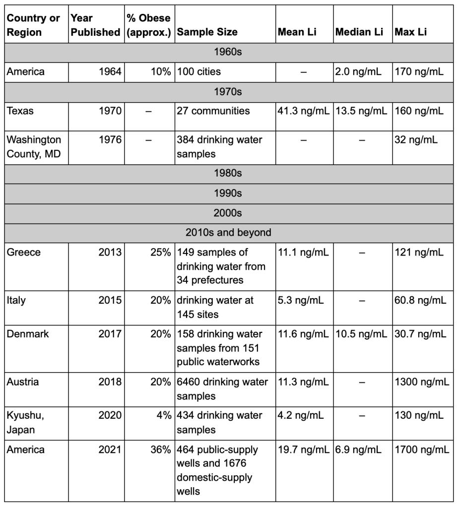
Right now lithium is our top suspect, so we’re using lithium as our go-to example in all of these experiments. But if it turns out that lithium isn’t a good match, any of these experiments could be retrofitted to target some other contaminant instead. 

To use a targeted approach, we need to be able to figure out how much exposure people are getting, and we need to know what we can do to reduce that exposure. So there are a few pre-experiment projects we need to do first.

To begin with, we need to figure out which water filters (if any!) remove lithium from drinking water. If we can find a filter that works, this will let us make sure any water source is lithium-free.

In addition, we’re worried that lithium might accumulate in food, so we need to do another study where we look at as many different types of food as we can and try to figure out if there are high levels of lithium in any of the stuff we’re all eating. Without this, any study will be hopelessly complicated because we won’t be able to control for the lithium in your food. But if we figure out what crops (if any) are concentrating lithium, maybe we can figure out a way to feed people a low-lithium diet.

Targeted Water Filters

Assuming we can find a water filter that does the job, we could do a pretty straightforward study where we send people a water filter that takes lithium out of their water, and see if they lose weight over a couple months.

For maximum effect, we would also want to make sure they weren’t getting any lithium from their food, which is why we want to do a study on how much lithium is in the food supply. It’s not clear how easy this would be — we might have to curate food sources and provide people with all their meals as well, which would make this study a hundred times more complicated.

There are a couple other things we could do to improve this study. We could focus on sending water filters to people in the most obese parts of the country, or to places where we already know the water is contaminated with lithium.

We could test the amount of lithium in people’s blood, urine, and/or saliva as they use the filter, see if it goes down, and see if the decrease in lithium in their body tracks on to weight loss. Assuming people did lose weight, this would be important because it might help us figure out more about the mechanism of lithium leaving the body. Some people will probably clear lithium faster than others, and if lithium causes obesity, we would want to be able to figure out how to help people clear it from their body as fast as possible. 

We could also do a slightly bigger study, where we go to one of the fattest places in the US and install a bunch of whole-home water filtration systems for a couple randomly selected families who are overweight or obese. This would be more expensive but it would have some perks. If it turns out that showering in lithium-tainted water is really the active ingredient, and not just drinking it, then a whole-home water filtration system would take care of that. 

There’s also a small chance that there’s just no filter on the market that can get lithium out of drinking water. Or maybe distillation works, but the cost is prohibitive for a whole-home system. In that case, we could rent a few water tanker trucks, fill them with water we know is low in lithium (we’ll import it from Colorado if we have to!), and take them to a cul-de-sac in one of the most obese communities in the US. If we can find a neighborhood who’d sign up for this, we could switch their houses’ water supplies over to our tanker trucks for a few months, bringing in new water as needed, and see if that did anything for their health. 

Amish Obesity

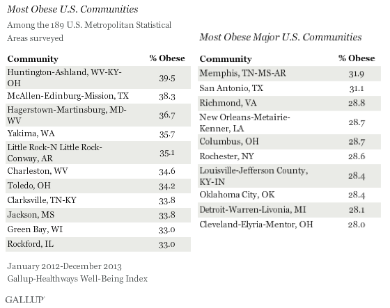
This piece from the LA Times is pretty bad, but it tells an interesting story. In part of Ontario, Canada, a group of Old Order Amish have “stunningly low obesity levels, despite a diet high in fat, calories and refined sugar.” The figure they quote is an obesity rate of only 4%. But about 200 miles south, the Amish in Holmes County, Ohio have obesity rates similar to the rest of the population, closer to 30% obese.

These two groups should be genetically similar. Both groups grow most of their own food. Both of them have pretty similar lifestyles — despite what the LA Times piece and this related article say, even if “only” 40% of the Amish in Ohio do hard farm labor, their lives are still more like the Amish in Ontario than the non-Amish in Holmes Country. 

This makes them almost a perfect comparison. Why are the Amish in Ohio so much more obese than the Amish in Ontario? If the contamination hypothesis is correct, then we should be able to look at the local environments of these two communities and find more contamination (of one sort or another) in Ohio than in Ontario. 

Because both groups grow most of their own food (we think?), we don’t need to worry about the influence of food imported from elsewhere — whatever contaminants are in their water will also be in their plants, and they won’t be bringing in contaminated food from outside. This makes this situation a much more controlled environment to study our hypothesis.

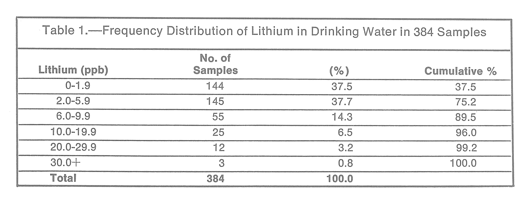
If lithium is the contaminant that causes obesity, we might expect to see deeper wells in Ohio than in Ontario. Information about the Amish is hard to find on the internet, for obvious reasons, but we have found some information that suggests that the Amish in America do use drilled wells, some of which may be relatively recent. We can’t find anything about the wells used by the Amish in Ontario — but it would be interesting if they were still using older, shallower wells for their water.

Another thing we might expect to see, if lithium is to blame, is evidence of some kind of fossil fuel activity in Ohio and not in Ontario. Well, in our last post we did review evidence for fossil fuel contamination in a number of places in Ohio. And when we were looking for documentation on water wells in Amish Ohio, we came across articles like Fracking on Amish Land (in Ohio), Energy Companies Take Advantage of the Amish Prohibition on Lawsuits (in Ohio), this excerpt about natural gas wells (in Pennsylvania), and Tradition, temptation as Amish debate fracking (in Pennsylvania, but mostly in Ohio). 

Ontario has its own problems, including thousands of abandoned gas wells, but very few of them appear to be on Amish land. Zoom in on the towns of Milverton, Millbank, Newton, Linwood, and Atwood on that map, and you’ll see that there are almost no petroleum wells around these Amish communities. And unlike in Ohio, we haven’t found any news stories about recent drilling or fracking on Amish land in Ontario. 

Or we could just go test the water. It’s a simple question, how much lithium is in the water in each place, and testing for other contaminants might not be a bad idea either. If we find similar levels of lithium in both places, and there are no complicating factors like imported food, that would be a strike against lithium as an explanation. But if there’s more lithium in the food and water in Ohio than in Ontario, that would be quite a mark in favor of the lithium hypothesis. Assuming they were interested, we could then work with the Amish in Ohio to try to get the lithium (or whatever) out of their water, and see if that reduced their rates of obesity. 

We don’t expect that we have many Amish readers, but if you know of a good way to get in contact with the Amish in either of these locations, we’d be interested in talking to them!  

Research Advising

There are also a few ideas we have that we won’t be pursuing ourselves, but if someone else (or a small team) wants to go after them, we would be happy to advise.

Taking lithium out of the water supply as a whole would be pretty hard, so it’s not usually an option. But it might be an option for countries that get most of their drinking water from desalination. You could run this as an experiment — one desalination plant uses lithium-free brine while another continues with the normal procedure — but you wouldn’t have to. In this case, there’s no need for a control group. If Saudi Arabia or Kuwait changed their desalination process so that no lithium ended up in their water, and saw their obesity rate fall 10% over the next five years, that would be evidence enough. Or you could do a version of this study with some other relevant group, e.g. seafarers drinking desalinated water as suggested by commenter ugoglen. So if anyone is able to do something like this, we would be interested in being involved.

In our post on PFAS, we did a small amount of regression modeling using data from The National Health and Nutrition Examination Survey (NHANES) and found evidence of a relationship between BMI and certain PFAS in the data for 1999-200, 2003-2004, and 2005-2006. This finding is very suggestive, but we only tested some very simple models, and we only looked at three of the datasets that are available. We think that a bigger analysis could be very illuminating, but model fitting isn’t our specialty. We would love to work with a data scientist or statistician with more model fitting experience, however, to conduct a more complete analysis. So if you have those skills and you’re interested, please let us know

We’re still pretty interested in the all-potato diet. So far all we have are anecdotes, but the anecdotes are pretty compelling. Chris Voigt famously vowed to eat nothing but 20 plain potatoes (and a small amount of cooking oil) and lost 21 pounds over 60 days, without feeling very hungry. There’s also Andrew Taylor of Australia, who lost 114 lbs over a year of eating nothing but potatoes and reports feeling “totally amazing”. Last we heard he’s still doing pretty well. Magician Penn Jillette lost over 100 lbs using a strategy that started with two weeks of a potato-only diet (h/t reader pie_flavor), and seems to be keeping it off. This also inspired at least one copycat attempt from a couple who have jointly lost over 220 lbs starting with two weeks of an all-potato diet.

There’s also this comment from u/DovesOfWar on reddit:

To complement the potatoes anecdote, at some point to save money and time I ate almost nothing but potatoes, onions and butter and I lost like 60 pounds. I stopped because everyone thought I was starving (despite not being hungry) and I chugged it off to extreme lazyness/depression (despite not being sad) so I stopped doing that and never connected it to my diet, but what I should have done is write a fad book on the diet and solve the money problem that way. I’m back to a normal healthy 29 BMI now and still relatively poor, so I see I interpreted the experiment completely wrong and now my life sucks.

Based on those examples, you can see why we’re interested. It seems pretty low-cost (potatoes are cheap) and low-risk (if you feel bad, you can stop eating potatoes). If someone wants to organize a potato-centered weight-loss study, or if people just want to get together and try it for themselves, we’d be happy to advise. You can coordinate on the subreddit u/pondgrass set up over at r/spudbud if you like, though so far there doesn’t seem to be much activity.

We’re also interested in the effect of alkali metal ions, especially potassium. Lithium, currently our prime suspect, is an alkali metal ion that appears to affect the brain. Other alkali metal ions like sodium and potassium also play an important role in the brain, and there’s evidence that these ions may compete with each other, or at least interact, in interesting ways (see also here, here, and here). If lithium causes obesity, it may do so by messing with sodium or potassium signaling (or maybe calcium) in the brain, so changing the amount of these ions you consume, or their ratios, might help stop it. 

This is supported by some hints that potassium consumption is related to successful weight loss. Potatoes are high in potassium, so if the all-potato diet really does work, that might be part of the mechanism.

You can easily get sodium from table salt, and you can get potassium from potassium salts like this one or this one. We’ve tried them, and we find them a little gross, but to some people they taste just like regular salt. If that’s no good, there are always dietary sources like potatoes.

So trying various forms of alkali-metal diets — high-K+, high-K+/low-Na+, high-K+/high-Na+, high-K+/low-Ca2+, etc. — seems pretty easy and might prove interesting. As before, if someone wants to organize a community study around this angle, or if people want to try it for themselves, we’d be happy to advise. These salts are pretty safe, and not prescription medications, but they’re not quite as basic as potatoes — before you try seriously changing your sodium or potassium intake, please talk with your doctor.

Also, how about lithium grease? These greases are basically the perfect slow-release form of lithium, which make them kind of concerning. Mechanics work with lithium grease and are relatively obese. But there are alternative kinds of greases that don’t use lithium, and sometimes companies intentionally switch what kind of grease they use. If a company switched out lithium grease for some other grease in one of their factories, we could compare the weights of workers at that factory to workers at other factories, and see if there was any weight loss over the next few years. And what happens when mechanics who use lithium grease every day switch to a new job? What happens if they get promoted to a desk job? What happens when they retire? If you know a group of mechanics or some other group that works with lithium grease and might be interested, please let us know!

We’re also interested in advising original ideas. We love it when you send us ideas we never would have come up with ourselves. So if you have some great idea — a review of a contaminant we didn’t cover, another idea for a related study, relevant anecdotes that might inspire something, etc. — let us know. If we like it, we’ll do what we can to help — advise you, promote it, try to help you get funding, whatever.


This is the end of A Chemical Hunger. We will still write more about obesity, and probably more about contamination, but this is the end of the series. Thank you for reading, commenting, sharing, contributing, questioning, challenging, and yes, even disputing! We’ve learned a lot from your comments and questions — and we hope you’ve learned something from reading!

Even if you still don’t find our hypothesis convincing, thank you for reading the series all the way to the end! We think it’s great that you were willing to give our wacky idea the time of day. This kind of exploration is essential, even if some of the theories turn out to be a little silly. And even if our theory is totally wrong, someday someone will figure out the answer to this thing, and we’ll send the global obesity rate back down to 2%.

As we mentioned, we want to conduct some research to follow up on the book-length literature review you just finished reading. Our near-term goal is to better understand how people get exposed to contaminants, especially lithium, so we can give advice on how to avoid exposure. Our medium-term goal is to figure out what causes obesity, probably by trying to cure it in a sample population. Our long-term goal is to try to cure it everywhere. That would be pretty cool.

If you’re interested in supporting this research, you can become a patron on patreon, or contact us if you want to help fund a larger project.

In conclusion: Be excellent to each other. Party on, dudes.


A Chemical Hunger – Interlude I: The Fattest Cities in the Land

[PART I – MYSTERIES]
[PART II – CURRENT THEORIES OF OBESITY ARE INADEQUATE]
[PART III – ENVIRONMENTAL CONTAMINANTS]
[INTERLUDE A – CICO KILLER, QU’EST-CE QUE C’EST?]
[PART IV – CRITERIA]
[PART V – LIVESTOCK ANTIBIOTICS]
[INTERLUDE B – THE NUTRIENT SLUDGE DIET]
[PART VI – PFAS]
[PART VII – LITHIUM]
[INTERLUDE C – HIGHLIGHTS FROM THE REDDIT COMMENTS]
[INTERLUDE D – GLYPHOSATE (AKA THE ACTIVE INGREDIENT IN ROUNDUP)]
[INTERLUDE E – BAD SEEDS]
[PART VIII – PARADOXICAL REACTIONS]
[PART IX – ANOREXIA IN ANIMALS]
[INTERLUDE F – DEMOGRAPHICS]
[INTERLUDE G – Li+]
[INTERLUDE H – WELL WELL WELL]

It’s surprisingly hard to tell what the fattest and leanest American cities are. 

We can’t find an official source — the closest we can find is this Gallup report from 2014 that lists some of the most and least obese US communities, out of 189 “Metropolitan Statistical Areas”. They offer a top 10 most obese list and a top 10 least obese list both for all US communities, and for “Major US communities”, which are communities with populations above 1 million. This isn’t perfect, but Gallup is pretty reliable, so for now let’s take it seriously. 

We’ve already seen that communities in Colorado get most of their water from pure snowmelt and are exceptionally lean. It would be interesting to see if other communities on the leanest list seem to have exceptionally pure local water, and if there’s any evidence of lithium (or other contaminants) in the drinking water of the communities on the most obese list.

There are 38 communities on Gallup’s lists. We’re going to hit them all, so to keep this from spiraling out of control, we’ll focus on communities where we can find actual measurements of how much lithium is in their water. For everywhere else, we’ll give a decent overview, and let you know if we can make educated guesses, but keep the speculation to a minimum.

Because “major communities” is kind of vague and long-winded, we’ll be calling the communities on that list “cities”.

Lithium isn’t commonly recorded in water quality assessments, so for most of these communities, no direct measurements of lithium in drinking water were available — so we use other local measurements, like levels in nearby groundwater, instead. If you find actual tap water lithium measurements for any communities we missed, please let us know!

Before we start, let’s orient you to the lithium measurements we’ll be looking at: 

  • 2 ng/mL is low, about how much was in the water in 1964 
  • 10 ng/mL starts to seem like a concern, and is the EPA’s threshold for drinking water
  • 40 ng/mL is the EPA’s threshold for groundwater contamination at power plants
  • 100+ ng/mL is a lot, about how much the Pima were exposed to

Least Obese

Gallup offers these lists for the least obese communities in the United States:

Boulder, CO – #1 Leanest Community

In our last post, we discussed how Colorado gets almost all its drinking water from snowmelt, so it’s no surprise that three of the ten leanest communities are from Colorado.

Even for Colorado, Boulder is a crazy outlier, at only 12.4% obese. Boulder is a college town, so age may be having some effect here, but nearby Fort Collins is also a college town, and their obesity rate is 18.2%. So is Boulder’s water source separate? Is it somehow crazy-extra-pure? Strangely enough, the answer on both counts may be “yes”. Boulder gets its water from a different company than Denver does, and its water generally comes from much closer by

Naples-Marco Island, FL  – #2 Leanest Community

Water in Naples “is drawn from the Lower Tamiami Aquifer via 51 wells.” We found this document suggesting that in 2008 the city of Naples was contracting analysis including lithium for the City Utilities Department. But we haven’t been able to find any actual lithium measurements either for the city or the Lower Tamiami Aquifer, and no other indications of lithium contamination in the area.

Fort Collins-Loveland, CO – #3 Leanest Community

Another Colorado town, Fort Collins’ appearance on this list is unsurprising. The water in this town comes from “the Upper Cache la Poudre River and Horsetooth Reservoir.” We can’t find any lithium measurements for these sources, but they appear to be snowmelt sources similar to other surface waters in Colorado. Their water appears to be at least partially provided by a company called Northern Water, which also provides water to Boulder.

Charlottesville, VA – #4 Leanest Community

Charlottesville gets its water from South Fork Rivanna River Reservoir and Ragged Mountain Reservoir. These collect water from the surrounding mountains, and the watershed appears to be about 70% forested. We haven’t been able to find any lithium measurements related to Charlottesville or from either of the reservoirs.

Bellingham, WA – #5 Leanest Community

The City of Bellingham gets its water from Lake Whatcom. According to this report, lithium measurements for Lake Whatcom should be available in a CSV called lakemetalstoc.csv on this page. All the other data files are indeed there, but lakemetalstoc.csv is not, and we can’t find it anywhere else. We fired up the Wayback Machine and found a version of the page from 2011, which helpfully tells us that “metals, TOC … are not posted in electronic format, but are included in the printed copies of the annual reports.” Ok then.

Denver, CO – #6 Leanest Community, #1 Leanest City

In our last post we reviewed how Denver gets its water from pure snowmelt off the Rocky Mountains, but we hadn’t tracked down any actual lithium measurements. Happily, we can now add something to that previous finding. This report from Denver Water in 2010 lists lithium as one of the “Contaminants Not Found In Denver’s Drinking Water” — “either below the reporting limit or the average result was less than the reporting limit.” Same for this report from 2016, this report from 2017, etc. etc.

San Diego-Carlsbad-San Marcos, CA – #7 Leanest Community, #2 Leanest City

In San Diego, 85-90% of city drinking water is “imported from Northern California and the Colorado River”. We haven’t been able to find any measurements of lithium in San Diego tap water, but this report from 2018 says that wastewater at the San Diego North City Water Reclamation Plant ranged from 12 ng/mL to 48 ng/mL in 2018. Similar numbers are found in this report about wastewater at the South Bay Water Reclamation Plant from 2011. In fact it looks like there are a LOT of wastewater reports, but we’ll stop there. 

This doesn’t tell us how much is in San Diego drinking water exactly, but wastewater almost certainly contains no less lithium than the tap water it started as, so this suggests that the lithium concentration in San Diego drinking water is somewhere below 12-48 ng/mL.  

San Jose-Sunnyvale-Santa Clara, CA – #8 Leanest Community, #3 Leanest City

For San Jose-Sunnyvale-Santa Clara, we’ve been able to find some lithium measurements for the tap water itself. This report from 2017 finds a range of “not detected” to 25 ng/mL in the water served to San Jose-Sunnyvale-Santa Clara, with a median level of 5.60 ng/mL. This is pretty low. The numbers in this report from 2018 are even lower — a range of “<5” to 6.2 ng/mL and an average of “<5”. There’s also this other report from 2018 finding a range from “not detected” to 8.1 ng/mL, with a median of 3 ng/mL.

Bridgeport-Stamford-Norwalk, CT – #9 Leanest Community

Bridgeport and surrounding towns appear to get their water from “mostly surface water drawn from a system of eight reservoirs (Aspetuck, Easton Lake, Far Mill, Hemlocks, Means Brook, Saugatuck, Trap Falls and West Pequonnock).” 

We haven’t been able to find any lithium measurements for the city or for any of these reservoirs, but we do want to note that at least some of these reservoirs were in use back in 1964, and back then they all contained less than 0.50 ng/mL lithium, a truly miniscule amount. There isn’t any sign that they’ve been exposed to lithium since then (no nearby coal power plants, no petroleum mining in Connecticut at all), so lithium levels in these reservoirs may still be that low. There is a coal power plant in Bridgeport itself, but while it might be contaminating the harbor, the city isn’t drinking that water.

Barnstable Town, MA – #10 Leanest Community

Barnstable Town is a small town on Cape Cod. Like every part of Cape Cod, Barnstable relies on the Cape Cod Aquifer for its groundwater. We managed to find this report from 1988 where some hydrologists injected bromide and lithium into the Cape Cod Aquifer to test their transport in the aquifer over time. To do this they needed background readings of lithium levels so that they could track their own sample, and they found that the background concentration of lithium in the aquifer was “below the detection limit”, or something less than 10 ng/mL. Unfortunately their analysis wasn’t very sensitive so we don’t know how much less.

San Francisco-Oakland-Fremont, CA – #4 Leanest City

You may remember from above that the water in San Jose-Sunnyvale-Santa Clara contains very little lithium. This water system gets about 20% of its water from Hetch Hetchy Reservoir, a reservoir located in Yosemite National Park, and this is relevant to San Francisco because Hetch Hetchy supplies San Francisco with 85% of its drinking water.

We can’t find any lithium measurements for Hetch Hetchy itself (not even in the 1964 data!), but Hetch Hetchy water largely comes from snowmelt, and if it’s providing San Jose-Sunnyvale-Santa Clara with 20% of its drinking water, Hetch Hetchy can’t be holding much lithium. For this reason, we suspect that the lithium levels in San Francisco drinking water are probably low as well. 

Boston-Cambridge-Quincy, MA – #5 Leanest City

Boston and most of the surrounding towns get their water from the Quabbin Reservoir in western Massachusetts. Again we can’t find any modern measurements, but Boston was drawing from the Quabbin in 1964, and in the 1964 data we see that water sourced from the Quabbin contained only 0.21 ng/mL lithium. Massachusetts hasn’t drilled any new oil wells right next to the Quabbin or anything in the past 60 years, so while we’d love to see some modern tests to confirm this, there’s no reason to expect lithium levels in the Quabbin to be much higher today.

Miami-Fort Lauderdale-Pompano Beach, FL – #6 Leanest City

In Miami, “water supply comes from the Biscayne Aquifer, the County’s primary drinking water source.” In the USGS well water dataset, there are 53 measurements from the Biscayne Aquifer, all from either 2010 or 2016. The average level of lithium in these samples is 1.26 ng/mL, the median is 1.11 ng/mL, the maximum level is a mere 2.60 ng/mL, and in a full 24 of these 53 samples, the levels of lithium were below the detectable threshold. 

This aquifer is such an exceptional case, they mention it by name in the abstract: “no public supply wells in the Biscayne aquifer (southern Florida) exceeded either threshold, and the highest concentration in that aquifer was 2.6 [ng/mL].”

Washington-Arlington-Alexandria, DC-VA-MD-WV – #7 Leanest City

Water for DC comes from the Potomac River. DC Water provides detailed water quality reports online, all the way up through 2021, and in the report for 2021, the average level of lithium in DC water was 2 ng/mL and the range was 1 to 2 ng/mL. Now, the Gallup numbers are from 2014 — well, in the report from 2014, the average level of lithium in DC water was 2.1 ng/mL and the range was 1.2 to 4.0 ng/mL. Case closed.

Minneapolis-St. Paul-Bloomington, MN-WI – #8 Leanest City

Minneapolis and St. Paul both draw much of their water from the Mississippi River. This may not seem like a good idea, but they’re so close to the headwaters that the Mississippi hasn’t really had a chance to pick up all that much stuff on its way to the ocean. Unfortunately we haven’t been able to find any lithium measurements from either city. 

Los Angeles-Long Beach-Santa Ana, CA – #9 Leanest City

Drinking water in LA comes from a couple different sources — the Owens River, Northern California and the Colorado River, and groundwater. Again we haven’t been able to find actual measurements, but we can note that much of this water is piped hundreds of miles from distant mountain ranges (see figure below).

We also found this news report from 2015 about “a massive natural gas leak at Aliso Canyon” that appears to have contaminated tap water in the Los Angeles water system. This includes a picture of lithium measurements from what appears to be a powerpoint slide deck, indicating average lithium levels in LA drinking water of 65.4 ng/mL. This is pretty high, but of course the gas leak occurred in 2015 and the Gallup obesity numbers are from 2014. 

The article also includes a statement from a Los Angeles Department of Water and Power spokesperson saying that “the agency doesn’t test for lithium and is not required to.” This suggests that there are probably no official lithium records to be found for the city, so it’s no surprise we weren’t able to find anything.

Seattle-Tacoma-Bellevue, WA – #10 Leanest City

Seattle gets most of its drinking water from two large watersheds in “mountain forests” to the east. The only lithium coming out of Seattle is a Nirvana byproduct. Ok but seriously, we couldn’t find anything.

Most Obese

Next, let’s look at the most obese communities.

Gallup sez:

Huntington-Ashland, WV-KY-OH – #1 Most Obese Community

Let’s start at the top. Huntington-Ashland WV-KY-OH is the #1 most obese community on Gallup’s list and appears to get all of its drinking water from the Ohio River. We can’t find any measurements for lithium in the actual river water, but we found this report outlining several nearby power plants that show coal-ash contamination in groundwater. 

Coal-ash contamination is relevant because fossil fuels and their byproducts are often extremely rich sources of lithium. This includes coal ash as well as oilfield brines and other “produced water” from petroleum extraction.

The first power plant we’ll look at is the Mountaineer Plant in New Haven, WV, which is about 70 miles directly upstream of Huntington-Ashland and was found to be contaminated with lithium in 2019. These reports are a little tricky to read, but if you flip through the plant’s own groundwater monitoring reports, it looks like the levels in the plant’s groundwater monitoring wells often exceeded 40 ng/mL and sometimes exceeded 100 ng/mL.

The Mountaineer Plant, the locations of the plant’s groundwater monitoring wells, and the Ohio River

Just a few miles downstream on the Ohio River sits the Gavin Power Plant. This plant is split up into three sections on the groundwater testing reports. There isn’t much lithium in the Bottom Ash Pond, but in the Residual Waste Landfill, several wells are heavily contaminated, and the highest level recorded was 249 ng/mL. In the Fly Ash Reservoir, many testing wells contain more than 100 ng/mL lithium, the highest level detected being 702 ng/mL.

Just 1.6 more miles down the Ohio River, in the direction of Huntington-Ashland, sits Kyger Creek Station. Many of the groundwater monitoring wells at this plant also show high concentrations of lithium, including levels as high as 480 ng/mL.

How many other places in America are right downstream from three coal power plants? This seems too crazy to be a coincidence. If lithium causes obesity, then it’s no wonder that Huntington-Ashland is #1 in the nation.

McAllen-Edinburg-Mission, TX – #2 Most Obese Community

McAllen, Texas gets its water from the Rio Grande. This one is almost too easy — the USGS well water report says, “the highest concentrations [of lithium] were in the High Plains, Rio Grande, Stream-valley aquifers and Basin and Range basin fill aquifers of the West.”

We have access to the raw data, and we can confirm that the Rio Grande aquifer had the second-highest levels of lithium of all the principal aquifers in the dataset. In Texas, there were only 9 measurements from this aquifer, but the level of lithium was pretty high in all of them — the median was 59.7 ng/mL, the mean 64.83 ng/mL, and the range was 20.8 ng/mL to 115.0 ng/mL.

Hagerstown-Martinsburg, MD-WV – #3 Most Obese Community

Hagerstown-Martinsburg MD-WV is interesting because Hagerstown is in Washington County, MD. By coincidence, one of the few good sources we have for levels of lithium in the 1970s is a 1976 paper looking at 384 drinking water samples from Washington County. Back in 1976 they found very low levels of lithium in the well water in Washington County, with 90% of samples containing less than 10 ng/mL and the highest level being only 32 ng/mL.

Unfortunately we can’t find good modern data for lithium levels in Hagerstown or Washington County as a whole. As far as we can tell from their water quality reports, Washington County doesn’t test for lithium at all. Numbers from the state as a whole do seem to have increased since 1976, but the state’s trends don’t tell us all that much about this one town.

We can also mention that Martinsburg, the other half of Hagerstown-Martinsburg MD-WV, is notable for being exceptionally contaminated with PFAS, even for West Virginia. According to this source it looks like the USGS is planning to test West Virginia for lithium too, keep an eye on this one! 

Yakima, WA – #4 Most Obese Community

Most of Yakima’s drinking water comes from the Naches River, though this is supplemented by 4 wells that draw from the Ellensburg Aquifer. This USGS report from 2013 suggests that well water in the area is pretty low in lithium, but most of their water doesn’t come from the wells. Unfortunately we haven’t been able to find any measurements at all for tap water in Yakima or for the Naches River in general. There is this 1987 USGS report that includes measurements of lithium in Yakima River Basin streambed sediment, if anyone wants to try to make sense of that.

There’s also a possible mining connection — the Bumping Lake Mineral Spring Calcium Mine is upstream of Yakima and has lithium listed as one commodity of interest. Even so, it’s not clear whether this is relevant.  

Little Rock-N Little Rock-Conway, AR – #5 Most Obese Community

Drinking water in Little Rock comes from two surface water sources, Lake Winona and Lake Maumelle, which supply Jackson Reservoir. Drinking water in Conway comes from nearby Brewer Lake. Unfortunately we have not been able to find any lithium measurements from any of these bodies of water.

Now, Arkansas does sit on a huge amount of lithium in the form of the Smackover Formation, which is being mined by Standard Lithium Ltd., but this is all in southern Arkansas and should be downstream from the Little Rock area, so unless something weird is happening (which is possible) that shouldn’t be reaching Little Rock. 

That said, there are plenty of petroleum jobs in Little Rock. Maybe it’s just more plain old oil-field brine spills — like this spill from 2015, when a pipeline under the Arkansas River near Little Rock ruptured, spilled 4 million cubic feet of natural gas, and blew up a tugboat.

Charleston, WV – #6 Most Obese Community

Charleston is the capital of West Virginia and the state’s most populous city. The city sits at the intersection of the Kanawha and Elk rivers. The city’s water supply appears to come primarily from the Elk River. We can’t find any lithium measurements either in Charleston tap water, or in the water from either river. 

Even so, there are good reasons to suspect lithium contamination in the area. West Virginia has a long history of Coal and Natural Gas production, and Charleston is no exception. In fact, the first natural gas well in the United States was drilled in Charleston in 1815 by Captain James Wilson. Most of the official histories (including naturalgas.org) say that the first natural gas well in the United States was drilled in 1821 by William Hart in Fredonia, New York, but what they mean is that the first intentional natural gas well in the United States was drilled in 1821 by William Hart in Fredonia, New York. This is true, because when Captain James Wilson hit natural gas in Charleston in 1815, he wasn’t drilling for gas — he was drilling for salt brine. 

This is because the Kanawha River has an even longer history with salt brines than it does with natural gas. It was such a big deal that the little community upstream of Charleston now known as Malden, WV, was originally known as Kanawha Salines! In some ways this shouldn’t be a surprise, since we already know that fossil fuels and salt brines tend to pop up in the same areas.

This is a concerning potential source of lithium contamination, but can we confirm this with any measurements? We can’t find any modern measurements, but this 1906 report includes an analysis of a sample of brine from Malden taken in 1905 and finds a level of lithium chloride of 0.101 “parts in 1,000 parts by weight.” Parts-per notation can be a little ambiguous, but this probably works out to around 101,000 ng/mL lithium in the brine. In any case, it was more lithium than was found in the brines in other parts of West Virginia — about 3x that found in Webster Springs and about 10x that found in Hartford City.

Toledo, OH – #7 Most Obese Community

When you Google “toledo ohio lithium”, one of the first links you see is this: 

Ouvrir la photo

This leads to a news story about a chemical fire at the Lithium Innovations plant in central Toledo, Ohio. “The fire is releasing lithium gas, a potentially toxic fume, into the air,” reports WTOL11 News. “The gas could make the air difficult to breathe.” There’s even a police drone video of the fire on Youtube.

The fire was in 2017, so while it probably wasn’t good for the health of the community, it couldn’t have impacted Gallup’s obesity numbers, which are from 2014. But the Lithium Innovations plant came to Toledo in 2009, so it had a couple of years to expose people to the metal. The news report we quoted above also casually mentions, “during a 2010 inspection, fire inspectors found large quantities of lithium.”

We can’t find any direct measurements of lithium in Toledo’s drinking water, but this does look pretty bad. 

Clarksville, TN-KY – #8 Most Obese Community

Water in Clarksville comes from the Cumberland River. Clarksville, and the Cumberland, are practically surrounded by fossil fuel plants. About 20 miles downstream, sitting right on the river, is the Cumberland Fossil Plant. Groundwater testing wells at this plant seem to have pretty high levels of lithium — in 2018, the highest level was 79 ng/mL. 

About 80 miles upstream is a different plant, the Gallatin Fossil Plant, which also sits right on the Cumberland River. In fact it sticks way out in a bend in the river, so it’s surrounded by the Cumberland River on three sides. Several of the groundwater testing wells show an average of more than 60 ng/mL lithium, and the well with the highest level of contamination, right on the river’s edge, has a mean concentration of 1,660 ng/mL and a maximum of 2,300 ng/mL. This is further away, but the level of lithium contamination is almost 30x higher, and it is upstream.   

Jackson, MS – #9 Most Obese Community

Water in Jackson comes from a couple different sources — the Pearl River, the Ross Barnett Reservoir, and six groundwater wells. Unfortunately we can’t find any lithium measurements for any of these sources.

Like some other places on this list, Jackson has a long history of natural gas mining within the city limits, which gives us this great line from Wikipedia: “failure did not stop Ella Render from obtaining a lease from the state’s insane asylum to begin a well on its grounds in 1924”. 

They also tried to mine oil in Jackson, but it didn’t work out. Wikipedia gives us this other very interesting line about why: “The barrels of oil had considerable amounts of salt water, which lessened the quality.” Now is a good time to mention that Jackson sits right on the Smackover Formation, which is notorious for the high level of lithium in its brines. We can’t find any measurements for the levels of lithium in these brines around Jackson specifically, but this report does mention “lithium-rich produced water from Norphlet and Smackover completions in east central Mississippi” in the abstract.

There are also some weird records suggesting that people have been drilling for CO2 deposits from the Norphlet formation right on the banks for the Ross Barnett Reservoir, but these reports are much more vague than we would like.

We also found this report about oilfield brines contaminating groundwater and streams in Lamar and Marion Counties, Mississippi, and this other report about oilfield brines contaminating groundwater in Lincoln County, Mississippi. Neither of these are near Jackson but it does make you wonder. So no smoking gun, but it seems suggestive. 

Green Bay, WI – #10 (tied) Most Obese Community

Lake Michigan is Green Bay’s “main source” of water. Green Bay also has a lot of coal stuff going on. They used to have two coal power plants, both right on the water. Green Bay West Mill (sometimes called Green Bay Broadway?) burned coal for more than 100 years, but as of 2020 they are switching over entirely to natural gas. There was also Pulliam Plant or JP Pulliam Generating Station, a coal and natural gas power plant which operated from 1927 to 2018. Unusually, we can’t find any groundwater monitoring data for either of these plants.

But these are not the end of Green Bay’s coal-based attractions. Arguably more interesting are the coal piles stored by C. Reiss Coal Co. right on beautiful riverfront property, right in the middle of town, and a 10-minute walk from the local elementary school. 

The locals have an interesting relationship with these coal piles. The announcement that the city might be able to move the piles was: 

…embraced by residents of the Astor Neighborhood, across the Fox River from the coal piles, whose properties can be covered by a thin film of coal dust when the wind blows out of the west.

Resident Cheryl Renier-Wigg said the coal dust was “an unpleasant surprise” when she moved into the neighborhood in 1990. 

“It’s that you don’t realize you’ve got this coal dust lingering in the air until you clean your windows or your outside tables and chairs,” Renier-Wigg said. “You wipe it down and it’s black. Plastic things get pitted to the point you can’t clean them anymore.” 

So these are not lithium measurements, but the coal plants and coal dust blowing all over town are certainly the sorts of things that might be getting lithium into the local environment.

Rockford, IL – #10 (tied) Most Obese Community

According to the official report from 2020, “the source of drinking water used by ROCKFORD is Ground Water.” 

Rockford is located on the Rock River. Just upstream of Rockford on the Rock River is Rockton. A company named Chemtool built a new manufacturing facility in Rockton in 2008. What does Chemtool make, you ask? 

The plant grew and soon employed dozens of people. Everything was going well until June 14th, 2021, when the plant exploded.

Memphis, TN-MS-AR – #1 Most Obese City

We found this 2021 story from the Memphis Flyer about the Allen Fossil Plant, which is located adjacent to Memphis on the Mississippi River. The plant ran from 1959 to 2018 — according to the Flyer, it consumed 7,200 tons of coal per day, producing about 85,000 tons of ash every year. The plant is now closed but the ash remains, in “two massive ponds at the old coal-plant site.”

The TVA report from 2019 finds lithium in the monitoring wells at the plant — only one is above the safety threshold of 40 ng/mL, but it’s at concentrations above 20 ng/mL in other wells. There’s also something weird going on here, where many of the measurements are marked as “the result is estimated”, and there are a few much higher values (up to 125 ng/mL) that are marked as “the analyte was not detected above the indicated reporting limit.” It’s also notable that they report background levels, for theoretically uncontaminated groundwater, of up to 34 ng/mL. This isn’t a huge concentration — but it is very high compared to the levels found around Memphis in 1964, which ranged from 0.51 to 3.80 ng/mL.  

Because coal power plants often use inadequate testing mechanisms, the true level of lithium around plants may be higher than reported. For example, in some cases power plants use methods with a reporting limit of 200 ng/mL, which makes any levels below this threshold appear on reports as “not detected”. 

San Antono, TX – #2 Most Obese City

The San Antonio Water System “draws water from the Edwards Aquifer to service its customers in all 8 counties of the Greater San Antonio metropolitan area.” This is kind of complicated because the Edwards Aquifer is divided into different zones, and San Antonio sits right on the line between the freshwater and saline water zones, or “bad water line”. The saline water zone definitely contains a ton of lithium, up to 290,000 ng/mL. 

Some of this also appears to end up in the freshwater zone, and in drinking water. This USGS report from 1987 looked at four “subareas” of the Edwards Aquifer and found 12.9, 13.0, 16.0, and 100.0 ng/mL lithium in each. This other USGS report from 1987 found 22 ng/mL lithium in a well in the freshwater zone. There’s also this 2014 report on the Edwards Aquifer from the Edwards Aquifer Authority, which is confusing and vague, but suggests that about 33 samples from the freshwater zone contained 50 ng/mL or more of lithium. We can also just look at the USGS well water data again, because they pick out the “Edwards-Trinity aquifer system” specifically. In these 100 observations from 2008-2018, the median level of lithium is 6.03 ng/mL, the mean is 20.74 ng/mL, and the maximum is 188.00 ng/mL. 

And all of these measurements are much higher than historical values — in 1964, four wells in San Antonio were tested and found to contain only 1.5 ng/mL lithium.

Richmond, VA – #3 Most Obese City

Richmond gets its water from the James River and has since 1924. 

Chesterfield Power Station sits on the James River downstream. In 2020, several monitoring wells at this site were found to contain more than 100 ng/mL lithium, the highest concentration being 265 ng/mL.

The lower ash pond at Chesterfield Power Station

Bremo Power Station sits on the James River upstream. It was originally commissioned in 1931 and burned coal until 2013, when it converted to natural gas. In 2020, two monitoring wells were found to contain high levels of lithium — 121 ng/mL in one and 330 ng/mL in the other. Coincidentally, these seem to be the two wells closest to the James River, just a couple hundred feet from the banks. There are four monitoring locations in the river, and at the time of testing none of them registered high levels of lithium — but the reporting just says “<7.3” ng/mL for all four of them, suggesting they are not very sensitive.

New Orleans-Metairie-Kenner, LA – #4 Most Obese City

New Orleans gets its water from the Mississippi River. In the 100 cities paper from 1964, they report 4.3 ng/mL lithium in the Mississippi River near New Orleans. A similar amount was found in 1979, with this paper reporting 3.8 ng/mL lithium in New Orleans drinking water. By 1984, this paper reports about 15 ng/mL lithium in the Mississippi River near New Orleans. 

Unfortunately this is where the trail goes cold. We can’t find any more modern sources for lithium in either New Orleans drinking water or in the lowest stretches of the Mississippi River (if you are a chemist in the area, would you mind going down to the river for us? or just turn on your tap). 

Columbus, OH – #5 Most Obese City

Columbus gets its drinking water from — well, it’s complicated. Four wells in Franklin County provide about 15% of the city’s water supply. The other 85% comes from the Griggs and O’Shaugnessy Reservoirs, fed by the Scioto River, and the Hoover Reservoir, fed by Big Walnut Creek.

The only lithium measurements we were able to find come from this USGS report from 1991,  where they found lithium levels in the Scioto River between 10 ng/mL and 45 ng/mL. This is south of the city, however, so these are the levels after it has passed through the city. Even so, it’s interesting that the levels were all above 10 ng/mL even back in 1991. 

North of Columbus in Morrow County, there are a bunch of Class II injection wells, which are used to send oil brines BACK TO HELL back deep beneath the earth. This seems concerning for Columbus because Morrow county is the headwaters of Big Walnut Creek, and some of these injection wells appear to sit right alongside some of the area’s many streams.

The local injection authorities make all the usual claims about how these brines never get into creeks or public water supplies, but there have been spills — like this one in 2016, where a train plowed into a brine truck, spilling 3,200 gallons of brine. See also this senior thesis from 1974 documenting oil-field brines in Morrow County — it begins, “Since the discovery of oil in Morrow County, Ohio in 1961 the area’s ground and surface water has become grossly contaminated by oil-field brines.” And also this paper by Wayne Pettyjohn from 1971 which mentions extensive brine contamination, with several contamination events in Morrow County specifically.

Most of these reports don’t include any actual lithium measurements, but the Supporting Information for this paper does, and they find that oilfield brines in eastern Ohio contain between 202 ng/mL and 108,000 ng/mL lithium.

Oh, and they spread it on the roads as a de-icer, even though it’s definitely radioactive.

Rochester, NY – #6 Most Obese City

Rochester draws its drinking water from nearby lakes. Back in 1964, the local lithium levels were around 1.2 ng/mL. This report finds no lithium at all in Hemlock Lake between 1975 and 1977. 

Today things seem like they are different. We found this USGS report on groundwater quality in western New York from 2006, which reports lithium concentrations in the local aquifers as high as 917 ng/mL. Thankfully the sites with levels this high don’t appear to be close to any population centers, but the two wells closest to Rochester contain 64.2 ng/mL and 78.9 ng/mL lithium. 

We can’t find any actual measurements for either lake or for the local drinking water. The city’s annual water quality reports give a clear list of all the contaminants they test for and lithium isn’t on the list, so there probably aren’t any records out there for us to find. 

Louisville-Jefferson County, KY-IN – #7 Most Obese City

Louisville appears to get most or all of its drinking water from the Ohio River. Like other cities we’ve looked at along the Ohio River, Louisville is downstream from a coal power plant with a lithium problem.

The Ghent Generating Station is about 70 miles upstream from Louisville. This news article from 2021 describes coal ash being moved to ash ponds near the Ohio River, and mentions that “groundwater monitoring wells at the Ghent power plant had lithium levels up to 154 times the amount considered safe … one of the highest lithium levels documented at 265 coal power plant sites.” We also found this news article from 2019 about how “Louisville Gas and Electric power plants are illegally contaminating groundwater flowing into the Ohio River”, which mentions lithium specifically. We tracked down some actual measurements, and found that levels of lithium found in the groundwater at this plant can be as high as 6,167 ng/mL.

Oklahoma City, OK – #8 Most Obese City

The Oklahoma State Capitol has the interesting distinction of being the only state capitol grounds in the United States with active oil rigs. This is because Oklahoma City, Oklahoma sits on top of the Oklahoma City Oil Field. This produces a lot of oil and a lot of brine.

Oklahoma State Capitol Building; note oil derrick on the right

At this point the contamination should not be a surprise. Here’s a USGS report from 1998 on water quality in the confusingly-named Canadian County, Oklahoma, which is just one county over from Oklahoma City. They report one measurement from a test well in the area, which showed a concentration of 32 ng/mL of lithium.

We can’t find any more recent measurements in drinking water, or for the brine itself, but as always there are the news reports of oil and gas wastewater wells overlapping with drinking water wells, and news reports of oil-field brines polluting the water supply “to such a degree that no trees or flowers will grow.”

Detroit-Warren-Livonia, MI – #9 Most Obese City

It probably won’t take any special convincing to get you to believe that the drinking water in Detroit might be contaminated. Unfortunately Detroit is another one of those cities that just doesn’t seem to test for lithium, but it’s still looking pretty bad.

To begin with, at the Trenton Channel Power Plant on the Detroit River, all eight groundwater testing wells are heavily contaminated. Six out of eight had an average level of lithium above 40 ng/mL, and the highest level on record is 370 ng/mL.

And at the end of the day, the city is just generally polluted. Take for example the Samuel B. Jolly Site at 3445 West Warren Avenue, Detroit. This used to be a gas service station, but is currently a vacant lot. The service station structures have been removed, but three 8,000-gallon gasoline storage tanks, “temporarily out of use”, remain underground. The report calls this a leaking underground storage tank (“LUST”; no, really) site, and documents the petroleum contamination. The units are a little unfamiliar because they’re for soil rather than water, but suffice to say, of the 14 samples, 10 contained more lithium than the statewide background levels, and the highest measurement was almost 30x higher than background levels.

Cleveland-Elyria-Mentor, OH – #10 Most Obese City

Cleveland drinking water comes from Lake Erie. Cleveland doesn’t seem to test for lithium, and we can’t find any modern measurements for the lake, though we’ll note that Cleveland is downstream of Detroit. 

Without any measurements, the best we can do is note that the water around Cleveland has a history of being really, really polluted. Cleveland sits where the Cuyahoga River empties into Lake Erie, a river so polluted that it has caught fire at least 13 times. Most of these were in 1969 or before, but another one came around in 2020, when an oil tanker truck crashed and leaked flaming gas into the river. 

The timeline seems a little off for this, since the river was more polluted in the past than it is now. But a lot of these pollutants have stuck around in one way or another, leading to headlines like, “Cleveland’s water supply at risk as toxic blob creeps across Lake Erie, Ohio EPA says”.

But we can also just note that Cleveland was only 28.0% obese in 2014, which seems to be sightly less than the rate for Ohio overall in that year. We may have simply reached the point on the list where the cities are catching up to background levels.   

In Conclusion

Looking at the leanest list, we were able to find explicit measurements of the lithium levels in the drinking water of five communities. In Denver’s drinking water, lithium is consistently tested for but not detected. In San Jose, the median level of lithium in the water was around 3-5 ng/mL, and the maximum observed was only 25 ng/mL, which seems to be an outlier. In Barnstable Town, the aquifer they draw their water from appears to contain less than 10 ng/mL lithium, though the analysis we found wasn’t sensitive enough to say how much less. Miami’s aquifer contains a median of 1.11 ng/mL, and the maximum level observed was only 2.6 ng/mL. Finally, in DC we found an average of 2 ng/mL and a range of only 1-4 ng/mL in drinking water. 

There were also six communities where we weren’t able to find measurements of lithium in drinking water from modern sources, but were able to find evidence that suggests that the lithium levels are probably quite low. In most cases this is suggested by the fact that the community gets its drinking water from a pristine source, like remote mountain snowmelt, and in some cases we were able to support this with historical measurements. If a source wasn’t contaminated in 1964, and nothing has happened to change that, then the source probably still isn’t contaminated now.

Finally, in six of the communities on the leanest list, we weren’t able to find any indication of how much lithium is in their drinking water.

Looking at the most obese list, we were able to find good measurements of the lithium levels in the drinking water of two communities. In McAllen, the median level we found was 59.7 ng/mL, with a range from 20.8-115.0 ng/mL. In San Antonio, the most recent analysis found a median level of lithium of 6.03 ng/mL, a mean of 20.74 ng/mL, and a maximum of 188.00 ng/mL. 

In twelve communities, we found evidence of groundwater and/or drinking water source contamination from fossil fuel sources — usually coal plants nearby or upriver, but also natural gas wells, injection wells, other coal sources, etc. In nine of these communities, we found direct measurements of the contamination, with levels of lithium levels in groundwater often smashing the reporting limit of 40 ng/mL, the highest being 6,167 ng/mL. In the other three, we found evidence of nearby coal plants or other major petroleum contamination, but couldn’t find direct measurements of lithium levels. 

We also found five communities with evidence of lithium exposure or contamination from some other source — like explosions of local lithium-grease factories.

Finally, in two of the communities on the most obese list, we weren’t able to find any indication of how much lithium is in their drinking water and weren’t able to find any evidence of lithium contamination. 

Overall, there is evidence of lithium contamination in most of the most obese communities. In contrast, when going down the list of the leanest communities, we didn’t find any indication of lithium contamination, and in the drinking water measurements we found, we never saw a lithium level above 25 ng/mL. We also didn’t find any evidence of fossil fuel mining or waste disposal near any of the leanest communities. 

Drinking water is important, but this still surprised us — we didn’t expect such a clear association. There’s something kind of weird going on here. When we discovered evidence that wolfberries concentrate 100 ng/mL lithium in water to 1,120,000 ng/mL in the plant, we were pretty excited. Trace doses are really low compared to psychiatric doses, which makes it seem a little weird to expect trace doses to have any noticeable effect at all. But if other crops concentrate lithium like the wolfberry does, then people could be getting sub-therapeutic (i.e. pretty huge) doses from their food alone.

For a while there we thought this was the solution — that if lithium caused obesity, it did so via subtherapeutic doses in your food. But in our last post and in the examples we give above, we found what looks like a pretty strong relationship between how much lithium is in the groundwater and how obese people are, even down to the community level. 

We’re not sure what to make of this. It could be that lithium doesn’t cause obesity, it’s something else that commonly co-occurs with lithium, something else found in coal ash and oilfield brines. 

Maybe trace levels of lithium in your drinking water really are enough to make you obese, all by themselves. Or maybe it’s not “drinking” water per se. Maybe lithium has a different, much stronger effect when it’s absorbed through your skin, or when you inhale lithium-rich steam droplets into your lungs. If this were the case, then tap water levels would matter a lot, at least if you’re showering in the stuff. As far as we know there aren’t any studies where they had people shower in distilled water, but if you find one, let us know.


[Next Time: WHAT DO WE DO ABOUT IT?]


A Chemical Hunger – Interlude H: Well Well Well

[PART I – MYSTERIES]
[PART II – CURRENT THEORIES OF OBESITY ARE INADEQUATE]
[PART III – ENVIRONMENTAL CONTAMINANTS]
[INTERLUDE A – CICO KILLER, QU’EST-CE QUE C’EST?]
[PART IV – CRITERIA]
[PART V – LIVESTOCK ANTIBIOTICS]
[INTERLUDE B – THE NUTRIENT SLUDGE DIET]
[PART VI – PFAS]
[PART VII – LITHIUM]
[INTERLUDE C – HIGHLIGHTS FROM THE REDDIT COMMENTS]
[INTERLUDE D – GLYPHOSATE (AKA THE ACTIVE INGREDIENT IN ROUNDUP)]
[INTERLUDE E – BAD SEEDS]
[PART VIII – PARADOXICAL REACTIONS]
[PART IX – ANOREXIA IN ANIMALS]
[INTERLUDE F – DEMOGRAPHICS]
[INTERLUDE G – Li+]

A while back, one of us was talking to a family member about the improperly sealed abandoned boreholes in the Gila River Valley, and how oilfield brines are really high in lithium. This inspired him to speculate that while most of us don’t live near improperly sealed abandoned boreholes, there is a different kind of hole in the ground that many of us interact with every day — the wells we draw our water from.

There are a couple of things that make water wells seem kind of suspicious. When it comes to obesity, we’re looking for something that’s really universal, something that would reach pretty much everyone, because every part of the world is becoming more obese all the time. Maybe some people have oilfield brines in their water, sure. But not everyone is downriver from a pipeline.

Well, back in the day, nobody got their water from deep, drilled wells. Nowadays, millions of people drink well water every single day. The USGS estimates that 115 million people, more than one-third of the nation’s population, rely on groundwater for drinking water, and that 43 million of those people are drinking from private wells. And just because you aren’t drinking well water doesn’t mean you’re not affected — when all those wells bring up water from the depths, it ends up mixing with the surface water. 

This could represent a pretty big change in the ecosystem. You might think of groundwater as just normal water — maybe more pure, but still just water. But often it’s not like surface water at all. Some of the water flowing underground has been there only for a few weeks, but some of that water has been down there for hundreds, thousands, or even millions of years. 

Generally speaking, the deeper the well, the older the water you’re drawing. But sometimes even relatively shallow wells draw from very old waters. For example, this analysis from Alberta suggests that in the Paskapoo Formation aquifers, “a very important source of water for irrigation and drinking in southwestern Alberta,” some water samples drawn from relatively shallow depths (less than 60 meters) are more than 1,000,000 years old.

Who knows what might be down there. The USGS helpfully notes, “old groundwater is more likely than young groundwater to have contaminants from natural sources, such as metals and radionuclides, because old groundwater can spend thousands of years in contact with and reacting with aquifer rocks and minerals that might contain these elements.” If water from drilled wells tends to have more lithium in it than water from shallow wells or surface water does, that would explain why people are exposed to more lithium now than they used to be, and could explain why the exposure is so universal. 

Artist’s rendition of Paskapoo Formation wells in Alberta, Canada

Basic well-drilling technology first arose in the early 1800s. We can take as an example Levi Disbrow, who according to some sources drilled the first artesian well in the United States in 1824. Things took a leap forward in 1909 when a patent for the first roller cone drill bit was issued to Howard Hughes Sr. — but even then, drilling tools were all still platform-based, and impractical for homeowners. It wasn’t until the 1940s that portable drills became effective, and it took until the 1970s for drilled wells to become common for individual homes. 

Most states keep pretty good records for drilled wells, so we’re able to confirm this with publicly available data. Rather than trying to hunt down data for every state, we did some spot checks. For example, Massachusetts keeps a database of wells dating back to 1962. Looking just at new, domestic wells, we see that about 96% were drilled in 1970 or later, and about 91% were drilled in 1980 or later. The two biggest decades for domestic drilling in Massachusetts were the 1990s and the 2000s, when about 37,000 wells were drilled each decade.

In Vermont, well drillers have been required to submit reports to the state on each well they drill since 1966, but there are some records dating as far back as 1924. We found that of the wells in the database, 96% had been drilled since 1970, and 83% had been drilled since 1980. Again, the two decades with the most well drilling were the 1990s and 2000s.

Since we mentioned bioaccumulation in plants last time, we also want to mention that a lot of crops these days are irrigated with water from drilled wells. Without getting too much into the details, it looks like most irrigation wells were also drilled pretty recently. In Kansas for example, it looks like only five of the irrigation wells on record were drilled before 1970, compared to about 22,000 wells drilled afterwards! 

The timeline for drilled wells lines up pretty well with the timeline for the spread of obesity. These days lots of people get their water from drilled wells, but that’s historically weird. If well water contains more lithium than surface water does, and lithium causes obesity, that would explain why obesity is so widespread.

The second reason this seems plausible is that similar things have happened with well-drilling and other contaminants. Let’s look at one well-documented example (h/t Phil Wagner):

It was the best intentions of governments and world bodies in the 1970s to improve health that led to the crisis in Bangladesh. Until the 1980s, most villagers drew water from shallow wells, or collected it from ponds and rivers – and regularly suffered cholera, dysentery and other water-borne diseases. 

In response to these preventable illnesses, the UN and many western donors advised Bangladesh to bore deeper “tube wells” into the underground water aquifers to draw clean, pathogen-free water. But the scientists and donors advised drilling to about 150ft (46m) – almost precisely the depth of arsenic-rich rock. 

The first cases of arsenic poisoning were discovered in the early 1990s, and, in 1995, an international conference in Kolkata drew the world’s attention to the problem.

Efforts have been made to do something about this, but it still seems to be a huge problem. This report from the Human Rights Watch in 2016 says that “an estimated 43,000 people die each year from arsenic-related illness in Bangladesh”.

Similar contamination can be found elsewhere. In parts of India, wells are contaminated with uranium.

Third and finally, we want to point to a few examples that indicate that lithium specifically might be a problem in deep, drilled wells. The first is a passage from Sievers & Cannon (1973), the Gila River Valley paper, about where the Pima got their home drinking water:

Wells, the main source of domestic water, have needed deepening because the ground-water table has dropped at least 20 feet in the last few years. The lower aquifers now in use produce water of higher salt content than previously.

They don’t quite say it outright, but this suggests that the Pima wouldn’t have been exposed to as much lithium if they hadn’t deepened their wells. The lower aquifers have a higher salt content, and this likely includes dissolved lithium salts.

An even clearer example can be found in this paper about lithium levels in part of Maryland in 1976, where they found that deep wells had abnormally high levels of lithium compared to other sources: 

Lithium levels varied by type of water source. The highest lithium levels were found in deep wells. Two thirds of the samples with concentrations greater than or equal to 10 [ng/mL] were found in deep wells, and 24% of the deep wells had concentrations greater than or equal to 10 [ng/mL]. City waters had no levels greater than 12 [ng/mL], and less than 2% had levels over 10 [ng/mL].

This all just makes the idea seem plausible. What we really want to know is, is there an appreciable amount of lithium in well water today? 

Lithium in Modern America

The answer is yes!

The first time we wrote about lithium, we said we didn’t know if there was lithium in the groundwater, we didn’t know if groundwater concentrations of lithium had increased over time, and the USGS wasn’t interested. Well, we are happy to report that all of that has changed.

On February 11, 2021, the USGS released a report titled Lithium in U.S. Groundwater. The first conclusion they share is that “45% of public-supply wells and about 37% of U.S. domestic supply wells have concentrations of lithium that could present a potential human-health risk.” It doesn’t get any better from there. The header for the report looks like this:

The report is backed by a paper released on May 1, 2021. The raw data is available here (see the two urls near the bottom).

There’s a lot of interesting stuff in this paper, but mostly we want to know if there are serious levels of lithium in well water, and if most Americans are getting lithium in their drinking water. The answer in both cases seems to be a pretty clear “yes”:

Concentrations nationwide ranged from <1 to 396 [ng/mL] (median of 8.1 [ng/mL]) for public supply wells and <1 to 1700 [ng/mL] (median of 6 [ng/mL]) for domestic supply wells. For context, lithium concentrations were compared to a Health Based Screening Level (HBSL, 10 [ng/mL]) and a drinking-water only threshold (60 [ng/mL]). These thresholds were exceeded in 45% and 9% of samples from public-supply wells and in 37% and 6% from domestic-supply wells, respectively

This dataset includes a few samples from as far back as 1991, but almost all the samples were collected after 2000, and the biggest chunk are all from 2010 or later, so this is a pretty modern dataset. As we can see, the median concentration in well water is about 6-8 ng/mL, though this kind of obscures the fact that about 40% of all wells contain more than 10 ng/mL of lithium. Since we have the raw data, we can clarify and state that the median for all samples was 6.9 ng/mL. 

There are two comparisons we want to make. The first is to historical sources — are we being exposed to more lithium now than we were back in the day? Our best source for this is that 1964 paper, Public water supplies of the 100 largest cities in the United States by Durfor & Becker, which as you may remember is available on Google Books. They report a median level lithium concentration of only 2.0 ng/mL in the water supplies they analyzed. Based on this, the median level in US drinking water seems to have increased 3-4x since 1964. But this obscures the long tail of these data. Back in 1964, the maximum level they recorded was 170 ng/mL. In the modern data, the highest level is 1700 ng/mL, 10x higher.

We can also compare this to the Pima, who in the early 1970s were being exposed to about 100 ng/mL of lithium in their drinking water. This was very unusual back then but it is only somewhat unusual now — about 5% of the modern well water samples were in this range or higher, and about 1% contained more than 200 ng/mL. 

The median level of contamination has increased somewhat, but the maximum level of exposure has increased by an order of magnitude. There’s definitely more lithium in the groundwater today than there was in the 1960s and 1970s.

(We also noticed that in this paper, they mention: “As the stream flows toward its mouth, many sources contribute dissolved and suspended matter to the stream. … It is not surprising that the raw water obtained by Minneapolis, Minn., from the upper reaches of the Mississippi River contains about one-half the amount of dissolved solids as the raw water used by New Orleans, La., near the mouth of the river.”)

The other comparison we want to make is to other countries. The United States is pretty obese, much more obese than most other parts of the world. So the next step is to track down some data and see if other parts of the world have more or less lithium in their groundwater and/or drinking water than we do. 

We’ve found sources for a couple other countries, and we’re prepared to make some comparisons. These distributions are generally skewed, so the median is really the most appropriate metric here — but unfortunately some of these sources don’t report it and just report the mean instead. So to keep us comparing apples to apples as much as possible, remember — the US is about 36% obese, the median of lithium in the well water dataset is 6.9 ng/mL, and the mean is 19.7 ng/mL.

Greece is about 25% obese. In 2013, a team published this paper looking at lithium levels in 149 samples of drinking water from 34 prefectures of Greece. They found that the average level of lithium in the samples was 11.10 ng/mL, with a range from 0.1 to 121 ng/mL. (They also looked at 21 samples of different kinds of bottled waters and found mean lithium levels of 6.21 ng/mL) We can see that the average is lower than the average level in American well water, and that while there is quite a range of values, the range is also much more limited than the range in modern American water samples. We can also point out that the highest level for lithium in this sample (121 ng/mL) was on Samos Island, and in our first post on lithium, we found hints that people on Samos Island are about as obese as Americans.  

Denmark is about 20% obese. In 2017, a team published this paper looking at lithium levels in 158 drinking water samples from 151 public waterworks supplying approximately 42% of the Danish population. Of these, 139 measurements came from “a drinking water sampling campaign, executed from April to June 2013, spatially covering the entire country”. They found an average level of lithium in their sample of 11.6 ng/mL (SD 6.8 ng/mL), with a range from 0.6 ng/mL in Western Denmark to 30.7 ng/mL in Eastern Denmark. This average is pretty high, though lower than the average in our American samples, but it’s also notable that the range and maximum levels are quite low. Even though the Greek and Danish averages are very similar, the Danish maximum value is about one-fourth the Greek maximum value. They also happily report the median value, 10.5 ng/mL.

Austria is about 20% obese. In 2018, a team published this paper looking at 6460 lithium measurements in drinking water samples from all 99 Austrian districts. The average level of lithium was 11.3 ng/mL (SD 27 ng/mL), with a range from “not detected” to 1300 ng/mL.The authors mention that the measurements are extremely skewed — between this and that extreme maximum value, we expect the median is much lower than 11.3 ng/mL.

Italy is about 20% obese. In 2015, a team published this paper looking at lithium concentrations in drinking water at 145 sites in Italy. The average level of lithium in the samples was 5.28 ng/mL, with a range from 0.110 to 60.8 ng/mL. The mean and the maximum level are markedly lower than the levels found in American water. 

Japan is about 4% obese, making it the leanest industrialized nation in the world. In 2020, a team published this paper (h/t commenter Patrick Halstead) looking at lithium levels in 434 drinking water samples in the 274 municipalities of Kyushu Island, the third largest island of Japan’s five main islands, which is home to about 10% of the population. They found that the average level of lithium in the samples was 4.2 ng/mL (SD 9.3 ng/mL), with a range of 0 ng/mL to 130 ng/mL. 

This average is lower than any of the other modern averages we’ve seen. If you look at the map below, you’ll see that only three municipalities had more than 40 ng/mL lithium in their water. Combined with the high maximum value of 130 ng/mL, this suggests an extreme skew, and suggests that the median value is lower than 4.2 ng/mL, maybe much lower. Unfortunately the authors haven’t publicly shared the raw data, so it’s hard to know what the median value really is.

There’s also this paper from 2020 (h/t commenter AJ), by some of the same authors, which looked at lithium levels in tap water samples across the 26 municipalities of Miyazaki Prefecture. Miyazaki Prefecture is part of Kyushu Island, so this is sort of zooming in on the result above. The average lithium levels in the tap water samples was 2.8 ng/mL, with a range from 0.2 ng/mL to 12.3 ng/mL. This time they also report the median, which is 1.7 ng/mL. Note that this median level is lower even than the median in the US in 1964.  

There’s also this paper from 2009, again by some of the same authors, again looking at a prefecture on Kyushu Island. This time they looked at Oita Prefecture, which borders Miyazaki Prefecture to the south. The only difference is that the data are somewhat older, being collected in 2006. Unfortunately they don’t seem to report a mean or a median, but the range was from 0.7 ng/mL to 59 ng/mL, and the authors note that “the distribution of lithium levels was considerably skewed.” Reporting on this paper, the BBC said, “The researchers speculated that while these levels were low, there may be a cumulative protective effect on the brain from years of drinking this tap water.”

Taken together, these three papers strongly suggest that Japanese people have much lower levels of lithium in their drinking water than Americans, or indeed any industrialized population.

We’re comparing a lot of unlike things here. We’re comparing means to medians; comparing sources from different countries and across different years; comparing samples from “groundwater”, “well water”, and “drinking water” without knowing if these are meaningfully different. But even with these limitations, we see that drinking water in America clearly has higher levels of lithium than the drinking water in other countries. This is apparent in the average levels found in large samples, but even more impressive is the differences in extreme values. Most other countries see maximum values of not much more than 100 ng/mL, while the American maximum value recorded was 1700 ng/mL, and a full 1% of samples in our best dataset contained more than 200 ng/mL lithium.

There’s more lithium in American well water than there is in the drinking water of these countries. But there’s also more lithium in the drinking water of these countries than there was in America in the 1960s. Greece, Denmark, Austria, and Italy all have more lithium in their water today than America did in 1964. The median in the dataset for America in 1964 was 2.0 ng/mL — we only have averages for most of these countries, but they all are much higher than 2.0 ng/mL. Denmark, where they do report the median, has a median value of 10.5 ng/mL. The only exception is Japan, where the median (if we could calculate it) might be around 2.0 ng/mL. But modern-day Japan is leaner than America was in 1964 — they’re about as lean as America was in 1890! 

Lithium and Depth

We can also look at the data from this new USGS report to see if there’s anything to our suspicion that drilling deeper and deeper wells is leading to more background lithium exposure. 

The most basic thing to look for is just to see if deeper wells have higher concentrations of lithium, and the answer is a clear “yes”. The paper itself comments, “Lithium concentrations … are positively correlated with well depth”, and naturally we see the same thing in the raw data.

The relationship varies slightly depending on how you do the analysis, but however you slice it, well depth and lithium levels are correlated at about r = 0.2. Because the sample size is several thousand, these are always statistically significant. The relationship also remains significant, and about the same strength, when we control for other variables we expect to be relevant.

In the case of the arsenic contamination in Bangladesh, arsenic was concentrated at a depth of around 50 meters. Wells at around this depth tended to be heavily contaminated, but wells that were either shallower or deeper were generally fine. We thought there might be a similar “sweet spot” for lithium, but so far we haven’t found much evidence for this. Overall there is a weak but pretty constant relationship, where the deeper the well is, the more lithium it contains. There are some indications of a sweet spot for certain types of aquifers, but we’d need to do a more detailed analysis.

There’s even some evidence that wells have been getting deeper over the years. This dataset doesn’t contain information about when wells were drilled, but when they were tested is a proxy for when they were drilled — a well tested in 2003 couldn’t have been drilled in 2008. When we look at the data, we see that the depth of the wells being tested shows a consistent increase over time. In the 1990s they tested 39 wells, and the deepest was only 260 feet deep. In the 2000s, they tested 1,288 wells, and 313 were deeper than 260 feet. Only two of the wells tested in the 2000s were more than 2,000 feet deep. In the 2010s and on, 33 of the wells they tested were more than 2,000 feet deep.

This is supported by the publicly-available well data we pulled from Vermont and Massachusetts earlier, where we see moderate correlations (about r = 0.3) between the year a well was completed and the overall depth. This is omitting the wells in the MA dataset that were listed as being 4,132,004 and 10,112,002 feet deep — we think these may be typos.

What about the maps? 

If there’s one thing we’ve learned from this project, it’s that people love maps. This paper contains a few, and they’re pretty interesting. This one is the most relevant: 

​​

One thing that you’ll notice is that the distribution of lithium in well water doesn’t match up all that well with the distribution of obesity. Colorado is the leanest state but has pretty high levels of lithium in its well water. Alabama is quite obese but levels of lithium in the well water there are relatively low. What gives? 

We think there are a couple of reasons not to be concerned about this. The first is that the sample is nowhere near representative. If you look at the map, you’ll see that the domestic-supply networks are thick around the coasts but thin in the interior of the country — except in Nebraska, where they are massively overrepresented for some reason. Only six wells were recorded in West Virginia and only three in Kentucky, which is too bad because those states seem pretty important. No effort seems to have been made to target population centers — this is a study by the USGS, so they are more interested in figuring out the features of major aquifers than of major cities. If a major city happens to be drawing from an especially contaminated source, they might have missed it.

The second is that there are big seasonal and weather effects, which they don’t adjust for. There’s almost no lithium in rain and snow — it’s essentially distilled water — so when it rains, lithium levels in groundwater drop as it becomes diluted with this influx of pure water. Similarly, there are seasonal effects — in part due to precipitation and snowmelt cycles — where lithium in the groundwater rises and falls over the course of the year.

But the third and most important thing is that all of these measurements are of well water, but many areas get their drinking water from surface sources rather than from wells. 

Let’s start with Colorado, since it’s the clearest example. As you can see from the map above, the average level of lithium in Colorado well water is higher than the national average. We have the raw data, so again we can tell you that the median level in Colorado wells is 17.8 ng/mL, the mean is 28.0 ng/mL, and the max is a rather high 217.0 ng/mL.

But this doesn’t matter, because almost none of the drinking water in Colorado comes from wells. Instead, most of the drinking water in Colorado comes from surface water, and most of that water comes directly from pure snowmelt.

Denver is the largest city in Colorado and also the capital. A company called Denver Water, which is Colorado’s oldest and largest water utility, serves the city of Denver and surrounding areas. They have this to say about where they get their water

Denver Water … relies on a system that collects rain and snow from across 4,000 square miles of mountains and foothills west of Denver. … On an average year, the utility captures 290,000 acre-feet of rain and snowmelt in its collection system. That’s roughly 94 billion gallons of water — or enough to fill up nearly 157 Empower Fields at Mile High. The water flows down rivers and streams, then through a network of tunnels, pipelines and canals to treatment facilities in the Front Range to be cleaned for delivery to homes and businesses. Because most of the water comes from mountain snowmelt in the spring, water is stored in mountain reservoirs until it is needed.

On another page, they say:

Denver Water is responsible for the collection, storage, quality control and distribution of drinking water to 1.5 million people, which is nearly one-fourth of all Coloradans. Almost all of its water comes from mountain snowmelt, and Denver is the first major user in line to use that water. Denver Water’s primary water sources are the South Platte River, Blue River, Williams Fork River and Fraser River watersheds, but it also uses water from the South Boulder Creek, Ralston Creek and Bear Creek watersheds.

Colorado Springs is the second-largest city in Colorado. Despite the name, they also get most of their drinking water from snowmelt. Per coloradosprings.gov

Colorado Springs is a community that lacks a natural water source. 80% of our community’s water comes via pipelines from the western slope, 200 miles away.

And per waterworld.com

Most of Colorado Springs’ current water comes from snowmelt, either on Pikes Peak or on the Western Slope. If snowfall is inadequate and precipitation falls as rain, the water is not easily captured in the high mountains where the Homestake pipeline begins. However, the Southern Delivery System (SDS) project would capture water as the flow emerged from the mountains as the Arkansas River and into Pueblo Reservoir.

Also enjoy this video from Colorado Springs Utilities called What it Takes to Drink Snowmelt.

Aurora is the third-largest city in Colorado (and right next to Denver). We bet you can guess where we’re going with this! From auroragov.org:

One of the benefits of living in a state that relies primarily on this surface water is that unlike groundwater, surface water is a renewable water source. 

Aurora receives 95 percent of our water from surface water sources, with the remaining five percent coming from deep aquifer groundwater wells. Replenished each year through snowmelt, Aurora’s water supply is transported from 180 miles away through a complex and extensive system.

As we mentioned above, precipitation has extremely low levels of lithium because it’s basically been distilled. In one study of rainwater in Montréal, they found a mean level of only 0.48 ng/mL. This means that if you are drinking rainwater or snowmelt, you are getting less lithium in your drinking water than any other group we’ve seen — less than in Italy, less than the Japanese, and less than Americans back in 1964. 

People in Colorado more or less are drinking nothing but snowmelt. It runs through rivers and reservoirs first, so it probably picks up some trace minerals and other contaminants from the slopes and riverbeds. But it doesn’t matter if the well water in Colorado is high in lithium — people aren’t drinking that, they’re drinking snowmelt.

Lithium aside, this is pretty interesting just from the perspective of Colorado being the leanest state. Snowmelt will be extremely low in pretty much every contaminant, so this seems to be additional evidence that obesity is caused by a contaminant that is carried in drinking water. We think you can still get exposure from other sources as well, probably your food — which is why Colorado is 20% obese, rather than 2% obese like premodern populations — but this seems like some evidence that drinking water alone makes some difference.

Other states also use surface water, but we’re pretty sure no one else is getting 95-100% of their drinking water directly from snowmelt. Utah is just on the other side of the ridge, but their Department of Environmental Quality says

Utah’s drinking water comes from either surface water (lakes, reservoirs, rivers) or ground water (wells or springs), altogether 1,850 sources. Utah’s larger cities generally use surface water and wells while its small towns depend on springs that serve the system all year long, supplemented by wells during the summer months.

Nearby Nebraska seems to get most of their drinking water from wells. According to one source, about 80 percent of the population consumes drinking water that is pumped from groundwater sources; according to another source, 85% of the population does. So unlike Colorado, Nebraska should be concerned about the levels of lithium in their groundwater — a median level of 17.6 ng/mL and a mean of 21.7 ng/mL — because they’re actually drinking it. And the rest of us should be concerned as well, because Nebraska is #3 in the nation for agricultural production.


[Next Time: THE FATTEST CITIES]


A Chemical Hunger – Interlude G: Li+

[PART I – MYSTERIES]
[PART II – CURRENT THEORIES OF OBESITY ARE INADEQUATE]
[PART III – ENVIRONMENTAL CONTAMINANTS]
[INTERLUDE A – CICO KILLER, QU’EST-CE QUE C’EST?]
[PART IV – CRITERIA]
[PART V – LIVESTOCK ANTIBIOTICS]
[INTERLUDE B – THE NUTRIENT SLUDGE DIET]
[PART VI – PFAS]
[PART VII – LITHIUM]
[INTERLUDE C – HIGHLIGHTS FROM THE REDDIT COMMENTS]
[INTERLUDE D – GLYPHOSATE (AKA THE ACTIVE INGREDIENT IN ROUNDUP)]
[INTERLUDE E – BAD SEEDS]
[PART VIII – PARADOXICAL REACTIONS]
[PART IX – ANOREXIA IN ANIMALS]
[INTERLUDE F – DEMOGRAPHICS]

Let’s talk about some of the new stuff we’ve learned about lithium.

Lithium Grease

Our first post on lithium mentioned lithium grease, which is used on all kinds of heavy machinery. We found this interesting because professions that work closely with cars, trucks, planes, and trains tend to be more obese than average, and if lithium causes weight gain, lithium grease might be able to explain this pattern.

We knew that lithium grease was a modern invention, but we recently found out that the timeline for lithium greases matches the timeline of the obesity epidemic even better than we realized — it was introduced in the 1940s, but only started seeing serious use in the 1980s. Here’s the story per The Society of Tribologists and Lubrication Engineers:

Greases made with simple lithium soap thickeners first appeared in the 1940s, starting with Clarence Earle’s 1942 patent (U.S. 2,274,675). Users found that these greases resisted water better than greases made with sodium soaps, and they performed better at high temperatures than calcium soap greases did. Lithium soap greases resist shearing, and they exhibit good pumpability properties, although they require the addition of antioxidants. This combination of advantages outweighed the extra manufacturing expense compared with calcium and sodium thickeners, and lithium soap greases (notably lithium 12-hydroxystearate formulations) quickly claimed a large share of the market (9). 

Lester McClennan patented the first lithium complex grease in 1947 (U.S. 2,417,428), but lithium complex greases did not become popular commercially until the early 1980s (9). For the past 20-30 years, manufacturers have been shifting away from thickeners based on simple lithium soaps to lithium complex thickeners because of the latter’s better performance at high temperatures, Waynick says. 

With this in mind, you can imagine our reaction when we saw an email drop into our inbox with the subject line, “Repeatedly eating lithium grease”. This email turned out to be from reader Emily Conn, sharing the following anecdote about a guy she used to work with: 

I used to work in HVAC repair with a guy named A—, and he was sort of famous in our company for eating lithium grease. The reason he did this was so that he could identify the sort of grease that had been used somewhere and then apply the same type. He could even taste differences between brands. We all touched the stuff, which I thought at the time was safe, but he was the only one who ever ate it.

Well, all the other health problems the guys in the company had, he had 10 times over. Not only was he extremely fat, he was also frequently out for medical issues, although I never knew what they were.

Another note for the story – I’ve never seen anyone else care about matching brands of lithium grease, not sure why A— thought it was important. Also, I never validated his claim that he could taste the difference between brands – that was what he said he could do but none of us ever checked.

This is just an anecdote and only a sample size of one, and may not be representative of all cases. Nevertheless, we strongly recommend that you avoid eating lithium grease.

What about the Middle East?

In our first post about lithium, we speculated that many Middle Eastern countries have high rates of obesity because they get a lot of their drinking water from desalination. Desalination removes all trace elements from seawater, but because distilled water is bad for pipes and trace elements are important for your health, the desalinated water is remineralized by blending it with some of the original sea water. 

Seawater has more than a bit of lithium in it, and lithium levels in the Persian Gulf are on the high end for seawater. Based on measurements of seawater in the gulf, we calculated that desalinated seawater in the Middle East could end up carrying a pretty big dose of lithium, somewhere in the range of 10-100 ng/mL.

(Also notable is that desalination produces lots of toxic brine, which is itself a problem.)

It’s true that 100 ng/mL is a pretty high level of lithium to find in your drinking water, but it’s not a total outlier — we see lithium levels this high or higher in places like Texas, some Greek Islands, and some parts of Austria. So 100 ng/mL is concerning, but it’s still surprising that Middle Eastern countries ended up so obese when there are other places that get similar doses.

Some Reddit comments recently introduced us to the Pima people of the Gila River Valley, who had very high levels of obesity way before the obesity epidemic started for the rest of the world, as high as 40% obese in 1970. In the course of looking into this, we learned that the Pima were exposed to very high levels of lithium in their food and water quite early on, because “in the Gila River Valley, deep petroleum exploration boreholes were drilled during the early 1900’s through the thick layers of gypsum and salty clay found throughout the valley. Although oil was not found, salt brines are now discharging to the land surface through improperly sealed abandoned boreholes, and the local water quality has been degraded.” Fun!

This led us to the literature on oil-field brines, which tend to contain huge amounts of lithium. How huge? Well first we need some comparisons. In drinking water, a low level of lithium is about 0.5 ng/mL, and high levels are 100 or 200 ng/mL. In some parts of Chile, however, drinking water can have up to 700 ng/mL, and in Argentina, up to 1000 ng/mL. In seawater, lithium concentrations are usually in the range of 100 to 1000 ng/mL. The highest concentrations of all are found in extreme locations like the Dead Sea, with 14,000 ng/mL of lithium, and 24,880 ng/mL in the headwaters of one river in Chile. 

All of these are dwarfed by the levels possible in oil-field brines. Here’s a quick review from a USGS paper released in May 2021:

Produced water from oil and gas wells can have extremely high concentrations of lithium (Dresel and Rose, 2010; Blondes et al., 2018). For example, waters from shale gas wells in the U.S. had reported lithium concentrations ranging from 10 to 634,000 [ng/mL] (median 25,000 [ng/mL]) and those from conventional oil and gas wells had concentrations ranging from <10 to 1,730,000 [ng/mL] (median 5000 [ng/mL]) (Blondes et al., 2018). Lithium and associated components of such brines may be accidentally or intentionally released to the surface or groundwater in certain locations (Tasker et al., 2018; McDevitt et al., 2019).

Another point of comparison is this report from 2019 on recovering lithium from “oil and gas produced water”. This includes a number of interesting observations, including that Smackover brines from the Smackover Formation, which extends from Texas to Florida, contain between 50,000 ng/mL and 572,000 ng/mL of lithium. This source is currently being considered for exploration by the Arkansas Smackover Lithium Project.

Some of these levels are very very extremely high indeed. The highest number we reported in our original post was 24,880 ng/mL in parts of Chile. In comparison, the MEDIAN concentration in waters from shale gas wells is 25,000 ng/mL. Many of these brines have lithium concentrations in the range of 100,000 ng/mL, and some contain more than 1,000,000 ng/mL!

The USGS report also mentions that lithium concentrations are higher in arid regions. All together, this seems pretty interesting because the Middle East is especially famous for 1) being very arid and 2) having lots and lots of oil wells.

In theory, these wells should all be sealed and/or the brines should be injected deep underground where they can never contaminate anything humans come into contact with. This is important because these brines are not only as salty as hell, but also radioactive. Fortunately, the oil and natural gas industry doesn’t make mistakes.

It seems quite clear that the Pima were exposed to lithium from brines leaking out of improperly sealed boreholes, so there is at least one example of accidental exposure. And the USGS report we quoted above acknowledges that “such brines may be accidentally or intentionally released to the surface or groundwater”. Is it possible that the Middle East is especially obese because of lithium leaking in from petroleum mining, rather than (or in addition to) lithium exposure from desalination? 

If this were true, one thing we might see would be especially high rates of obesity in oil field workers. There are some indications that this is the case. One paper looked at Kuwait Oil Company employees in 1999-2000, and found that 28.8% of field workers were obese, compared to only 25.1% of office workers. Still, both of these groups were less obese than Kuwait in general at the time (about 29% obese). There are also reports like this one, this one, and this one, that suggest that obesity is a particular issue for oil and gas workers, though the reports are frustratingly short on details.

We’ll also note that some of these reports focus on offshore oil workers in particular, and it seems that offshore oil rigs get much of their water from desalination (e.g. see here, here). 

“The mining industry,” says a paper from 2017 suggested by a reader, “has the highest proportion (76%) of overweight and obese employees in Australia.” This is in comparison to 62.8% of Australian adults in general. Tsai et al. (2008) looked at “4153 Shell Oil Company employees from three refineries, one each in Texas, Louisiana, California” in the years between 1994 and 2003. “For study subjects actively employed in 1994,” they report, “the most current examination data before 1994 were used. For employees hired after 1994, data were derived from the preemployment exams.” They found that 44.6% of employees were overweight, and an additional 29.0% were obese. For comparison, the general rate of obesity in the US was about 21% in 1994 and about 28% in 2003. (Though note that all these samples are majority male, often about 80% male, which increases the mean somewhat.)

It’s easy to see how this could be a problem in the Middle East, where there’s so much oil drilling. But is it a problem elsewhere? Is it a problem in the US? And could these brines really be getting into the average person’s groundwater?

The first thing to keep in mind is that the United States is one of the top three oil producing countries in the world, and as of this writing holds the #1 spot for most oil produced per day. We produce a lot of oil, and that means we also produce a lot of brine. 

The second thing to keep in mind is that we seem to be pretty bad at not spilling our brine everywhere. You’ll recall that the USGS report we quoted above said, “lithium and associated components of such brines may be accidentally or intentionally released to the surface or groundwater in certain locations.” This sounds bad enough, but the bird’s-eye view really obscures some of the horrible details. So let’s look at some sources for these horrible details. In no particular order: 

This report from North Dakota State University, which mentions that “the average well in North Dakota produces 18 barrels of brine per barrel of oil and three barrels of brine per barrel of gas,” and goes into some detail about “commonly used methods” for responding to brine spills. 

This report “characteriz[ing] the major and trace element chemistry and isotopic ratios … of surface waters (n = 29) in areas impacted by oil and gas wastewater spills in the Bakken region of North Dakota”, which is full of interesting tidbits. For example, we can see that there appear to be more leaks pretty much every year, and we can see that in this sample 46.7% of the brine leakage by volume came from pipeline leaks. We even have lithium measurements — we can see that in “Type A Spills” (whatever those are), the first sample contained 3,244 ng/mL lithium, the second sample contained 3,490 ng/mL, the third sample contained 478 ng/mL… you get the idea.

This report of an ACME Environmental response to an event where “500 barrels of produced water and 50 barrels of oil spilled into a drainage gully which directly flowed into a creek” in Central Oklahoma. The spill was vacuumed up and then the area was flushed with freshwater until “the salinity levels reached an acceptable level.”

This article from certifiedcropadviser.org, that tries to sound optimistic, but includes a number of concerning statistics. “North Dakota’s oil boom can have a salty side-effect,” it begins. “Wastewater from oil drilling and hydraulic fracturing – or fracking – is often laden with salts and can spill, contaminating soils. In 2014, for example, 42 such brine spills per week, on average, were recorded in North Dakota.” They discuss a new method for cleaning up such spills, but the method appears to remove less than half of the salts. “Other methods,” they tell us, “attempt to push the salts below the level plant roots can reach.”

This article from Rolling Stone, which documents some cases of brine trucks crashing and spilling thousands of gallons of brine into drinking water, discusses a case where a hauling company had been dumping brine into abandoned mine shafts for six years, and mentions that “brine has even been used in commercial products sold at hardware stores and is spread on local roads as a de-icer.” If they’re spreading it on the roads, that would uh, that would be a clear reason why it’s ended up everywhere:

Radioactive oil-and-gas waste is purposely spread on roadways around the country. The industry pawns off brine — offering it for free — on rural townships that use the salty solution as a winter de-icer and, in the summertime, as a dust tamper on unpaved roads. … In 2016 alone, 11 million gallons of oil-field brine were spread on roads in Pennsylvania … Much of the brine is spread for dust control in summer, when contractors pick up the waste directly at the wellhead, says Lawson, then head to Farmington to douse roads. On a single day in August 2017, 15,300 gallons of brine were reportedly spread.

This article from the Dallas Morning News, which documents some seriously concerning spills. Really this one is just worth quoting directly. Here are some choice excerpts: 

Five years ago, a broken pipe soaked the land with as much as 420,000 gallons of wastewater, a salty drilling byproduct that killed the shrubs and grass. It was among dozens of spills that have damaged the Johnsons’ grazing lands and made them worry about their groundwater.

An Associated Press analysis of data from leading oil- and gas-producing states found more than 180 million gallons of wastewater spilled from 2009 to 2014 in incidents involving ruptured pipes, overflowing storage tanks and even deliberate dumping. There were at least 21,651 individual spills. The numbers are incomplete because many releases go unreported.

Though oil spills get more attention, wastewater spills can be more damaging. Microbes in soil eventually degrade spilled oil. Not so with wastewater — also known as brine, produced water or saltwater. Unless thoroughly cleansed, salt-saturated land dries up. Trees die. Crops cannot take root.

“Oil spills may look bad, but we know how to clean them up,” said Kerry Sublette, a University of Tulsa environmental engineer. “Brine spills are much more difficult.”

The AP obtained data from Texas, North Dakota, California, Alaska, Colorado, New Mexico, Oklahoma, Wyoming, Kansas, Utah and Montana — states that account for more than 90 percent of U.S. onshore oil production. In 2009, there were 2,470 reported spills in the 11 states; by 2014, the total was 4,643. The amount spilled doubled from 21.1 million gallons in 2009 to 43 million in 2013.

The spills usually occur as oil and gas are channeled to metal tanks for separation from the wastewater, and the water is delivered to a disposal site — usually an injection well that pumps it back underground. Pipelines, tank trucks and pits are involved.

Equipment malfunctions or human error cause most spills, according to state reports reviewed by the AP. Though no full accounting of damage exists, the scope is sketched out in a sampling of incidents:

•In North Dakota, a spill of nearly 1 million gallons in 2006 caused a massive die-off of fish and plants in the Yellowstone River and a tributary. Cleanup costs approached $2 million. Two larger spills since then scoured vegetation along an almost 2-mile stretch.

•Wastewater from pits seeped beneath a 6,000-acre cotton and nut farm near Bakersfield, Calif., and contaminated groundwater. Oil giant Aera Energy was ordered in 2009 to pay $9 million to grower Fred Starrh, who had to remove 2,000 acres from production.

•Brine leaks exceeding 40 million gallons on the Fort Peck Indian Reservation in Montana polluted a river, private wells and the municipal water system in Poplar. “It was undrinkable,” said resident Donna Whitmer. “If you shook it up, it’d look all orange.” Under a 2012 settlement, oil companies agreed to monitor the town’s water supply and pay $320,000 for improvements, including new wells.

•In Fort Stockton in West Texas, officials in February accused Bugington Energy of illegally dumping 3 million gallons of wastewater in pastures. The Middle Pecos Groundwater Conservation District levied a $130,000 fine, alleging a threat to groundwater, but the company hasn’t paid, contending the district overstepped its authority.

•A pipeline joint failure caused flooding on Don Stoker’s ranch near Snyder in West Texas in November 2012, turning his hackberry shade trees into skeletons. Vacuum trucks sucked up some saltwater and the oil company paid damages, but Stoker said his operation was in turmoil. “I had to stay out there three days and watch them while they were getting the saltwater out, to make sure they didn’t totally destroy the whole area.”

So yeah, maybe these brines are sometimes ending up in the groundwater.

No one is drinking these brines directly. For one thing, doing so would almost certainly kill you. But the lithium concentrations in these brines are so high that even a small amount leaching into your drinking water could have big consequences. 

Let’s imagine that a groundwater source containing no lithium mixes with a brine that contains 100,000 ng/mL lithium. If the brine mixes at 1%, the water source ends up containing 1,000 ng/mL lithium, higher than pretty much any lithium levels we’ve seen in drinking water. If the brine mixes at 0.1%, the water source still ends up containing about 100 ng/mL lithium, which is pretty high. But we see about 100 ng/mL in the data for the Pima (coming up below), and that’s probably from a leak from an old well, so 100 ng/mL looks pretty plausible for a brine leak. Even if it were only mixing at 0.05%, that would still be 50 ng/mL in your drinking water, which is quite a bit.

Return to Gila River Valley

A while ago, we looked at the case of the Pima people of the Gila River Valley. During our investigation, we became interested in a paper by Sievers & Cannon (1973). Sources suggested that this paper contained a lot of detail about lithium contamination in the Gila River Valley in the early ‘70s, but we weren’t able to track it down.

But in recent developments, commenter Ralph Waldo Porcupine found the original paper and sent us a copy. Thanks Ralph!

This paper is short, but contains a number of interesting details, so let’s jump right in. To begin with, the obvious pull quote is:

It is tempting to postulate that the lithium intake of Pimas may relate 1) to apparent tranquility and rarity of duodenal ulcer and 2) to relative physical inactivity and high rates of obesity and diabetes mellitus.

Native Americans have higher rates of obesity and diabetes than Caucasians, so we should expect relatively high rates among the Pima either way. However, the paper makes it clear that the rates of both diseases among the Pima are “extraordinary”, even for Native American populations at the time, “the highest ever reported”. For full context:

Most southwestern tribes greatly exceed whites in prevalence of diabetes mellitus. Observations at the PIMC reveal that the Pima tribe has the highest diabetic rate—45% of adults (12). Population studies by Bennett confirm an extraordinary frequency of diabetes mellitus in Pima Indians—the highest ever reported and 10 to 15 times that for the general population (2).

Most American Indian tribes have a very high prevalence of obesity. … The Pima tribe has an especially high rate of marked obesity.

The obvious question is, how much lithium was in their water back in the 1970s? The paper doesn’t name a specific number, but judging from Figure 1, the median lithium level in their drinking water was around 100 ng/mL. You’ll recall that this is pretty high even compared to the modern water sources we reviewed in our first post on lithium.

This figure is a little hard to read, so let’s orient you. Each “chemical constituent” is a vertical bar showing the range of concentrations in 77 samples, and a small triangle indicates the median value. We can see that the triangle for lithium is hovering around 10-1 ppm, which works out to 100 ng/mL.

The diagonal line cutting through the figure indicates the median for each constituent in municipal waters, and the horizontal location of each of the bars tells you how much of each constituent is normally in “municipal waters”. This may actually be the most important aspect of the figure, because it answers a longstanding question: back in the day, how much lithium was in the average water supply? We know that in the early 1970s the Pima were getting about 100 ng/mL, but how much was everyone else getting? 

Figure 1 suggests that back in the early 1970s, the average concentration of lithium in “municipal waters” was just slightly more than 1 ng/mL. This seems like a pretty big deal — the Pima were not just being exposed to a pretty high dose in their water, their dose was 50-100x higher than the median dose in American municipal water sources at the time! 

But we can actually do one better, because Sievers & Cannon cite their source for this diagonal line, a 1964 paper called Public water supplies of the 100 largest cities in the United States by Durfor & Becker. This whole paper is available on Google Books where you can also download a copy for yourself as a PDF.

Just like the title says, this paper looks at the public water supplies of the 100 largest cities in the United States in 1964, and looks at what was in their water. Unlike most modern sources, lithium was on their list — so amazingly, we have pretty good records of how much lithium was in American drinking water all the way back in 1964. 

The records are quite clear. The median level of lithium in their samples was only 2.0 ng/mL, 50 times less than the median for the Pima and quite low compared to modern sources.

The minimum level detected was “not detected at all”, and perusing the numbers from individual cities, this makes a lot of sense. As you flip through the 100 cities, you see that lithium levels are generally quite low — often around 1 ng/mL, but sometimes no lithium at all. 

Occasionally lithium levels are higher, especially for cities in arid locations like Arizona and Texas. The maximum level detected was 170 ng/mL (in Texas), which is a lot — but this makes sense given what we see with the Pima. We already knew that some water supplies were contaminated with lithium that far back, and it’s no surprise that these water supplies are in Arizona and Texas! In fact, while it’s hard to read from Figure 1, it looks like the maximum value recorded in the Gila River Valley was more than 170 ng/mL, probably closer to 250 ng/mL. But notably, not all water supplies from arid locations had high concentrations of lithium, not even in Texas.

This also matches the other historical sources we’ve been able to find, though most of them have a much more limited scope. 

Municipal Drinking Water and Cardiovascular Death Rates from 1966 looked at water from 88 cities. They don’t give much detail, but suggest that the lithium levels in city drinking water were somewhere in the range of 16.8 ng/mL to 5.3 ng/mL. This may seem maddeningly vague to you — it also seems vague to us, so we’re more inclined to trust the 100-cities paper from above, since it is much clearer and provides more detail.

This paper from 1970 looks at lithium levels in the drinking water of 27 Texas communities in summer and fall 1968. They found that lithium was present in measurable amounts in the drinking water of 22 of the 27 communities, and found levels above 11 ng/mL in 15 of the 27. Matching what we saw in the 100-cities paper, some sources were found to contain as much as 160 ng/mL. Texas wasn’t universally contaminated back then, but like Arizona, it had some extreme cases.

Mood and Lithium in Drinking Water from 1976 looked at 384 drinking water samples from Washington County, Maryland. They found that 37.5% of the samples had lithium levels below 1.9 ng/mL and 75.2% had lithium levels below 5.9 ng/mL. About 90% of samples contained less than 10 ng/mL, and the highest recorded level was a mere 32 ng/mL.

Wolfberries

Sievers & Cannon also found that trace elements in the groundwater accumulate in some plants but not in others. Lithium in particular seems to concentrate in specific plants to an incredible degree:

Vegetation is low in most trace elements but some food plants concentrate particular ones. Mesquite beans accumulate strontium; cabbage accumulates sulfate; beans concentrate molybdenum and wolfberry contains an extraordinary 1120 ppm lithium in the dry weight.

Figure 2 shows the chemical content of produce and plants that grow on the sandy alluvium of the Gila River. This vegetation has low concentrations of most trace metals but has high levels of lithium. The median level of lithium for Pima Reservation plants is 1.4 ppm (general average elsewhere, 1.0 ppm) but the mean is much higher due to abnormal accumulation by the wolfberry (or squawberry; Lycium californium).

High concentrations of particular elements in certain vegetations become important to human health if the plants are consumed in quantity. Some unusual accumulations in edible plants are shown in Table I. The wolfberry, with an extraordinary lithium content of 1120 ppm, is used occasionally for jelly. 

They’re not kidding when they say “extraordinary” — 1,120 ppm is equivalent to 1,120,000 ng/mL! 

Let’s unpack this a little. Elsewhere in the paper they say, “Pima Indians drink about 1.6 liters per day (9) of hard water.” Since the level of lithium in the water seems to have been around 100 ng/mL, which is the same as 100 µg/L, this suggests that they got about 160 µg of lithium per day from their drinking water.

Lycium californium

In comparison, they say that the wolfberry is “occasionally” used for jelly. Let’s say that this means an average of one tablespoon of wolfberry jelly per day, and let’s assume that the dose is the same in the jelly as it is in the wolfberry itself. A tablespoon is about 14 milliliters, so with a lithium concentration of 1,120,000 ng/mL, they would be getting 15,680,000 ng or 15,680 µg of lithium from the jelly. If these numbers are anywhere near correct, then the Pima were getting around 100 times more lithium from wolfberry jelly than directly from their drinking water. 

This might help us square the fact that lithium seems to be associated with weight gain, but the trace amounts in water are so much smaller than the therapeutic doses given by psychiatrists. By the calculations we did in our first post on lithium, the “minimum efficacious” therapeutic dose is about 600,000 µg per day, which would take about 40 tablespoons of wolfberry jelly (2 ½ cups, or slightly more than one jar of jelly). Alternatively, 3,750 liters of Gila River Valley water. It would be hard to drink that much water, but you could definitely get a therapeutic dose if you ate enough jelly. We don’t know what dose of lithium you need before the weight gain starts kicking in, but whatever it is, you can get there a lot faster if lithium is concentrating in the plants you eat.

Let’s imagine that corn accumulates lithium similarly to the wolfberry. (Just to be clear, this is purely a hypothetical — we have no reason to suspect corn in particular.) If your corn is irrigated with pure water containing no lithium, then the corn also contains no lithium. But if the corn is irrigated with water containing 100 ng/mL lithium, like the water in the Gila River Valley, then the corn accumulates a lot of lithium, maybe as much as 1,120 ppm / 1,120,000 ng/mL like the wolfberry does. Certain corn products might contain even more, if they concentrate the lithium further. If the corn is irrigated with water somewhere in between those two doses, then the corn ends up containing some lithium, but probably not as much.

This is complicated even further by the fact that (again just picking on corn as an example, this is true of most crops) there are many different varieties of corn. We treat them all as simply “corn”, but there can be important differences between different varieties, and some varieties might end up concentrating more lithium than others. This means that it’s impossible or sort of even meaningless to ask a question like, “how much lithium is in corn?” Well, what kind of corn? Where is it from? How much lithium was the irrigation water when it was being grown? 

So in the future, we need to keep an eye out for plants that might be concentrating lithium. Even if they are only exposed to trace amounts in their water, they could end up concentrating levels around 10,000 times higher! We grow a lot of crops — corn, soybeans, wheat, grapes, rice, almonds, peanuts, apples, etc. — which of these concentrate lithium from their water? Which are commonly exposed? 

This complicates things somewhat, but the good news is that if this is the case, we wouldn’t have to worry too much about lithium in our actual drinking water. Instead, we would want to make sure that the water we use to irrigate crops is as low in lithium as possible, which seems much more manageable.


[Next Time: WELL WELL WELL]


A Chemical Hunger – Interlude F: Demographics

[PART I – MYSTERIES]
[PART II – CURRENT THEORIES OF OBESITY ARE INADEQUATE]
[PART III – ENVIRONMENTAL CONTAMINANTS]
[INTERLUDE A – CICO KILLER, QU’EST-CE QUE C’EST?]
[PART IV – CRITERIA]
[PART V – LIVESTOCK ANTIBIOTICS]
[INTERLUDE B – THE NUTRIENT SLUDGE DIET]
[PART VI – PFAS]
[PART VII – LITHIUM]
[INTERLUDE C – HIGHLIGHTS FROM THE REDDIT COMMENTS]
[INTERLUDE D – GLYPHOSATE (AKA THE ACTIVE INGREDIENT IN ROUNDUP)]
[INTERLUDE E – BAD SEEDS]
[PART VIII – PARADOXICAL REACTIONS]
[PART IX – ANOREXIA IN ANIMALS]

Income

The stereotype is that poor people are more obese than rich people, but rich countries are definitely more obese on average than poor countries:

This same trend of wealth being related to obesity is also mirrored within many countries. In poor countries, upper-class people are generally more likely to be obese than lower-class people. For example, in India rich people are fatter than poor people.

We see that the general pattern between countries is that wealth is associated with obesity, and we see the pattern within most poor countries is also that wealth is associated with obesity. Given this, it would be kind of surprising if the relationship ran the other way around in wealthy countries. 

Still, common-sense beliefs say that — in America at least — poor people are more obese than rich people, maybe a lot more obese. But evidence for this idea is pretty elusive. 

The National Health and Nutrition Examination Survey (NHANES) is an ongoing project by the CDC where every year they take a nationally representative sample of about 5,000 Americans and collect a bunch of information about their health and lifestyle and so on. In 2010 a NCHS team led by Cynthia Ogden examined the NHANES data from 2005-2008. They wanted to find out if there was any relationship between socioeconomic status and obesity, the exact same question we have in this post.

The results of their analysis were mixed, but there certainly wasn’t a strong relationship between socioeconomic status and obesity. Their key findings were: 

Among men, obesity prevalence is generally similar at all income levels, however, among non-Hispanic black and Mexican-American men those with higher income are more likely to be obese than those with low income.

Higher income women are less likely to be obese than low income women, but most obese women are not low income.

There is no significant trend between obesity and education among men. Among women, however, there is a trend, those with college degrees are less likely to be obese compared with less educated women.

Between 1988–1994 and 2007–2008 the prevalence of obesity increased in adults at all income and education levels.

Cynthia Ogden got to do it again in 2017, this time looking at the NHANES data from 2011-2014, trying to figure out the same thing. Again the picture was complicated — in some groups there is a relationship between socioeconomic status and obesity, but it sure ain’t universal. This time her team concluded:

Obesity prevalence patterns by income vary between women and men and by race/Hispanic origin. The prevalence of obesity decreased with increasing income in women (from 45.2% to 29.7%), but there was no difference in obesity prevalence between the lowest (31.5%) and highest (32.6%) income groups among men. Moreover, obesity prevalence was lower among college graduates than among persons with less education for non-Hispanic white women and men, non-Hispanic black women, and Hispanic women, but not for non-Hispanic Asian women and men or non-Hispanic black or Hispanic men. The association between obesity and income or educational level is complex and differs by sex, and race/non-Hispanic origin.

If you don’t trust us but do trust the Washington Post, here’s their 2018 article on Ogden’s work.

The studies that do find a relationship between income and obesity tend to qualify it pretty heavily. For example, this paper from 2018 finds a relationship between obesity and income in data from 2015, but not in data from 1990. This suggests that any income-obesity connection, if it exists, is pretty new, and this matches the NHANES analysis above, which found some evidence for a connection 2011-2014 but almost no evidence 2005-2008. Here’s a pull quote and relevant figure:

Whereas by 2015 these inverse correlations were strong, these correlations were non-existent as recently as 1990. The inverse correlations have evolved steadily over recent decades, and we present equations for their time evolution since 1990.

Another qualifier can be found in this meta-analysis from 2018. This paper argues that while there seems to be a relationship between income and obesity, it’s not that being poor makes you obese, it’s that being obese makes you poor. “Obesity is considered a cause for lower income,” they say, “when obese people drift into lower-income jobs due to labour–market discrimination and public stigmatisation.” 

Anyone who is familiar with how we treat obese people should find this theory plausible. But we don’t even have to bring discrimination into it — being obese can lead to fatigue and health complications, both of which might hurt your ability to find or keep a good job. 

This may explain why Cynthia Ogden found a relationship between income and obesity for women but not for men. It’s not that rich women tend to stay thin; it’s that thin women tend to become rich. A thin woman will get better job offers, is more likely to find a wealthy partner, is more likely to find a partner quickly, etc. Meanwhile, there’s a double standard for how men are expected to look, and so being overweight or even obese hurts a man’s financial success much less. This kind of discrimination could easily lead to the differences we see.

But the biggest qualifier is the relationship between race and income. If you’re at all familiar with race in America, you’ll know that white people make more money, have more opportunities, etc. than black people do. Black Americans also have slightly higher rates of obesity. The NHANES data we mentioned earlier contain race data and are publicly available, so we decided to take a look. In particular, we now have complete data up to 2017-2018, so we decided to update the analysis.

Sure enough, when we look at the correlation between BMI and household income, we see a small negative relationship, where people with more income weigh less. But we have to emphasize, this relationship is MEGA WEAK, only r = -.037. Another way to put this is that household income explains only one-tenth of a percent of the variance in BMI! Because the sample size is so huge, this is statistically significant — but not by much, p = .011. And as soon as we control for race, the effect of income disappears entirely.

We see the same thing with the relationship between BMI and family income. A super weak relationship of only r = -.031, explaining only 0.07% of the variance in BMI, p = .032. As soon as we control for race, the effect of income disappears.

We see the same thing with the relationship between BMI and education. Weak-ass correlation, r = -032, p = .022, totally vanishes as soon as we control for race. 

Any income effect needs to take into account the fact that African-Americans have higher BMIs and make less than whites do, and the fact that Asian-Americans have lower BMIs and make slightly more than whites do.

We don’t see much of a connection between income and obesity. If there is a link, it’s super weak and/or super idiosyncratic. Even if the connection exists, it could easily be that being obese makes you poorer, not that being poor makes you obese. 

Race

Race actually doesn’t explain all that much about BMI either. A simple model shows that in the 2017-2018 data at least, race/ethnicity explains only 4.5% of the variance in BMI. The biggest effect isn’t that African-Americans are heavier than average, it’s that Asian-Americans are MUCH leaner than everyone else. In this sample, 42% of whites are obese (BMI > 30), 49% of African-Americans are obese, but only 16% of Asian-Americans are obese! 

On the topic of race, some readers have tried to argue that race can explain the altitude and/or watershed effects we see in the Continental United States. But we don’t think that’s the case, so let’s take a closer look. Here’s the updated map based on data from 2019:

US Adults

This map is for all adults, and things have not changed much in 2019. Colorado is still the leanest state; the states along the Mississippi river are still among the most obese. Now, it’s true that a lot of African-Americans do live in the south. But race can’t explain this because the effect is pretty similar for all races. 

For non-hispanic white Americans, Colorado is still one of the leanest states (second-leanest after Hawaii) and states like Mississippi are still the most obese:

Non-Hispanic White Adults

For non-hispanic black Americans, Colorado is still one of the leanest states, and while you can’t see it on this map because the CDC goofed with the ranges, states like Mississippi and Alabama are still the most obese: 

Non-Hispanic Black Adults

In fact, here’s a hasty photoshop with extended percentile categories: 

Non-Hispanic Black Adults

If the overall altitude pattern were the result of race, we wouldn’t see the same pattern for both white and black and Americans — but we do, so it isn’t.


[Next Time: Li+]


A Chemical Hunger – Part IX: Anorexia in Animals

[PART I – MYSTERIES]
[PART II – CURRENT THEORIES OF OBESITY ARE INADEQUATE]
[PART III – ENVIRONMENTAL CONTAMINANTS]
[INTERLUDE A – CICO KILLER, QU’EST-CE QUE C’EST?]
[PART IV – CRITERIA]
[PART V – LIVESTOCK ANTIBIOTICS]
[INTERLUDE B – THE NUTRIENT SLUDGE DIET]
[PART VI – PFAS]
[PART VII – LITHIUM]
[INTERLUDE C – HIGHLIGHTS FROM THE REDDIT COMMENTS]
[INTERLUDE D – GLYPHOSATE (AKA THE ACTIVE INGREDIENT IN ROUNDUP)]
[INTERLUDE E – BAD SEEDS]
[PART VIII – PARADOXICAL REACTIONS]

A natural prediction of the idea that anorexia is the result of a paradoxical reaction to the same contaminants that cause obesity is that we should observe anorexia nervosa in animals as well as in humans. 

We’ve previously reviewed the evidence that pets, lab animals, and even wild animals have gotten more obese over the past several decades. We’ve also argued that anorexia is a paradoxical reaction of the compound or compounds that cause obesity. Since nonhuman animals are getting more obese when exposed to these contaminants, we should expect that some of them will experience a paradoxical reaction and become anorexic instead, just like humans do.

All the animals we have data on are getting fatter, but some species are gaining weight faster than others. It’s very likely that there will also be major differences in the rate and degree of paradoxical reactions. It would be very surprising if these contaminants affect mice in the exact same way they affect lizards or stingrays.

When we look at obesity data for animals, we see that primates appear to be gaining more weight than other species, and this makes sense. Primates are more closely related to humans than other animals are, so anything that causes obesity in humans is more likely to cause obesity in primates than in other mammals, and more likely cause obesity in mammals than in non-mammals, etc. As a result, we expect that anorexia is also most likely to be found in other primates.

Testing this prediction is a bit tricky. A wild animal that develops anorexia will likely die. As a result it won’t be around for us to observe, and won’t end up in our data. While pets and lab animals receive a higher standard of care, they may not survive either. 

As far as we can tell, when veterinarians notice that an animal is underweight and not eating, they don’t generally record this as an instance of an eating disorder. Instead, when a young animal doesn’t eat and eventually wastes away, this is often classified as “failure to thrive.” This is further complicated by the fact that veterinarians use the term anorexia to refer to any case where an animal isn’t eating, treating it as a symptom rather than a disorder. For example, a dog might not eat because it has an ulcer, or has accidentally consumed a toxic substance, and this would be recorded as anorexia. In humans, we would call this something like loss of appetite, which is itself a symptom of many disorders — including anorexia nervosa. (We’d love to hear from any vets with expertise in this area.)

As a consequence of all this, we don’t expect to find much direct evidence for anorexia in different species of animals. We do however expect there to be plenty of statistical evidence, because there are many statistical signatures that we can look for.

One thing we can look for is increased variance in body weights. Everyone knows that the average BMI has been going up for decades, but what is less commonly known is that the variance of BMI has also increased since 1975. When expressed in standard deviation, it has almost doubled in many countries. As correctly noted in The Lancet, this “contributed to an increase in the prevalence of people at either or both extremes of BMI.”

We should expect that animals today will have higher variation of body weights than they did in the past, just like humans do. We can similarly expect that animals that live in captivity will have higher variation of body weights than animals that live in the wild.

A particularly telling sign of this will be that while animals today (or in captivity) will on average be fatter than animals in the past (or in the wild), the leanest animals will actually be in the modern (or captive) group. We may not see animals with recognizable anorexia, but we should expect to see animals that are thinner than they would be naturally, which is presumably thinner than is healthy for them.

We might also expect to see different patterns by sex. In humans, women have higher variance of body weights than men do, which may explain why anorexia is more common in women than in men. This may not be the case in all species — it may even reverse. But a gender effect is what we see in humans and so we might also expect to see it in other animals as well.

Obesity in English Adults. Note that the distribution for women has a higher variance, which leads to more underweight AND more morbidly obese women than men.

Long-Tail Macaques 

In nonhuman animals, we use BMI equivalents. Sterck and colleagues developed a weight-for-height index for long-tail macaques which they called WHI2.7, which can function much like BMI does for humans.

For BMI in humans, values above 25 are considered overweight and values below 18.5 are considered underweight. For WHI2.7, the authors suggest that values above 62 indicate the macaque is overweight and values below 39 indicate the macaque is underweight.

Sterck and colleagues developed this measure by looking at macaques in their current population of research subjects, but they also compared the measurements of their research population to the measurements of the founder generation at Utrecht University from 1987 to 1989, and to some measurements of wild macaques from Indonesia in 1989.

Consistent with other observations of lab animals, we see that the macaques in the research population in 2019 are quite a bit fatter than the wild macaques in the 1980s (see table & figure below). The current population has an average WHI2.7 of 53.95, while the wild macaques had an average WHI2.7 of only 38.26. The current macaques are also quite a bit fatter than their ancestors, the founder group from the 1980s, who had an average WHI2.7 of 48.76.

WHI2.7 means and standard deviations for the three populations of long-tailed macaques described in Sterck et al., 2019

When we look at the standard deviations of these weight-height indexes, we find that the wild macaques in 1989 had a standard deviation of only 3.35, while the current population in 2019 had a standard deviation of 8.68! The founder population was somewhere in between, with a standard deviation of 8.07 (and this is slightly inflated by one extreme outlier). As macaques in captivity become more overweight and obese, the variance in their weight also increases. We can note that the standard deviation more than doubled between wild macaques and the current research population, and this is similar to the change in the standard deviation of human BMIs from 1975 to now, which approximately doubled.

WHI2.7 means and standard deviations for the three populations of long-tailed macaques described in Sterck et al., 2019

The wild monkeys were the leanest on average, with most of the wild females slightly underweight by the WHI2.7 measure. But the very leanest monkeys are actually in the current population, just as predicted. The leanest wild macaque had a WHI2.7 of 34.0, but the two leanest monkeys overall are both in the current population, and had WHI2.7 of 33.8 and 31.0. All of these leanest individuals were female.

As these observations suggest, there are consistent sex effects. In all three groups, male macaques have higher average WHI2.7 scores than females. In the wild group, the distributions barely overlap at all — the leanest male has a score just barely below that of the heaviest female.

Taking sex into account, the change in variance is even more pronounced. The wild macaques had a standard deviation in WHI2.7 scores of 3.35, but because the male and female distributions were largely separate, the standard deviation for males was 2.48 and the standard deviation for females was only 1.80.

This means that for the female macaques, the standard deviation of body composition scores increased by a factor of more than 4.5x, from 1.80 in the wild population to 8.14 in the current population.

We can use these data to make reasonable inferences about what we would see with a larger population. Weight and adiposity tend to be approximately normally distributed, and when we look at the distribution for WHI2.7 in these data, we see that the scores are indeed approximately normally distributed.

For these analyses, we’ll limit ourselves to the female macaques exclusively. Every underweight macaque in this dataset is female — not a single male macaque is classified as underweight. In every group, the mean WHI2.7 is higher for males than it is for females. Just as in humans, being underweight seems to be more of a concern for females than for males.

We could use this information to estimate what percent of macaques are underweight (WHI2.7 of 39 or less). But this doesn’t make sense because we already know that the wild macaques are underweight on average (mean WHI2.7 of 38.26). This is because that threshold, a WHI2.7 of 39, is based on the body fat percentage observed in these same wild macaques.

(This is quite similar to humans who don’t live a western lifestyle. On the Trobriand Islands, the average BMI was historically around 20 for men and around 18 among women, technically underweight by today’s standards.)

The authors also suggest that a WHI2.7 of 37 is perfectly healthy. Even though some of the macaques have WHI2.7 scores below 37, all macaques were examined by veterinarians as part of the study, and seem to be perfectly healthy (99% had BCS scores above 2.5, which indicates “lean” but not thin and certainly not emaciated). Other sources suggest that macaques can still be healthy even when they are thinner than this. Essentially, the threshold of 39 or even 37 isn’t appropriate for our analysis, because macaques appear to be largely healthy in this range.

While it’s hard to determine what WHI2.7 would indicate that a macaque is dangerously underweight, we’ve based our analysis on the leanest macaques we have data for. All the macaques we have data for have WHI2.7 scores above 30. We know that they were all surviving at this weight and the leanest were rated by the vets as merely thin, not emaciated. As a result, 30 seems like a good cutoff, and we can calculate approximately how many macaques would have a WHI2.7 below 30 in a larger population.

The wild female macaques have an average WHI2.7 of 36.16 with a standard deviation of 1.80. Based on this, in a larger population about 0.03% of wild female macaques would have a WHI2.7 below 30.0.

The female macaques from the current research population have an average WHI2.7 of 53.14 with a standard deviation of 8.14. Based on this, in a larger research population about 0.22% of current macaques would have a WHI2.7 below 30.0.

Theoretical distribution of WHI2.7 scores for female macaques in two distributions.

This shows an increase in the mean WHI2.7 and an enormous increase in the variation, just what we would expect to see if anorexia were the result of a paradoxical reaction. In addition, we see that the increase in variation also leads to an increase in the number of extremely underweight macaques (see below). If we tentatively describe a WHI2.7 of 30 or below as anorexic, then the rate of anorexia in female macaques in the current population is about ten times higher than the rate of anorexia in the wild population. The prevalence in the current female research macaques, 0.22%, is also notably similar to the prevalence of anorexia in humans, which is usually estimated to be in the range of 0.1% to 1.0% among women.

Lower tail of the theoretical distribution of WHI2.7 scores for female macaques in two distributions.

Another way to put this is that if we had a group of 10,000 wild macaques, we would expect about 7 wild macaques with a WHI2.7 of 30, 1 wild macaque with a WHI2.7 of 29, and no wild macaques with a WHI2.7 of 28 or below. In comparison if we had 10,000 macaques from a contemporary research population, we would expect about 8 macaques with a WHI2.7 of 30, about 6 macaques with a WHI2.7 of 29, about 4 macaques with a WHI2.7 of 28, about 3 macaques with a WHI2.7 of 27, about 2 macaques with a WHI2.7 of 26, about 1 macaque with a WHI2.7 of 25, about 1 macaque with a WHI2.7 of 24, and probably no macaques with WHI2.7 scores of 23 or below.

A different cutoff wouldn’t change the effect. For any arbitrary threshold, there will be more modern macaques at the extreme ends of the distribution. Based on what we know about healthy weights for these animals, 30 is a conservative cutoff, and the disparity only increases if we look at lower WHI2.7 scores.

Expected number of macaques with various extremely underweight WHI2.7 scores in different populations of 10,000 macaques.

It seems clear that a macaque with a score of 25 would be an extremely underweight animal, and from a simple analysis of the distributions, we should only expect to see these animals in a modern research population. In short, it’s clear that modern captive macaques have higher rates of anorexia than wild macaques from the 1980s, just the kind of paradoxical reaction this theory predicts.


[Next Time: DEMOGRAPHICS]


A Chemical Hunger – Part VIII: Paradoxical Reactions

[PART I – MYSTERIES]
[PART II – CURRENT THEORIES OF OBESITY ARE INADEQUATE]
[PART III – ENVIRONMENTAL CONTAMINANTS]
[INTERLUDE A – CICO KILLER, QU’EST-CE QUE C’EST?]
[PART IV – CRITERIA]
[PART V – LIVESTOCK ANTIBIOTICS]
[INTERLUDE B – THE NUTRIENT SLUDGE DIET]
[PART VI – PFAS]
[PART VII – LITHIUM]
[INTERLUDE C – HIGHLIGHTS FROM THE REDDIT COMMENTS]
[INTERLUDE D – GLYPHOSATE (AKA THE ACTIVE INGREDIENT IN ROUNDUP)]
[INTERLUDE E – BAD SEEDS]

We come up with theories to try to make sense of the world around us, and we start by trying to come up with a theory that can explain as much of the available evidence as possible.

But one of the known problems with coming up with theories is that sometimes you are overenthusiastic, and connect together lots of things that aren’t actually related. It can be very tempting to cherry-pick evidence to support an idea, and leave out evidence that doesn’t fit the picture. It’s possible to make this mistake honestly — you get excited that things seem to fit together and don’t even notice all the evidence that is stacked against your theory.

But sometimes noticing that things seem to fit together is how an important insight comes to light. The theory of continental drift was invented when Alfred Wegener was looking through a friend’s new atlas and noticed that South America and Africa seemed to have matching coastlines, “like a couple spooning in bed”. He wasn’t even a geologist — at the time, he was an untenured lecturer in meteorology — but he thought that it was important, so he followed up on the idea. “Why should we hesitate to toss the old views overboard?” he said when his father-in-law suggested that he be cautious in his theorizing. He was criticized by geologists in Germany, Britain, and America, in part because he couldn’t describe a mechanism with the power to shuffle the continents around the globe. But in the end, Wegener was right.

The true power of a theory is its ability to make testable predictions. One obvious prediction of the theory that obesity is caused by a contaminant in our environment is that we should also expect to see paradoxical reactions to that contaminant.

Predicting Paradoxical Reactions

Sometimes drugs have what’s called a paradoxical reaction, where the drug does the opposite of the thing it normally does. For example, amphetamines are usually a stimulant, but in a small percent of cases, they make people drowsy instead. Antidepressants usually make people less suicidal, but sometimes they make people more suicidal.

Normally when we talk about paradoxical reactions, we’re talking about the intended effect of the drug, not the side effects. But from the drug’s point of view, there’s no such thing as side effects — all effects are just effects. As a result, we should expect to sometimes see paradoxical reactions in side effects as well.

And in fact, we do. A common side effect of the sedative alprazolam is rapid weight gain. But another common side effect is rapid weight loss. Clinical trials show both side effects regularly. One trial of 1,388 people found that 27% of patients experienced weight gain and 23% of patients experienced weight loss. In those who do lose weight, weight loss is correlated with the dose (r = .35, p = .006).

Severe weight gain is a common side effect of psychiatric drug clozapine. People can and do regularly gain ten or twenty pounds on this drug. But some people actually lose weight on clozapine instead.

Lithium increases leptin levels in most patients, and this is presumably part of the mechanism that causes people to gain weight on lithium. But in some patients, lithium reduces leptin levels instead.

Normally the weight loss from these paradoxical reactions is pretty limited. But occasionally people lose huge amounts. People can gain 4 lbs (1.8 kg) over only 17 days on alprazolam. In comparison, anecdotal reports from admitted abusers suggest that high doses of alprazolam can lead you to eventually lose 10 or even 40 lbs.

On clozapine, people usually gain 10-15 lbs. But some people lose huge amounts of weight instead, up to 50% (!!!) of their body weight. One patient, a woman in her 30s, went from about 148 lbs (67 kg) to about 75 lbs (34 kg) on clozapine.

AGRP neurons are a population of neurons closely related to feeding. One of the ways researchers established this connection was by showing that activating these neurons in mice led to “voracious feeding within minutes.” Another way they showed this connection was by destroying these neurons, a process called ablation. “AGRP neuron ablation in adult mice,” reviews one paper, “leads to anorexia.”

If weight gain is the main effect of a drug, the paradoxical reaction is weight loss. If the obesity epidemic is caused by one or more contaminants that cause weight gain, we should expect that there will be some level of paradoxical reaction as well. If obesity is the condition, the paradoxical condition would be anorexia.

If it’s possible to turn the lipostat up, leading to serious weight gain, it’s certainly possible to turn the lipostat down as well, leading to serious weight loss. For most people, these environmental contaminants cause weight gain. But just like with other drugs, in some people there’s a paradoxical reaction instead.

This is biologically plausible. People with anorexia have extremely low leptin levels, and some reports suggest that leptin levels are correlated with symptoms other than just BMI. Anorexia risk is genetically heritable and some of the genes involved have already been identified. The authors of one genetic analysis close by saying,

Low BMI has traditionally been viewed as a consequence of the psychological features of anorexia nervosa (that is, drive for thinness and body dissatisfaction). This perspective has failed to yield interventions that reliably lead to sustained weight gain and psychological recovery. Fundamental metabolic dysregulation may contribute to the exceptional difficulty that individuals with anorexia nervosa have in maintaining a healthy BMI (even after therapeutic renourishment). Our results encourage consideration of both metabolic and psychological drivers of anorexia nervosa when exploring new avenues for treating this frequently lethal illness.

Brain lesions alone can cause anorexia nervosa, complete with the characteristic psychopathologies like fear of fatness, drive for thinness, and body image disturbance. Many cases present as “typical” anorexia nervosa, complete with weight and shape preoccupations. When tumors are surgically removed, these symptoms go away and the patients return to a healthy weight.

Brain lesions are not the only purely biological issue that can cause anorexia. In some cases, it appears to be closely related to the gut microbiome. In one case study a patient with anorexia had a BMI of only 15 even after undergoing cognitive-behavioral therapy, medication, and short-term force feeding, and despite maintaining a diet of 2,500 calories per day. Physicians gave her a fecal microbiota transplant from an unrelated donor with a BMI of 25. Following the transplant she gained 6.3 kg (13.9 lbs) over the next 36 weeks, despite not increasing her calorie intake at all. This is only one case, but the authors indicate that they are planning to conduct a randomized controlled trial to investigate the effects of fecal transplants in individuals suffering with anorexia. To the best of our knowledge this next study has not yet been published, but we look forward to seeing the results.

Eating and maintaining weight is a central cognitive problem. “The lipostat does much more than simply regulate appetite,” says Stephan Guyenet, “It’s so deeply rooted in the brain that it has the ability to hijack a broad swath of brain functions, including emotions and cognition.”

Remember those children we mentioned in Part II, who were born without the ability to produce leptin? Unlike normal teenagers, they aren’t interested in dating, films, or music. All they want to talk about is food. “Everything they do, think about, talk about, has to do with food,” says one of the lead researchers in the field. A popular topic of conversation among these teens is recipes.

These teenagers have a serious genetic disorder. But if you put average people in a similar situation, they behave the same way. The Minnesota Starvation Experiment put conscientious objectors on a diet of 1,560 calories per day. Naturally, these volunteers became very hungry, and soon found themselves unable to socialize, think clearly, or open heavy doors.

As they lost weight, these men developed a remarkable obsession with food. The researchers came to call this “semistarvation neurosis”. Volunteers’ thoughts, conversations, dreams, and fantasies all centered on food. They became fascinated by the paraphernalia of eating. “We not only cleaned our plates, we licked them,” recalled one volunteer. “Talked about food, thought about it. Some people collected as many as 25 or 30 cookbooks” (one such collection is pictured below). Others collected cooking utensils. “What we enjoyed doing was to see other people eat,” he continued. “We would go into a restaurant and order just a cup of coffee and sit and watch other people eat.”

Subjects became overwhelmingly preoccupied with food, and some collected dozens of cookbooks, like the collection shown above. 

These are the neuroses of people whose bodies believe that they are dangerously thin, either correctly (as in the starvation experiment) or incorrectly (as in the teenagers with leptin deficiency). The same thing happens when your mind, correctly or incorrectly, believes that you are dangerously fat. You become obsessed with food and eating, only in this case, you become obsessed with avoiding both. A classic symptom of anorexia is “preoccupations and rituals concerning food”. If that doesn’t describe the behavior above, I’m not sure what would.

But avoiding food and collecting cookbooks isn’t the lipostat’s only method for controlling body weight. It has a number of other tricks up its sleeve.

Many people burn off extra calories through a behavior called “non-exercise activity thermogenesis” (NEAT). This is basically a fancy term for fidgeting. When a person has consumed more calories than they need, their lipostat can boost calorie expenditure by making them fidget, make small movements, and change posture frequently. It’s largely involuntary, and most people aren’t aware that they’re burning off extra calories in this way. Even so, NEAT can burn off nearly 700 calories per day.

When most people eat less than they need, they become sluggish and fatigued, like the volunteers in the Minnesota Starvation Experiment. But people with anorexia fidget like crazy. A classic symptom of anorexia is excessive physical activity, even in the most severe stages of the illness. When one group measured fidgeting with a highly accurate shoe-based accelerometer, they found that anorexics fidget almost twice as much as healthy controls.

This kind of fidgeting is the classic response in people whose bodies are fatter than they want to be. In studies where people were overfed until they were 10% heavier than their baseline, NEAT increased dramatically. All of this is strong evidence that people with anorexia have lipostats that mistakenly think they desperately need to lose weight.

Of course, this does sound a little far-fetched. If anorexia were really a paradoxical reaction to the same contaminants that cause obesity, then in the past we would see almost no anorexia in the population, up to a sharp spike around 1980…

While there’s not as much historical data as we would like, the pattern we observe is just about that (see figure below). Cases were quite low until about 1970, when prevalence suddenly shot up. When we look at specific sections of historical data, finding evidence of an increasing trend (often only in young women) is pretty common.

Registered yearly incidence of anorexia nervosa in mental healthcare in northern Europe in the 20th century

In general the data is pretty scattered and spotty. Rarely does a study look at rates in the same area for more than five years. When there are such comparisons, they are usually for periods before 1980. For example, van’t Hof and Nicolson, writing in 1996 and arguing that rates of anorexia are not increasing, at one point cite studies that showed no increase from 1935-1979, 1935-1940, 1975-1980, and 1955-1960. But data from the Global Health Data Exchange (GHDx) shows that rates of eating disorders have been increasing worldwide since 1990, from about 0.185% to 0.215%. This trend is small but reliable — 87.5% of countries saw their rates of eating disorders increase since 1990.

(If that’s not enough for you, we can mention that in 1985 the New York Times reported, “before the 1970’s, most people had never heard of anorexia nervosa.” Writing in the 1980s, presumably they would know.)

There are other ways to look at the relationship. For example, we can compare the most obese countries to the countries with the highest rates of eating disorders:

Share of Adults that are Obese, 2016. Reproduced from ourworldindata.org under the CC BY 4.0 license.
Share of Population with an Eating Disorder, 2016. Reproduced from ourworldindata.org under the CC BY 4.0 license. 

With the exception of a few notable outliers (genetically homogeneous South Korea and Japan), these match up really well. The fit isn’t perfect, but we shouldn’t expect it to be. There are large genetic differences and differences in healthcare practices between these countries. They may use different criteria to diagnose eating disorders. But even given these concerns, we still see pretty strong associations — Chile, Argentina, and Uruguay are the most obese countries in South America, and they also have the highest rates of eating disorders.

We can go one step further. Looking at the data, we see that these are statistically related. In 2016, rates of eating disorders were correlated with obesity in the 185 countries where we have measures for both, r = .33, p < .001. If we remove the five tiny island nations with abnormally high (> 45%) obesity (Kiribati, Marshall Islands, Micronesia, Samoa, and Tonga), all of them with populations of less than 200,000 people, the correlation is r = .46:

Prevalence of eating disorders and obesity, 2016. Kiribati, Marshall Islands, Micronesia, Samoa, and Tonga not shown.

We see the same correlation between rates of obesity and rates of eating disorders when we look at the data from 1990, r = .37, p < .001.

Perhaps most compelling, we find that the rate of change in obesity between 1990 and 2016 is correlated with the rate of change in eating disorders between 1990 and 2016. The correlation is r = .26, p = .0004, and it’s r = .30 if we kick out Equatorial Guinea, a country where the rates of eating disorders tripled between 1990 and 2016, when none of the other countries even had their rates double. You can see those data (minus Equatorial Guinea) below:

 Increase in the prevalence of eating disorders and obesity, 1990-2016. Equatorial Guinea not shown.

That’s no joke. The countries that are becoming more obese are also having higher and higher rates of eating disorders.

We even see signs of a paradoxical reaction in some of the contaminants we reviewed earlier. You’ll remember that when mice are exposed to low doses of PFOA in-utero, they are fatter as adults — but when mice are exposed to high doses as adults, they lose weight instead. The dose and the stage of development at exposure seems to matter, at least in mice. It’s notable that anorexia most often occurs in teenagers and young adults, especially young women. Are young women being exposed to large doses all of a sudden, just as they start going through puberty? Where would these huge doses come from? It may not be that much of a stretch — PFAS are included in many cosmetics.

In one study of 3M employees, higher PFOS levels led to a higher average BMI, but also to a wider range in general. The lightest people in the study had some of the highest levels of PFOS in their blood. The quartile with the least PFOS in their blood had an average BMI of 25.8 and a range of BMIs from 19.2 to 40. The quartile with the most PFOS in their blood had an average BMI of 27.2 and a range of BMIs from 17.8 to 45.5. Remember, a BMI of below 18.5 is considered underweight.

In the study of newborn deliveries in Baltimore that we mentioned earlier, researchers found that obese mothers had babies with higher levels of PFOS than mothers of a healthy weight. But underweight mothers also had babies with higher levels of PFOS. In fact, babies from underweight mothers had the highest levels of PFOS exposure, 5.9 ng/mL, compared to 5.4 ng/mL in obese mothers, and 4.8 ng/mL in mothers of normal weight. “The finding that levels were higher among obese and underweight mothers is interesting,” they say, “but does not have an obvious explanation.” Knowing what we know now, the obvious explanation is that PFOS usually causes weight gain, but like all drugs, it sometimes has a paradoxical reaction, resulting in weight loss instead.


[Next Time: ANIMAL ANOREXIA]


A Chemical Hunger – Interlude E: Bad Seeds

[PART I – MYSTERIES]
[PART II – CURRENT THEORIES OF OBESITY ARE INADEQUATE]
[PART III – ENVIRONMENTAL CONTAMINANTS]
[INTERLUDE A – CICO KILLER, QU’EST-CE QUE C’EST?]
[PART IV – CRITERIA]
[PART V – LIVESTOCK ANTIBIOTICS]
[INTERLUDE B – THE NUTRIENT SLUDGE DIET]
[PART VI – PFAS]
[PART VII – LITHIUM]
[INTERLUDE C – HIGHLIGHTS FROM THE REDDIT COMMENTS]
[INTERLUDE D – GLYPHOSATE (AKA THE ACTIVE INGREDIENT IN ROUNDUP)]

People have been asking us if we’re going to review the literature on seed oils. 

We weren’t aware this was such a popular theory when we wrote the series, so we didn’t think to address it. Briefly, this theory says that some of our food oils — usually soybean, corn, canola, cottonseed, and safflower oils, but sometimes others — are behind the modern meteoric rise in obesity rates. Clearly this is relevant to our interests. 

People are split over exactly what to call the culprit — seed oils, industrial seed oils, vegetable oil, etc. These terms may mean slightly different things to different people, but ultimately these are all a closely related set of theories. In this post, we will go with the term “seed oils” because it is the shortest. 

Here is just a small subset of the sources people sent us:

We haven’t read everything ever written on seed oils because there are a truly enormous number of pieces on this idea. But we do think it’s worthwhile to do our own review of the theory, so here goes. 

Plausibility

There are a number of things that make this hypothesis attractive. For one, these oils truly are in everything

One of the authors of this blog went on a couple dates with a girl who had a serious corn allergy. Unfortunately for her, corn oils and other corn byproducts are all over the damn place. She couldn’t eat out at restaurants or buy most prepared foods. She couldn’t have chocolate. She couldn’t even eat citrus, because corn proteins are a component in the pesticides/preservatives sprayed on citrus trees and fruit. She could eat apples if she peeled them, but even that was a risk. She mostly lived on rice, rice noodles, a small number of safe vegetables, and potatoes (which, to be fair, are the prince of food). 

And this is just corn! We’re looking for a factor that is omnipresent in the environment and difficult to escape regardless of one’s diet, and seed oils do seem to fit the bill.

We should also note that the contaminants theory more or less predicts something like seed oils. Any contaminant that causes obesity probably bioaccumulates in plants and animals. If it bioaccumulates in plants, then highly concentrated byproducts of those plants might contain higher concentrations of the contaminant. This would vary based on the species of plant (some will bioaccumulate more than others) but we would expect to see especially high levels of contaminants in some extremely concentrated food products. 

Seed oils are also highly processed (check out the cool/disturbing video at that link) so they have many opportunities to come into contact with industrial contaminants. “I thought it was going well,” says YouTube commenter Sam De Francesco, “up to the bit about using a chemical solvent to remove the remaining oil from the canola cake. It went downhill from there quickly.”

The two theories are complementary, and it’s possible that both could be true. We can even look at specific contaminants to see if there might be a connection.

There is some work on measuring the levels of PFAS in cooking oils, and they do record some PFAS being detected in “Edible Oil Samples from Markets in Beijing, China, in 2013”, including corn oil, soybean oil, etc. But these levels of contamination are in about the same range as PFAS found in other foods, like milk, not thousands of times higher.

We can’t find any actual measurements of lithium levels in different food oils. This paper finds no relationship between vegetable oil consumption and lithium in the blood plasma of 922 Germans, but the food consumption measure was all self-reported, and people are probably not fully aware of how much vegetable oil is in many foods. Some secondary sources (here, here) say that lithium is most concentrated in vegetables, cereals, and grains, which would sort of line up with the seed oil hypothesis, but we can’t find the primary sources for these claims, so take this one with a grain of salt for sure. 

Glyphosate’s Hail Mary

In a previous post, we took a look at glyphosate and concluded that it doesn’t seem like glyphosate could be a primary driver of obesity, and probably doesn’t contribute to obesity at all. There is one longshot hypothesis, however, of how glyphosate might play a role in the obesity epidemic, or at least the increase we’ve seen since the 1990s. 

When reviewing the list of Roundup Ready crops, varieties designed to be sprayed with huge doses of glyphosate, we couldn’t help but notice that soybeans, corn, canola, and cotton are all on the list (though not safflower). As a result, these crops are sprayed with much more glyphosate than normal. This seems like kind of a weird coincidence. You’ll also recall that in 2016, the EPA found glyphosate in 63.1% of corn samples and 67.0% of soybean samples they tested

The level of contamination was quite low in all of these samples, but seed oils are highly concentrated, so the levels of contamination in corn oil could potentially be hundreds of times higher. That said, we haven’t been able to find any data on glyphosate levels in any of these oils, so it’s hard to tell. There’s some evidence that glyphosate is in more foods than officially recognized (thanks to commenter Louis for finding this one!), but that’s not a direct connection to seed oils per se. We also found one claim that glyphosate “does not mix with oil, so there are negligible glyphosate residues in vegetable oil from treated crops such as soybeans, canola and corn”, but this is from gmoanswers.com.

Challenges

The seed oil account of obesity also has several weaknesses, which make the hypothesis seem less likely.

First of all, it seems unlikely that there is a problem with the sources of the oils themselves. Soybeans and corn have been eaten for centuries without a wave of obesity. Rapeseed (you know this as the source of canola oil) is yet another Brassica, which people have been eating forever. 

(Ok rapeseed is a Brassica but not a Brassica Oleracea, just let us have this one.)

It could all be in the dose, though. These seed oils are highly concentrated — hundreds or thousands of servings of the relevant vegetable are needed to make one serving of the oil — so if there is some corn enzyme that is harmless at a small dose but dangerous when the dose is 100x higher, that could lead to corn being harmless but corn oil being an issue. A common saying among seed oil proponents is “the dose makes the poison,” and that certainly might be the case.

We notice that the seed oils under suspicion were developed around 1900-1930, which seems a little too early to match the timeline for obesity. People have been eating more and more of them over time, but this trend took off around 1940 and doesn’t show a clear inflection point around 1980. This isn’t damning evidence, but it doesn’t quite fit the pattern. 

Image courtesy of Jeff Nobbs, reproduced with permission of the author

In addition, seed oils face the same problems faced by every food-based explanation for the obesity epidemic.

Seed oils have a hard time accounting for patterns like obesity being related to altitude, and wild animals also becoming obese. Maybe wild animals are eating scraps of human food out of dumpsters behind the 7-11, but it’s not clear why people at low altitudes would be eating more seed oils than people at high altitudes.

Seed oils also seem unable to account for the big differences between obesity rates in different professions. It doesn’t seem like people in different professions are likely to eat different amounts of seed oils, but they do seem likely to be exposed to different contaminants at work.

Similarly, there is a large amount of variance in obesity rates between countries, and there has been for a long time. Why is the Middle East so obese? Why has Kuwait always been one of the most obese countries in the world? Why was Kuwait 20% obese in 1979, back when the obesity rate for the US was only 13%? It doesn’t seem like seed oils could be behind the high rates of obesity in the Middle East, which limits the possible role they could play in driving the obesity epidemic.

Health Claims

Of course, what we’re really interested in is whether or not seed oils are related to weight gain and obesity.

It’s unfair to look through a literature and start with some random papers. You want to let the theory’s supporters point you to the evidence they feel is strongest, the evidence they think is most important. We wanted to look at the strongest possible argument, the sort of case that only a supporter could put together. So we decided to start by looking at one person’s case against seed oils.

For this purpose, we decided to focus on work by Jeff Nobbs, because his series was the best of the many arguments we saw, and we want to engage with the strongest version of the theory. Nobbs cites lots of primary sources, links directly to them, and tells you which parts of the findings he thinks are relevant. He doesn’t hit you in the face with a bunch of biochem claims right out of the gate. He doesn’t engage in name-calling and doesn’t try to scare the reader by going on about how dirty or unnatural seed oils are, something we can’t say about some of the other sources we saw. He just shares the evidence that convinced him and explains why he thinks it’s important.

In Part 1 of his series, Nobbs does a really great job describing how levels of chronic disease and obesity are increasing, and reviewing the evidence for just how weird this is. He hits a number of the same points we made in our review of the mysteries surrounding obesity, and often he makes a more compelling case for their weirdness than we did. In particular, he does a better job describing how exercise rates are increasing. We especially like this figure: 

Image courtesy of Jeff Nobbs, reproduced with permission of the author

Part 2, called Death by Vegetable Oil: What the Studies Say, reviews a number of studies that suggest that seed oils (Nobbs prefers the term vegetable oil, but it’s essentially the same thing) contribute to health conditions like cancer, dementia, and weight gain. In this series we are primarily interested in obesity, so we will stick to the weight gain results.

In this post, Nobbs references four studies showing an obesity-seed oil connection:

In one study, rats were divided into different groups receiving diets identical in fat, protein, and carbohydrate calories but differing in the source of the fats. The rats in the group receiving fat from safflower oil had a 12.3% increase in total body weight compared to the rats eating traditional fats [6].

In a randomized trial on rabbits, three groups of rabbits were given access to identical foods, with only one difference: the first group of rabbits was fed unheated vegetable oil, the second group was fed vegetable oil that had been heated once, and the third group was fed vegetable oil that had been repeatedly heated multiple times. Everything else about their diets was kept the same [7].

The outcome? Compared to the group of rabbits eating unheated oil, the group eating single heated oil gained 6% more weight, and the group eating repeatedly heated oil gained 45% more weight!

A 2020 study in mice showed that consumption of soybean oil leads not only to weight gain, but also to gene dysregulation that could cause higher rates of neurological conditions like autism, Alzheimer’s disease, anxiety, and depression [8].

In another mouse study, feeding mice the equivalent of 2 tablespoons of canola oil per day is associated with worsened memory, learning ability and weight gain, along with “considerable neuronal damage” and increased formation of beta-amyloid plaques, the signature of Alzheimer’s disease [10].

Links 8 and 10 are to news sites, not to the original research papers, but as far as we can tell, 8 is probably this paper and 10 appears to be this paper.

We do want to mention at this point that all of these studies were conducted on animals, not humans. (Nobbs also knows this, of course.) We recognize the value of animal studies and we often cite them ourselves, but it’s curious that there seem to be no studies showing that seed oils cause weight gain in humans — more on this in a bit.

These sources describe what Nobbs says they do, showing connections between seed oil consumption and weight gain. And in fact there are many other studies that also show this connection — this study shows soybean oil led to more weight gain than other oils (in mice), this study shows soybean oil led to more weight gain than fish oil and palm oil (in rats), and this study shows safflower oil led to higher levels of leptin (but not body weight) compared to animal-based fats (also in rats).

However, there are also studies that show essentially no difference between seed oils and other oils in terms of weight gain. For example, in this study soybean oil led to an equal amount of weight gain as lard and palm oil, and canola oil led to less weight gain than the other three (still in rats), and in this study lard, sunflower oil, and palm olein oil led to nearly identical weights (mercifully, in vervets this time). 

Many other studies find the exact opposite, that seed oils cause less weight gain than other fats, including animal fats. For example, this paper found that a butter-rich diet led to more weight gain than a canola-rich diet (in rats), this paper found that a lard diet led to greater weight gain than safflower oil (in mice), and mice that were started on a lard diet and then switched to safflower oil actually started losing weight, this paper reviewed the literature and found that pretty much any high fat diet leads to some weight gain (in rats and mice), and the paper Body Fat Accumulation Is Greater in Rats Fed a Beef Tallow Diet than in Rats Fed a Safflower or Soybean Oil Diet found what it says on the tin. 

Even this is only a small selection of the large number of papers on this topic. Some of these papers are probably better than others — some we should take seriously, and others we should discount. Probably a bunch of these studies are crap. If someone wants to do a deep dive into these papers, and all the other ones out there, to try to figure out the state of the literature, we would be interested in reading that piece. But even if someone did a deep dive, we doubt there would be a clear result. It’s hard to look at this literature and say anything more than “wow that looks complicated”.

This is just one of those very large literatures where you have to be careful about drawing a conclusion from only a few studies. “Some studies where seed oils lead to more weight gain than other fats, some studies where they lead to less, and a couple studies where there’s no difference” is what we should expect to see if there is a small effect in either direction, or no effect at all.

There certainly doesn’t seem to be a strong effect here. If the effect were strong, it would be detected more reliably. So if seed oils have an effect on weight gain (in mice, rats, and vervets), it’s a weak effect at most, and it’s not clear from the evidence whether seed oil causes more or less weight than other fats.

Another problem with the weight gain results in rodents and monkeys is, why do none of the human studies find the same thing? Nobbs cites a number of studies on people, but none of the ones we looked into show any evidence that seed oils cause weight gain in humans. 

Let’s take a look. The Los Angeles Veterans Administration Study specifically mentions, “the unrestricted consumption of the two diets had no significant effect on average body-weight.” The Minnesota Coronary Experiment reports BMI in both conditions and finds them to be nearly identical, 24.6 versus 24.5. 

The MARGARIN Study reports BMI for all conditions and finds no difference in people who ate diets with margarine made with more fat from vegetable oil versus margarine made with less fat from vegetable oil. 

The Sydney Diet-Heart Study had two groups start out with similar BMIs (25.4 vs. 25.1) and BMI in both groups went down by a similar, small amount (ending up at 24.5 vs 24.3) after 12 months, regardless of whether they were eating mostly safflower oil and margarine, or mostly olive oil and butter.

These studies generally run for several years and have much higher sample sizes than the studies run on animals, and of course they’re looking at humans. If there’s no evidence in these studies that people gain weight when eating seed oils, then any effect of seed oils on weight would have to be very small or very subtle. Or, there might be no effect at all.

In fact, this is pretty strong evidence against seed oils causing obesity. If seed oils cause weight gain when people eat them, why didn’t seed oils cause weight gain when people ate them? Sure we didn’t review every study out there, but these are four rather large studies (a couple hundred to a couple thousand people each) and all of them show an effect of seed oil on weight that is absolutely zilch, bupkis, nothing. This is more than “no smoking gun”, this is “suspect was in another country giving a speech in front of 10,000 people on live TV.”

Rigor

And also… ok, we do want to pick on the rigor here, just a little.

Nobbs says, “In the Los Angeles Veterans Administration Study, the group of participants who increased fat from vegetable oil–while keeping total fat the same–were 82% more likely to die from cancer compared to the control group that didn’t increase fat from vegetable oil.” 

This sounds very impressive — but as far as we can tell, it is referring to this result: “31 of 174 deaths in the experimental group were due to cancer, as opposed to 17 of 178 deaths in the control group.” This is about 82% more in the experimental group, but as you can see, the absolute numbers are quite small. 

This difference is not even statistically significant, which the authors note, giving p = .06. In addition, they begin the discussion by noting, “The experience of other investigators using similar diets has not been the same.” They mention a couple other studies, including one from London which tested a diet high in “soya-bean oil”, where there were 6 cancer deaths in the control group and only one cancer death in the group eating a diet high in “soya-bean oil”.

We see something similar in the other studies. Nobbs mentions that “the group consuming more vegetable oil had a 62% higher rate of death during the seven-year study compared to the group eating less vegetable oil” in the Sydney Diet-Heart Study. Again, this sounds like a lot. We’re not entirely certain which result he’s referring to, but as far as we can tell this is also not significant, p = .051. In fact, every p-value reported in this paper seems to be between .02 and .13, which does not inspire confidence and is probably an indicator of p-hacking. Either way, the majority of these results are not statistically significant, and if we were to apply a simple correction for multiple comparisons, none of them would be.

In the MARGARIN Study, the “seven times higher” figure refers to one death in the less-vegetable-oil group and seven deaths in the more-vegetable-oil group. The authors note that this is “not significant because of the small numbers.” They don’t report a p-value here, so we double-checked their analysis just to be sure and found the same thing, p = .096.

The evidence in the Minnesota Coronary Experiment is a little more mixed, but the authors themselves do not seem to have access to the raw data, and in reference to the apparent increased mortality in adults over 65, say, “in the absence of the raw data, however, we cannot determine the statistical significance of this finding.”

Nobbs did a good job reviewing the literature and providing direct references to the studies he draws his conclusions from. But the literature on weight gain in animals is far larger and more mixed than many people realize, and doesn’t clearly point to seed oils causing obesity. The literature on seed oil consumption in humans consistently shows that seed oils cause no more weight gain than other fats. When we took a closer look at some of these studies, we found serious problems with several of the analyses. The evidence here is weak at best. 

This doesn’t mean that seed oils, or vegetable oils, or whatever you want to call them, are good for you. They may still be very bad for you, and the case for other health effects (including a connection with cancer) seems stronger. But it doesn’t look like they could be a major cause of the obesity epidemic, and probably, they play no role at all.


[Next Time: PARADOXICAL REACTIONS]


A Chemical Hunger – Interlude D: Glyphosate (AKA the active ingredient in Roundup)

[PART I – MYSTERIES]
[PART II – CURRENT THEORIES OF OBESITY ARE INADEQUATE]
[PART III – ENVIRONMENTAL CONTAMINANTS]
[INTERLUDE A – CICO KILLER, QU’EST-CE QUE C’EST?]
[PART IV – CRITERIA]
[PART V – LIVESTOCK ANTIBIOTICS]
[INTERLUDE B – THE NUTRIENT SLUDGE DIET]
[PART VI – PFAS]
[PART VII – LITHIUM]
[INTERLUDE C – HIGHLIGHTS FROM THE REDDIT COMMENTS]

Glyphosate is a herbicide and all-around general weed killer that you probably know as the active ingredient in Roundup *whip cracks*

We were put onto the trail of this here varmint by Justin Mares, who pointed out that there are several reasons to be suspicious of glyphosate. We’ll start with the fact that this stuff is pretty much everywhere. “Because of its widespread use, glyphosate is in water, food and dust, so it’s likely almost everyone has been exposed,” says PBS.

Most sources say that glyphosate has a relatively short half-life in both soil and water, though apparently this “can vary widely based on environmental factors” and “values between 2 and 197 days have been reported in the literature.” Many sources downplay this contamination, emphasizing how quickly it degrades, but it does seem to end up in groundwater, as there is a whole water treatment literature about how to remove it (see also this other review paper). 

Relevant to our interpretation of the altitude mystery, one study that examined glyphosate contamination in two rivers in Mexico found that the rivers were generally (though not always) more and more contaminated as they flowed downstream.

Glyphosate was patented in 1971 and first sold in 1974, but the FDA didn’t test for glyphosate in food until 2016, which seems pretty weird. The results of these tests are publicly available — in the report from 2016, we see that they tested 274 samples of corn, 267 samples of soybeans, 113 samples of milk, and 106 samples of egg for glyphosate. No glyphosate at all was detected in the milk or eggs, but 63.1% of corn samples and 67.0% of soybean samples showed some glyphosate contamination, though none contained glyphosate levels above the limit set by the EPA. It’s clearly in some foods, though apparently less in animal products and not at especially high levels overall.

Glyphosate can affect the growth of microorganisms that rely on a specific pathway for growth, but this paper finds that most gut bacteria don’t have that pathway, and so glyphosate probably doesn’t affect their growth. On the other hand, this paper says that “54% of species in the core human gut microbiome are sensitive to glyphosate.”

There’s also some evidence that glyphosate interferes with various enzymes, at least in rats. Some of these enzymes are related to the metabolism and clearance of many drugs, and interference with these enzymes does seem to sometimes lead to negative drug interactions. This suggests that even if glyphosate doesn’t cause obesity by itself, it could potentially make people more susceptible to other compounds that do.

In addition there is at least one speculative paper arguing explicitly that glyphosate’s suppression of cytochrome P450 enzymes leads to many modern diseases, including obesity. However, we should mention that the journal that published this paper found it so weird that they added a note about “potential bias in opinions and bias in the choice of citation sources used in this article” and issued “an Expression of Concern [emphasis in the original] to make readers aware that the approach to collating literature citations for this article was likely not systematic.” Also see this pushback, and this pushback from a group funded by the American Chemistry Council, American Petroleum Institute, etc. etc.

When we look at a map, the distribution of glyphosate use in the United States matches county-level obesity data pretty darn well: 

County-Level Estimates of Obesity among Adults aged 20 and over, 2009. Map from the CDC.

Glyphosate Use in 2009, USGS. This and other maps are from 2009 to match the map above, but click through to the USGS to see use in other years.

It’s not a perfect match, but it’s pretty striking. Granted, this also looks a lot like the distribution of other pesticides, for example our old friend 2,4-D:

And Atrazine, another common pesticide:

Maps of pesticide use mostly highlight agricultural regions, regardless of the pesticide you look at. The big difference is that unlike these other pesticides, glyphosate is used more and more every year, matching the rise in obesity. Again from the USGS:

Glyphosate (interestingly, the increase seems to have stalled around 2012?):

2,4-D:

Atrazine: 

Glyphosate was developed to fight weeds in the early 1970s and was first brought to market in 1974 as Roundup. Since then, glyphosate use has increased pretty much every year, both in the US and worldwide.

This is actually a little on the late side, especially since glyphosate saw relatively limited use before the 1990s. Things really kicked in with the introduction of genetically engineered Roundup Ready crops. Roundup kills most plants, so it kills most crops too, and in the beginning the only way to use it was to spray selectively. But in 1996 Monsanto introduced Roundup Ready soybeans, which are resistant to glyphosate. Now farmers could dump Roundup on the whole field and kill everything but the soybeans. This was followed by Roundup Ready corn, canola, sugar beets, cotton, and alfalfa. These new resistant varieties led to a huge increase in glyphosate use during the 1990s and onward.

(In addition, we should note that Kuwait was already 18% obese by 1975, and it’s hard to see how glyphosate could be responsible for that.)

Round Down

There’s some circumstantial evidence that if contaminants are responsible for obesity, at least one of those contaminants is related to agriculture. As we see from the maps above, the most obese parts of America are largely farm country. If we were to suspect an agricultural chemical, glyphosate would be at the top of our list.

But there are many more signs that the main contaminants are not agricultural. If the most widely used herbicide in the United States were the cause of obesity, then we would expect agricultural workers to be especially obese, as a result of their high level of exposure. Instead, we see that the rate of obesity among agricultural workers is pretty average — sometimes slightly higher than average, sometimes slightly lower.

Agricultural workers are clearly exposed to glyphosate. One study of 48 farmers, their spouses, and their 79 children found that 60% of farmers had detectable levels of glyphosate in their urine. Farmers who wore rubber gloves had less glyphosate in their urine, and farmers who made skin contact with the glyphosate had more. A small percent of spouses and children also had low levels of glyphosate in their urine, but this mostly seemed to happen when the spouses or children helped prepare the glyphosate formulation or apply it to the fields. Despite this direct exposure, farmers are not especially obese.

Maybe glyphosate (or some other pesticide) degrades over time, or combines with something else in the environment, and ends up forming some byproduct that causes obesity? Again this seems unlikely. If some byproduct of a chemical used at farms caused obesity, you would think that the people who spend all their time at the farm would get the most exposure. There are some exceptions — farm workers probably don’t get much exposure to the antibiotics given to livestock, for example — but it seems unavoidable in the case of contaminants that are sprayed directly on fields.

Maybe eating glyphosate-laced food is different from inhaling glyphosate or absorbing it through your skin. This seems possible, given that there are some signs glyphosate might disrupt the microbiome, and this could potentially explain why farmers are not all that obese, since they’re not eating the stuff. But once again this seems unlikely, because there are major differences between obesity rates for other professions.

Motor vehicle operators, healthcare workers, and law enforcement workers are some of the professions with the highest levels of obesity. Teachers, design workers, and legal workers are some of the professions with the lowest levels of obesity. Some of these differences are very robust

This seems hard to reconcile with an account where glyphosate, or a glyphosate byproduct, causes obesity. Granted, glyphosate is used other places than just on farms. But why would truck drivers and police officers be exposed to so much more glyphosate than everyone else? How could they be exposed to more than farm workers? It’s possible that there is something about driving a truck that unlocks the harmful potential of glyphosate (or something about glyphosate that unlocks the harmful potential of being a truck driver) but at the moment this seems unlikely.

Like farmers, forestry workers also work with glyphosate. But despite this, forestry workers involved in spraying don’t show any glyphosate in their urine, despite clearly getting it on their clothes and even on their skin. It’s hard to see how law enforcement workers or truck drivers could be getting an appreciable dose of glyphosate when forestry workers who handle the stuff directly don’t seem to get any in their body. And, we can note, forestry worker is a pretty lean profession as well.

While the geographic match is pretty good in the US, the international match is mixed. We haven’t been able to find the clearest sources, but here’s a map from one paper: 

Map of estimated glyphosate intake, source.

Compared to:

If glyphosate were a major driver of obesity, we would expect Central and South America and the Middle East to be much less obese. We would expect Spain, Germany, Poland, and much of Africa to be much more obese. Food imports and differences in water treatment techniques may be able explain some of this, but it’s not an immediate hit for glyphosate. 

Direct Evidence

If you look into a potential glyphosate-obesity connection you will eventually find a 2014 paper titled Genetically Engineered Crops, Glyphosate and the Deterioration of Health in the United States of America, or sources based on it, so we need to address it here. 

This paper reports an absolutely comically huge correlation of 0.962 between glyphosate application and obesity, and similarly enormous correlations with other diseases. This correlation is implausibly large, and it is not accurate — it is the result of a common error people make when working with time series data.

A good explanation of this error can be found in Avoiding Common Mistakes with Time Series Analysis by Tom Fawcett, where he shows that adding a slight trend to two totally random, unrelated time series ends up making them appear extremely correlated despite the total lack of a relationship. In his example, the apparent correlation ends up being .96, despite the true correlation being zero. What this paper reports is not evidence that glyphosate causes obesity, it is only evidence that glyphosate use has increased since 1996 (we already knew that) and that obesity has also increased since 1996 (we already knew that too).

There is some evidence of weight loss, or at least “decreased body weight gain”, in animal studies. All these studies are in rats and mice, however, and this seems to happen only at the highest doses. When we say “highest doses”, we mean really high — in one study the highest dose was 1183 mg/kg/day, in another it was ​​3500 mg/kg/day, in a third it was 4945-6069 mg/kg/day. 

In comparison, the U.S. Environmental Protection Agency reference dose for glyphosate in humans, “or estimate of daily exposure that would not cause adverse effects throughout a lifetime”, is 2 mg/kg/day. In that study from before, the highest estimated systemic dose in farmers who were working directly with glyphosate was only 0.004 mg/kg.

This is a tiny bit of evidence for glyphosate causing weight change, but it’s 1) in animals, 2) weight loss rather than weight gain, and 3) only at doses about 1000 times higher than recommended and about 250,000 times higher than the doses found in people who work with glyphosate directly.

The best evidence for glyphosate causing weight gain that we could find was from a 2019 study in rats. In this study, they exposed female rats (the original generation, F0) to 25 mg/kg body weight glyphosate daily, during days 8 to 14 of gestation. There was essentially no effect of glyphosate exposure on these rats, or in their children (F1), but there was a significant increase in the rates of obesity in their grandchildren (F2) and great-grandchildren (F3). There are some multiple comparison issues, but the differences are relatively robust, and are present in both male and female descendants, so we’re inclined to think that there’s something here.

There are a few problems with extending these results to humans, however, and we don’t just mean that the study subjects are all rats. The dose they give is pretty high, 25 mg/kg/day, in comparison to (again) farmers working directly with the stuff getting a dose closer to 0.004 mg/kg.

The timeline also doesn’t seem to line up. If we take this finding and apply it to humans at face value, glyphosate would only make you obese if your grandmother or great-grandmother was exposed during gestation. But glyphosate wasn’t brought to market until 1974 and didn’t see much use until the 1990s. There are some grandparents today who could have been exposed when they were pregnant, but obesity began rising in the 1980s. If glyphosate had been invented in the 1920s, this would be much more concerning, but it wasn’t.

Conclusions

It doesn’t look like glyphosate can be a major contributor to the obesity epidemic. It was introduced slightly before obesity began to skyrocket, but it didn’t see much use until decades later. It seems to have arrived too late to be responsible. There may be a slim chance that glyphosate contributes in some small way to obesity, and might be responsible for some of the increase in obesity since the mid-90s, but it doesn’t look like it could have started the epidemic.

Glyphosate exposure doesn’t seem to match international patterns of obesity, and glyphosate doesn’t seem to be able to explain the variation in obesity rates by profession. If glyphosate caused obesity, we would expect farm and forestry workers to have high levels of obesity, but in fact their obesity rates are pretty average, or even below average. Finally, there’s very limited evidence of glyphosate exposure causing weight change in animals, and no evidence in humans, at least none that we can find.

To us, it doesn’t seem likely that glyphosate plays any serious role in the obesity epidemic, and it probably doesn’t play any role at all. If you disagree or have any evidence to the contrary, however, please let us know!


[Next Time: SEED OILS]


A Chemical Hunger – Interlude C: Highlights from the Reddit Comments

[PART I – MYSTERIES]
[PART II – CURRENT THEORIES OF OBESITY ARE INADEQUATE]
[PART III – ENVIRONMENTAL CONTAMINANTS]
[INTERLUDE A – CICO KILLER, QU’EST-CE QUE C’EST?]
[PART IV – CRITERIA]
[PART V – LIVESTOCK ANTIBIOTICS]
[INTERLUDE B – THE NUTRIENT SLUDGE DIET]
[PART VI – PFAS]
[PART VII – LITHIUM]

There are a number of interesting comments on the A Chemical Hunger Discussion Thread recently posted on r/slatestarcodex, so we wanted to feature and discuss a few of them here. Thanks to everyone who commented and asked questions, we appreciate all the feedback.

Some of these questions are meaty enough to deserve a post of their own, so we won’t discuss any of those comments here. But trust us, it’s (probably) coming.

When did Obesity Spike?

The OP of the Reddit thread, u/HoldMyGin/, asks:

My biggest criticism is the assertion that obesity rates started spiking around 1980. If you look at a graph of rates, sure, they did, but isn’t that what one would expect to see if you’re measuring the percent of a normal distribution above a certain threshold, and the mean of that distribution is slowly but consistently inching upward?

This is an interesting point, but the trends don’t look that way to us. 

To test this, we ran a simple simulation where a population of 1000 people with normally distributed BMI (mean 23, sd 4) all see an increase of 0.1 points of BMI per year for 200 years. They start at about 3% obese, which is around the premodern rate of obesity, and show a pretty gradual increase over time:

In reality, the US went from about 1-3% obese in 1890 to about 10% obese in 1980, then from about 10% obese in 1980 to about 36% obese today. This is an increase of 7-9 points over 90 years versus an increase of 26 points over 40 years. In the simulation it takes about 20 years to reach 10% obesity and then about 36 more years to reach 36% obesity. The time scale seems way off for a constant mean increase.

In any case, the spike isn’t just caused by an increase in the mean because the SD of BMI has increased as well. Analysis of data from the Framingham Heart Study found that the standard deviation of BMI increased “from 4.18 kg/m(2) to 6.15 for women and 3.31 kg/m(2) to 4.73 for men” between 1971 and 2008.

u/KnotGodel also chimed in with:

Just to add to this. u/slimemoldtimemold‘s chart of obesity over time is from the CDC. I took this chart, hand-transcribed it, and then assumed BMI followed a normal distribution. From this, I computed the implied mean and standard deviation for each sex over time. … You can see from the chart that (in this model) mean BMI didn’t really change until 1978. After this point it increased by ~4 points.

Here are KnotGodel’s lovely figures based on the CDC data. Thanks Knot! 

Those SD seem very different from the numbers in the Framingham Heart Study over a very similar period, but maybe this is because the variance in Framingham, Massachusetts is going to be lower than the variance in the country as a whole.

Diseases of Deficiency

u/leerylizard raised an interesting alternative theory:

Another idea I’ve considered is that the modern diet is simply missing some key nutrient(s) we haven’t learned about yet. Like how beriberi and scurvy had unknown etiologies until they were eventually identified as thiamine and vitamin C deficiencies, respectively. Modern agribusiness tends to use different methods than were common before 1900, what with the Haber process for soil fertilization, mono-cropping, etc. Maybe some particular nutrient is lost when we switch to a modern diet.

This would be very weird because, if obesity were anything like beriberi and scurvy, it would be easily reversed when people got access to the required nutrient. It would probably be more common in people who depended on unusual or limited food supplies, e.g. arctic explorers, astronauts, people during sieges, etc. But we don’t see any of that.

As usual, this would be hard to square with the altitude data, and the fact that there is a lot of variation in obesity between different professions. Barring strong evidence for a particular nutrient, it seems pretty unlikely.

Psychiatric Doses

u/ScottAlexander, who is a practicing psychiatrist, says:

If lithium is involved, it’s got to be pretty weird and inconsistent. Lithium given in psychiatric doses – about 1000x the background dose – sometimes makes patients gain weight, in the same way that any drug can potentially make you gain weight. But you can still find plenty of psychiatric lithium patients with normal BMI. I’m not sure really sure how to square “use water filters to decrease your lithium by 0.001 mg” with “but also some people take 1000 mg lithium and are fine”. I don’t want to say it’s impossible, because there are a lot of effects like this (some people exposed to secondhand smoke get lung cancer, but some smokers do not get lung cancer). I still feel like I would need a better model of what’s happening before I cared too much about microinterventions to decrease environmental lithium.

We agree that there is something weird going on here, so let’s

As far as we can tell, the weight gain is more consistent than “sometimes patients gain weight”. Most people who take lithium at psychiatric doses gain some weight, 45/70 in one example. The weight gain tends to be quite a bit, on average 22 lbs (10kg), and about 20% of patients gain more than that. But it’s true that some people gain no weight.

Of course, 75% of the variance in modern obesity is still genetic. People who are “immune” or resistant to lithium’s effects on weight gain won’t gain much weight on psychiatric doses for the same reason they don’t gain weight on trace doses — they’re immune or resistant. And in fact we see evidence that matches this; one study says, “the patients who increased in weight during the treatment were overweight already before the start.” From this perspective, it’s not surprising that some people don’t gain weight on psychiatric doses of lithium. If someone from Mississippi has a BMI of 23, they are lean despite (presumably) high levels of exposure and will probably remain lean no matter how much you throw at them (until dead).

This is also pretty much what we would expect with the classic dose-response curve. If the inflection (EC50 or something) is at trace-level doses, then psychiatric doses blow past the inflection point and just max people out, and make them as obese as their genetics allows. For some people this is very obese, and for others it’s not obese at all.

Maybe the Silent Spring angle is correct, and lithium itself doesn’t cause obesity. Lithium is reactive, and it’s possible it forms some other compound that causes obesity, and that compound is created at higher levels in groundwater than when lithium carbonate reacts with stomach acid. 

Or it could just be that different lithium compounds lead to different levels of weight gain. Different lithium salts are used clinically, usually lithium carbonate or lithium citrate, but there are many other lithium salts, and many avenues of exposure. Has anyone ever checked to see if different salts lead to different levels of weight gain? 

As just one example, lithium bromide was used as a sedative back in the day, and is currently used as a desiccant in air conditioning and air purification systems. In a test of the oral toxicity of lithium bromide the European Chemicals Agency found that on a dose of 500 mg/kg no rats died, but “all rats gained weight by day 14 of the study.” On a dose of 2000 mg/kg, one rat died on the first day, but the rest survived, and “all surviving rats gained weight by day 14 of the study.” These doses are higher than psychiatric doses of lithium chloride, and we don’t know how much weight gain lithium bromide would cause in humans, but maybe psychiatric results aren’t a good indicator of how much weight gain can be caused by other lithium compounds.

Pima

In another comment, u/evocomp raises a number of points, the most interesting being:

The famous Pima Indians of Arizona had a tenfold increase in diabetes from 1937 to the 1950s, and then became the most obese population of the world at that time, long before 1980s. Mexican Pimas followed the trend when they modernized too. 

The Pima people, sometimes called Pima Indians, are a group of Native Americans from the area that is now southern Arizona and northwestern Mexico. In the United States, they are particularly associated with the Gila River Valley.

What evocamp describes is well-documented. The Pima seem to have had normal rates of diabetes and obesity in 1937, but both increased enormously by 1950, and by 1965 the Arizona Pima Indians had “the highest prevalence of diabetes ever recorded.” By 1970 the diabetes rate was around 40%, and by 2016, around 50%. The numbers on obesity are less specific, but it was also increasing and also very high by the 1970s.

The timeline here is very surprising — before 1970, obesity rates worldwide were almost always 10% or less. This is clearly a mystery that needs to be accounted for, so we really appreciate evocamp pointing us to this example.

If the contamination theory is right, we should be able to find evidence that the Pima were exposed to some contaminants, maybe from mining, as early as 1937. If the contamination theory is REALLY right, then we should be able to find evidence that the Pima were exposed to livestock antibiotics, PFAS, or lithium. We know that PFAS hadn’t been invented back then and antibiotics weren’t rolled out until a bit later, so that kind of leaves lithium.

Lithium was first mined in the United States in 1889. As far as we can tell, none of the early mines were in Arizona, but records from that period are spotty. There are lithium deposits in Arizona, so maybe there was a way for it to somehow get into the water supply. Around 1924, the government built a dam on the Gila river which halted the river waters, which caused the Pima to seek new water sources. Maybe it led to them switching to a water source that contained more lithium.

Or lithium could have been introduced some other way. For example, this report says, “In the Gila River Valley, deep petroleum exploration boreholes were drilled during the early 1900’s through the thick layers of gypsum and salty clay found throughout the valley. Although oil was not found, salt brines are now discharging to the land surface through improperly sealed abandoned boreholes, and the local water quality has been degraded.” Hm, that’s interesting. Did you know lithium is common in clays and oil-field brines?

The report also notes that “lithium is found in the groundwater of the Gila Valley near Safford.” There’s also this USGS report which says a Wolfberry plant (genus Lycium) “was sampled on lands inhabited by the Pima Indians in Arizona; it contained 1,120 ppm lithium in the dry weight of the plant.” To give that number some context, “an average of 150 ppm lithium in the ash and 25.8 ppm in the dry weight of all plants that were collected in both closed and open arid basins is considerably higher than the average of 1.3 ppm in dry weight reported for plants growing in a nonarid climate.” There was serious lithium contamination in this valley as early as 1974!

Also regarding the 1974 source, another USGS report says, “Sievers and Cannon (1974) expressed concern for the health problem of Pima Indians living on the Gila River Indian Reservation in central Arizona because of the anomalously high lithium content in water and in certain of their homegrown foods.”

We couldn’t have cherry-picked this example, because u/evocomp proposed it. The early and extreme incidence of obesity in the Pima is clearly a mystery that needs explaining, and sure enough, we found strong evidence for lithium contamination that fits the timeline of diabetes and obesity in the Pima. 

This seems like additional strong evidence that lithium causes obesity even at nonclinical levels. In fact, it is especially strong evidence that trace lithium alone can cause extremely high rates of obesity! There were many other groups of Native Americans living in largely similar conditions all over the country, but none of these groups were around 40% obese by 1970. It can’t be food or shelter or oppression by the US government because these things were more or less common to all groups — the difference between the Pima and other Native Americans is that the Pima were being exposed to huge doses of lithium in their food and water and other groups weren’t.


[Next Time: ROUNDUP?]