NHANES: Copper and Γ-Tocopherol

So, the CDC has this project called the National Health and Nutrition Examination Survey, or NHANES for short. They describe the project as:

…a program of studies designed to assess the health and nutritional status of adults and children in the United States. … [It] began in the early 1960s and has been conducted as a series of surveys focusing on different population groups or health topics. In 1999, the survey became a continuous program that has a changing focus on a variety of health and nutrition measurements to meet emerging needs. The survey examines a nationally representative sample of about 5,000 persons each year. These persons are located in counties across the country, 15 of which are visited each year.

Data from the NHANES is publicly available. It includes hundreds of health and nutrition measures for thousands of people, collected in multiple rounds of examination, across several decades. 

also it has a silly logo

But NHANES data is very hard to work with for the same reasons. Each two-year period of data (e.g. 1999-2000, 2001-2002, etc.) is split up into several different datasets, which have to be combined for analysis. Comparing measures across multiple years can be quite tricky, because formatting and variable names often change year-to-year, sometimes with no explanation. Variables are often added or removed, and it’s not always clear if a measure used in one year is the same as a similarly-named measure in another year. So while the dataset is extremely rich, its hugeness can make it difficult to work with. 

To address these problems, we worked with a data scientist, Elizabeth, to combine the NHANES datasets from 1999 to 2018 into a single package. The dataset we ended up with is certainly imperfect — we didn’t include every measure, we still aren’t sure which variables are duplicates, etc. — but it’s a starting point. 

Now, Elizabeth and the SMTM team are going through the dataset to see what it can tell us about the obesity epidemic, to see if there are any new mysteries we can uncover, and in particular to see what it can tell us about the contamination hypothesis of obesity. Analysis was performed only on data from adults (people 18 or over), and not including anyone marked as pregnant. Elizabeth is great, all mistakes are ours not hers, etc.

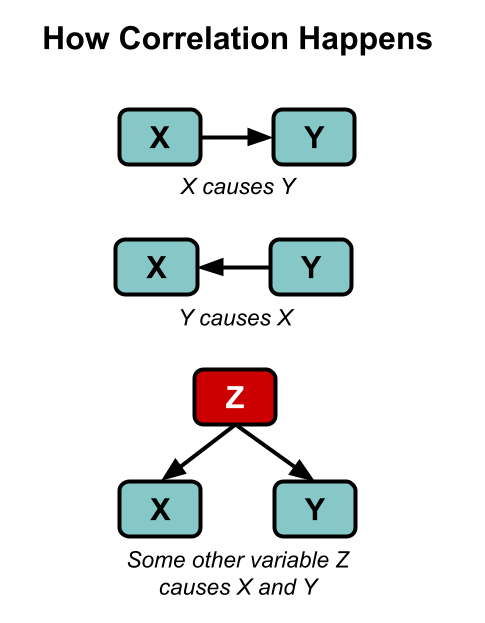
Here’s our standard disclaimer: all of the analysis you are about to see is correlational. As you well know, correlation does not imply causation — though as XKCD reminds us, “it does waggle its eyebrows suggestively and gesture furtively while mouthing ‘look over there’.” Correlation can still provide some evidence, and we can always follow up on anything we find in correlational data later on with more controlled research. We are fishing for weird surprises, like when you cast a net into the sea and pull up a bicycle.

A final reminder: about 75% of the modern variation in BMI is genetic, so any correlations of environmental variables with BMI will probably appear to be quite small. We should expect to see correlations like r = 0.10, not like r = 0.65. But that appearance of smallness is misleading, because we are looking for factors that can explain the 25% of the variance in BMI that isn’t genetic. If we find a factor that accounts for 5% of the total variance in BMI, it’s more like it explains 20% of the remaining mystery, the non-genetic variance (.05/.25 = 0.2), which is what we are really interested in.


We started with the simplest possible analyses. In this case it was as simple as: in the NHANES data, which variables have the biggest correlations with BMI? 

The strongest correlations of all, of course, were correlations of BMI with other measures of obesity. Naturally BMI is correlated with things like height and weight, this is not a surprise. So let’s pass over these variables and move on to more interesting findings.

From here, two correlations stand out in particular: 

Serum copper levels have the strongest correlation with BMI in the dataset, r = 0.240 (p < .001), and serum copper levels account for about 5.8% of the variance in BMI. 

Serum gamma-tocopherol levels are a close second, correlated with BMI at r = 0.230 (p < .001), and serum gamma-tocopherol levels account for about 5.5% of the variance in BMI.

Both of these relationships stand out quite a bit from the herd. The next-strongest correlation with BMI in the NHANES is just r = -0.170 (we’ll look at some of these variables in future posts). This is still significant but it’s definitely a step down — serum copper and serum gamma-tocopherol are, for some reason, pretty clear outliers.

Here’s a plot of the 20 strongest correlations with BMI in the NHANES data that we looked at (not including other measures of obesity). There are plenty of variables correlated with BMI, but serum copper and serum gamma-tocopherol are the only correlations above .20 and really stand out when you plot them graphically. Here they are plotted with absolute value, so we can compare positive and negative correlations without worrying about the sign: 

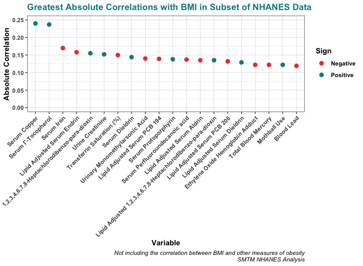
These correlations might seem small, but remember that about 75% of the variation in BMI is genetic. These small correlations are actually quite big in context. For example, the correlation between BMI and age (people generally get heavier as they get older) is only r = 0.072 — all the correlations pictured above are a bit larger than this.

This seems particularly interesting because while these two correlations are potentially compatible with a number of different theories, we don’t think there’s any theory of the obesity epidemic that would actually have predicted these correlations in advance.

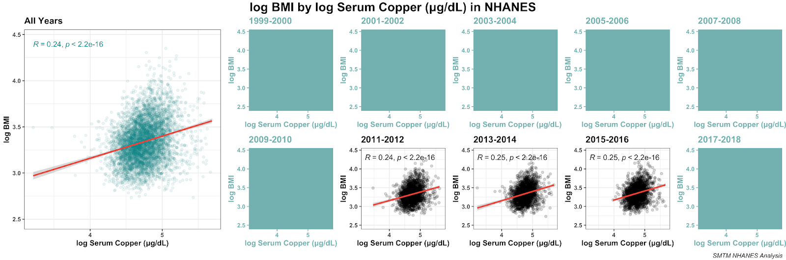
Sadly we cannot compare copper and gamma-tocopherol directly since, as you will see in a minute, they cover different years of the dataset. But we can look at them individually, so let’s do that.

Copper

The NHANES only collected serum copper in three datasets: 2011-2012, 2013-2014, and 2015-2016. But these provide three mostly independent replications, and the same relationship is found all three times.

Here’s that relationship with both variables log-transformed. The log transformation makes the visualization clearer, but the correlation remains pretty much the same: 

And here’s the distribution of serum copper levels in those three datasets:

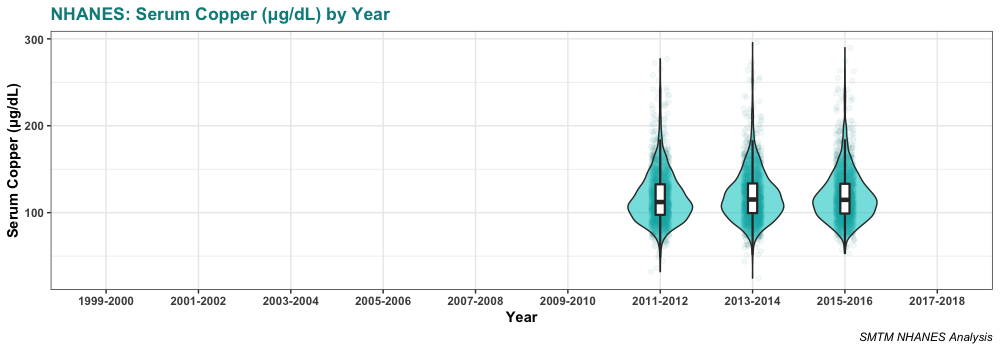
Serum copper levels are lowest in 2011-2012, the first year we have data for. They might be increasing a bit over time, but really there’s not enough years of data to tell.

Elizabeth did a different kind of visualization, where she took a look at the individual deciles for copper (she split people up into 10 groups by how much copper was in their serum) and found that the relationship is even more striking with this kind of analysis. 

Elizabeth: “I used a modified BMI to mitigate the 2D vs 3D scaling problem with the traditional BMI (adjusting to better represent shorter and heavier people as more overweight and taller people as less overweight), so that bmi = weight (KG) / Height (M)^2.5” (The results are similar either way)

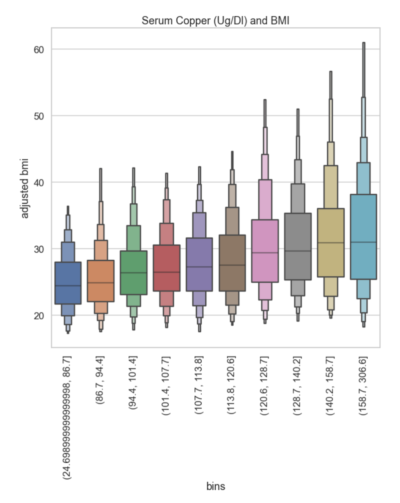
The people in the lowest two brackets for serum copper levels have median BMIs of 25, and around 70% of them have BMIs under 30.

In comparison, higher levels get you a higher median and a bigger spread — the top two brackets for serum copper levels have a median BMIs over 30. People in the top 20% for serum copper are on average obese. This is very weird. 

Finally, if you put serum copper in a regression model with age, gender, ethnicity, and education, it remains significant and the coefficient suggests that serum copper levels account for about 3.9 points of BMI difference across the normal range of serum copper levels. The model as a whole explains about 11% of the variation in BMI in this dataset. 

You might think that this correlation is driven by people with another condition that manifests as high serum copper, like kidney disease. But in fact, around 80% of people in this sample are within the normal range. If we look at just the people in the normal range (62-140 μg/dL), we get almost exactly the same correlation with BMI, r = 0.241. It seems like the BMI / serum copper relationship exists within the normal parameters and the general population. 

Biology

Copper does a bunch of stuff in the human body, so looking at its biological role does not narrow things down much at all. Per Wikipedia:

Copper is incorporated into a variety of proteins and metalloenzymes which perform essential metabolic functions; the micronutrient is necessary for the proper growth, development, and maintenance of bone, connective tissue, brain, heart, and many other body organs. Similarly to some other divalent ions, copper strongly interacts with lipid membranes and is involved in the formation of red blood cells, the absorption and utilization of iron, the metabolism of cholesterol and glucose, and the synthesis and release of life-sustaining proteins and enzymes. These enzymes in turn produce cellular energy and regulate nerve transmission, blood clotting, and oxygen transport.

This is additionally weird to us because we’re talking about serum copper levels. As an essential trace element, serum copper should be under tight homeostatic control, and really should not be correlated with much of anything. Wikipedia mentions this too: “The human body has complex homeostatic mechanisms which attempt to ensure a constant supply of available copper, while eliminating excess copper whenever this occurs.”

One way to interpret this could be that serum copper is not directly related to BMI at all — it could be that there’s something else that makes you obese AND messes up the control system that should keep your serum copper levels in the right range.

This is supported by the fact that the correlation between BMI and dietary copper is negative and nearly zero (r = -0.035). (Though also bear in mind imperfect collecting methods — all the nutrition measures are based on dietary interviews, so the estimates of elements are probably not very accurate.)

We brought this finding to a doctor we know, hoping he could shed some light on the result, but he was also pretty mystified. We also brought it to a biochemist, and she said, “Woah!!” (She also pointed out that copper is kind of an unusual ion because it has a couple of different charge levels.)

Literature Review

With the help of these colleagues, we started looking through the literature, and it turns out there’s already a small body of research out there about serum copper and obesity. We’re not even the first researchers to notice this in the NHANES data — this team of Chinese researchers wrote about serum copper and obesity in the NHANES data in 2017. But most of these papers haven’t gotten much attention.

The oldest source we saw was this paper from 1997, by a Turkish team studying children in Turkey. They found that serum copper concentrations were significantly higher in obese children than in “healthy controls”. They also report a similar relationship for serum zinc. They don’t mention any previous work linking copper to obesity.

This paper from a Tunisian team in 2001 found higher levels of serum copper in a group of obese participants. While they don’t report a correlation, they do mention that people with higher BMIs tend to have higher serum copper levels.

This paper from 2003, by a team from Kuwait University, found that serum copper concentration was associated with BMI (r = 0.220, p < 0.001). That’s really similar to the correlation we see in the NHANES data, r = 0.240. They also report some other relationships between leptin (one of the hormones that regulates fat storage) and various measures, including the serum zinc/copper ratio. It does seem a bit like they’re just picking variables and searching for relationships at random, but it’s still very encouraging to see this weird relationship we found in the NHANES replicated in a Kuwaiti population from almost a decade earlier.

This paper from 2019, by a team at Johns Hopkins, found a “significant positive and element-specific correlation between copper and BMI after controlling for gender, age, and ethnicity. Serum copper also positively correlated with leptin, insulin, and the leptin/BMI ratio.” They actually find a stronger relationship than in the NHANES, r = 0.40. 

Finally, this meta-analysis from 2019 looked at 21 previous publications and found that serum copper is generally related to obesity. They speculate that “elevated [copper] in circulation could contribute to oxidative stress disorder that reflects free radical concentrations and antioxidant imbalance” as well as some other mechanisms. That’s nice and all, but it doesn’t really explain why copper levels would be elevated in the first place. 

(Of interest to previous discussions, they also found that “in stratified analysis by the detection methods, the results showed that the association of serum Cu and obesity was significantly detected by AAS including flame atomic absorption spectrometry (FAAS) … but not for studies detected by ICP-MS.”)

One thing that stands out here is that many of these papers mention zinc. Copper and zinc are antagonists, meaning they work against each other in the body, so if copper is somehow involved in the obesity epidemic, it would make sense if zinc were involved too. 

However, we don’t see much evidence for it in the NHANES data. Serum zinc is not very correlated with serum copper or with BMI, though we noticed that if you put serum zinc and serum copper in a regression model predicting BMI, the interaction is significant (though only p = .004 with n > 5000). The idea that zinc is part of the picture remains interesting but tenuous. 

So much for copper.

Γ-Tocopherol

Γ-Tocopherol (gamma-tocopherol) is a form of vitamin E. Vitamin E is not a single compound, but a family of eight different compounds, four tocopherols and four tocotrienols (and also a secret third form of vitamin E, the synthetic tocofersolan). Gamma is the third letter in the Greek alphabet, and gamma-tocopherol is the third tocopherol in the vitamin E family.

What does it mean to be the third tocopherol? Like in the order God made them or what?

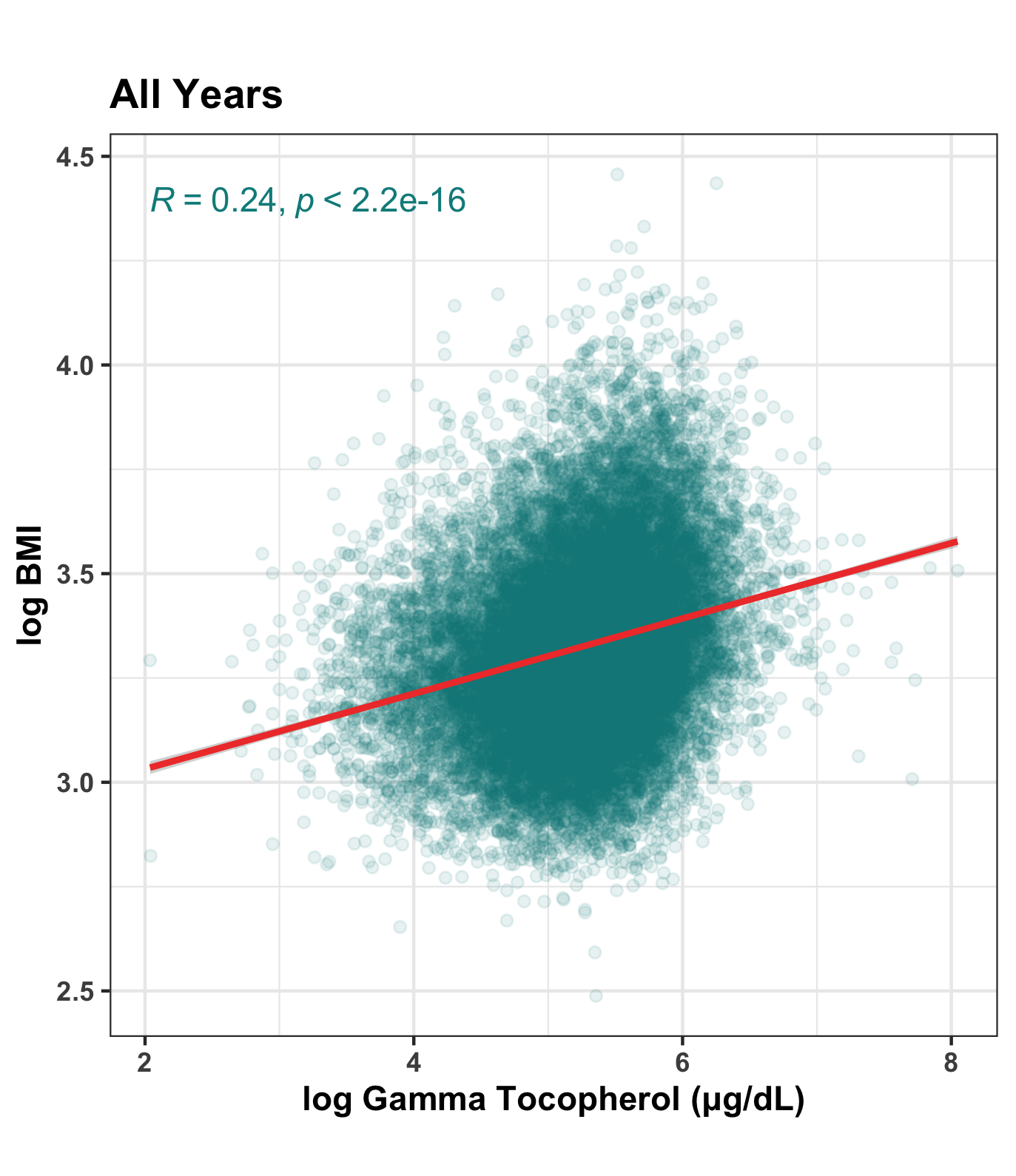
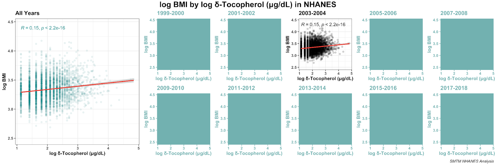
Along with serum copper levels, serum concentration of gamma-tocopherol stands out in the NHANES data for having an unusually strong correlation with BMI, r = 0.230, or r = 0.242 if both variables are log-transformed. 

Unfortunately, the gamma-tocopherol data is a little confusing, because NHANES kept changing the names of the serum tocopherol measures and the datasets they were a part of. Just because something is in a public dataset doesn’t mean it’s trivial to organize and make sense of it. If anything, quite the opposite. Let’s quickly disentangle.

In 1999-2000, gamma-tocopherol is in the Cadmium, Lead, Mercury, Cotinine & Nutritional Biochemistries (LAB06) dataset. There’s also a variable just called “Vitamin E” which is probably alpha-tocopherol, but we don’t see anything that makes this explicit. 

In 2001-2002, gamma-tocopherol is in the Vitamin A, Vitamin E & Carotenoids (L06VIT_B) dataset as “g-tocopherol”, and alpha-tocopherol is in this dataset explicitly as “Vitamin E”. Both alpha- and gamma-tocopherol are ALSO in the Vitamin A, Vitamin E, & Carotenoids, Second Exam (VIT_2_B) dataset, but in this dataset they are called “alpha-tocopherol” and “gamma-tocopherol”. These seem to be the same measures taken on a second day of testing, which is kind of neat, but you’d think they could keep the variable names consistent within a single year’s data.  

In 2003-2004, alpha-, gamma-, and delta-tocopherol are in the Vitamin A, Vitamin E & Carotenoids (L45VIT_C) dataset as “a-tocopherol”, “g-tocopherol”, and “d-tocopherol”, respectively.

In 2005-2006, gamma-tocopherol is in the Vitamin A, Vitamin E & Carotenoids (VITAEC_D) dataset as “g-tocopherol”, and alpha-tocopherol is in the same dataset but they’re calling it “Vitamin E” again.

In 2007-2008, 2009-2010, 2011-2012, and 2015-2016, there don’t appear to be any serum measures of tocopherols (there are dietary measures, but we don’t have much confidence in those). Oops? 

However, serum measures reappear in the 2017-2018 data. Both alpha- and gamma-tocopherol appear in Vitamin A, Vitamin E & Carotenoids (VITAEC_J) as “alpha-tocopherol” and “gamma-tocopherol”. 

(The NHANES is very rich but, as you might have noticed, rather disorganized. If you 1. have the data / database chops and are interested in cleaning it up, 2. have medical / biochemical / nutritional / etc. expertise and are interested in organizing the measures across years, or 3. are interested in funding a project to clean up and organize this mess so other people can more easily do the sort of thing we’re doing here, let us know and we’ll put you in touch with one another.)

While the naming conventions across these years are very messy, we didn’t see anything to suggest that these variables were measured in any substantially different way in different years. The 1999-2000 dataset seems to be ambiguous, but the others all describe the analysis method as being “high performance liquid chromatography with photodiode array detection”. So we combined all the tocopherol measures across years into single variables that we will use from here on out.

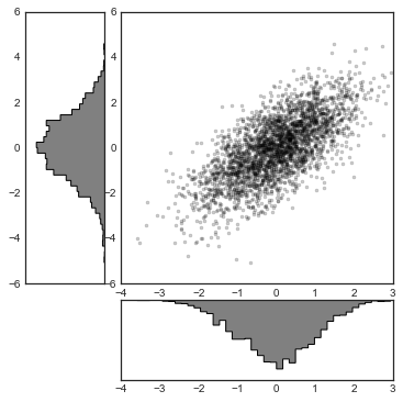
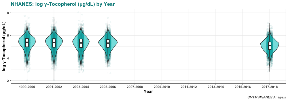
Here’s the overall relationship between BMI and gamma-tocopherol as a scatterplot. As usual, we have log-transformed both variables for a cleaner visualization: 

Here it is broken out by year: 

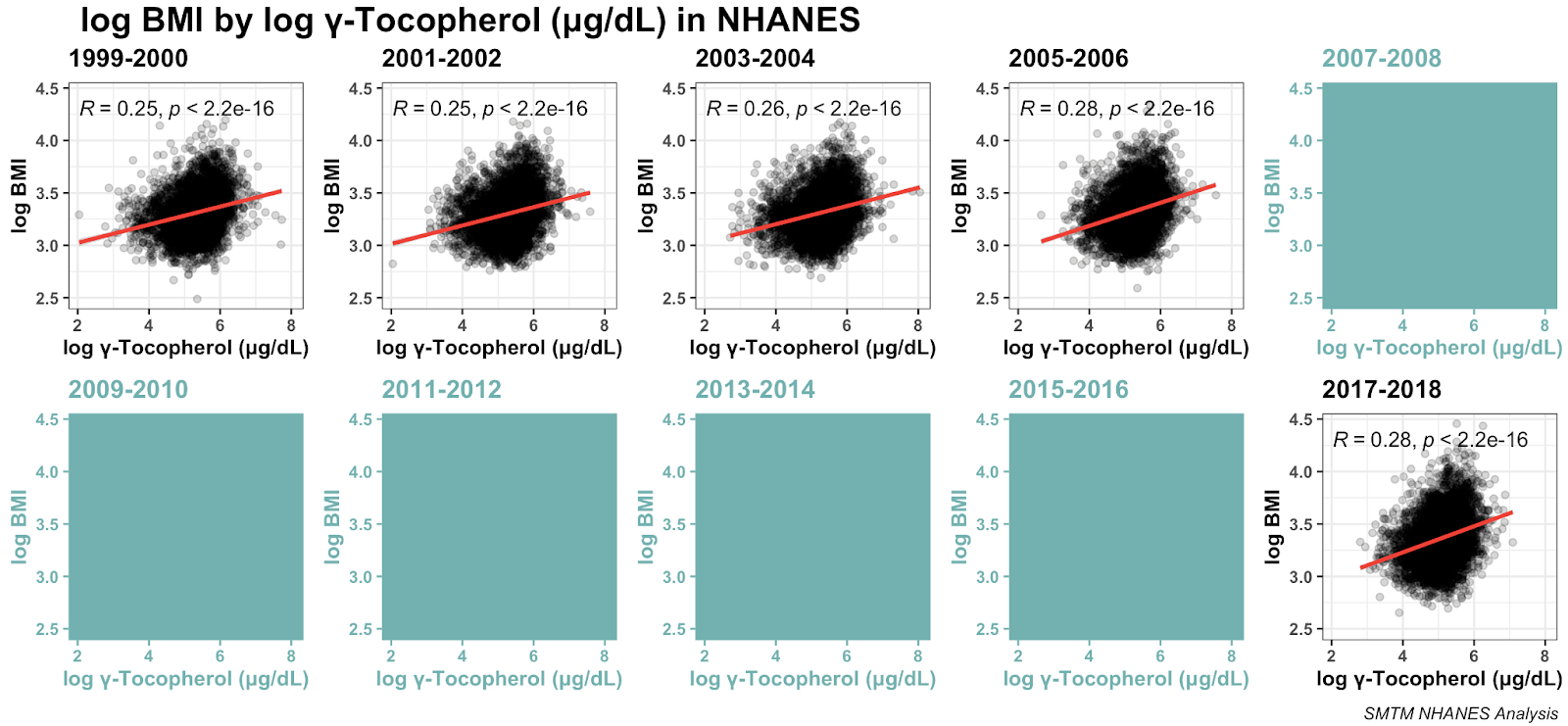
As we can see, the relationship seems to be very robust, replicating across five different datasets.

Serum levels of gamma-tocopherol seem to be declining slightly over time. The average was 240.0 µg/dL in 1999-2000 and is only 181.9 µg/dL in 2017-2018. This is certainly one point against the idea that gamma-tocopherol is causing obesity. If it were causing obesity, you would expect gamma-tocopherol levels to increase over time, as obesity has increased. 

Here’s the distribution in those years:

Elizabeth used a more advanced technique and found the following: 

A 2 variable decision tree for that year sometimes splits up on just Gamma Tocopherol and Iron (only time Iron shows up directly), which is an unexpected level of importance. 

Less restricted decision trees put Gamma Tocopherol levels after a split on gender, with a 4 point difference in predicted BMI. Some of the literature suggests that the effect may be gender specific, so that’s interesting.

She’s right: the relationship is stronger for women than it is for men. The correlation between BMI and serum gamma-tocopherol is r = 0.18 for male participants and r = 0.29 for female participants. In a multiple regression, this interaction is clearly significant, p < 0.001.

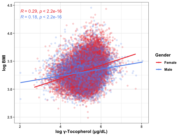
And like Elizabeth mentions, this is alluded to in some of the existing literature. This paper looking at the British National Diet and Nutrition Survey also finds a relationship between serum gamma-tocopherol and BMI, and highlights it for women in particular. They say:

In older women gamma-tocopherol and gamma-tocopherol:alpha-tocopherol ratios were directly related to indices of obesity. In young men alpha- and gamma-tocopherols were directly correlated with obesity, but gamma-tocopherol:alpha-tocopherol ratio was not.

We mentioned this finding to a physician we know. He didn’t have an immediate explanation for why gamma-tocopherol might be related to BMI, but he pointed out that vitamin E is fat-soluble, so it could just be that if you’re overweight, you have more body fat, which can store more of these fat-soluble vitamins. More fat, more gamma-tocopherol stored in your body, and more in your serum.

This is plausible — anything that gets stored in fat will probably show up in higher quantities in the bodies of people with more body fat. And this is a major possible confounder in general for this kind of big correlational analysis, keep it in mind for future posts (in case you’re wondering, copper and other metals in general are not fat-soluble). 

But one strike against the idea that fat accumulation is driving the relationship with BMI is that the correlation between BMI and other tocopherols is weaker. 

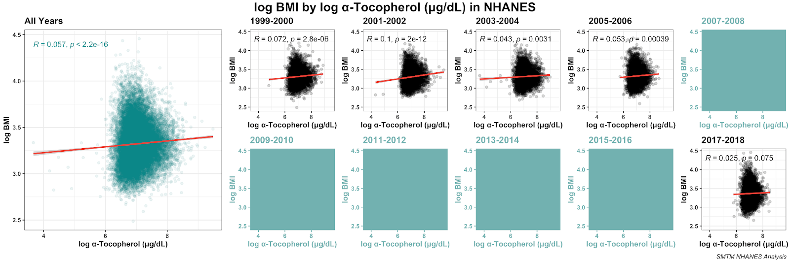
The relationship between BMI and serum alpha-tocopherol is also significant, but the magnitude of the relationship is much smaller.

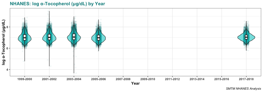
Here’s the distribution of serum alpha-tocopherol in those years:

We also happen to have one year of data for delta-tocopherol, so why not. It also has a bit of a relationship with BMI, stronger than alpha but weaker than gamma.

Some of the literature suggests that the ratio of gamma- to alpha-tocopherol is important, and yeah, the ratio is indeed correlated with BMI. Again we can plot it. We removed two weird outliers (their ratios are about 5x higher than everyone else’s) to make the plot a little cleaner, but removing them doesn’t make a difference to the overall correlation:

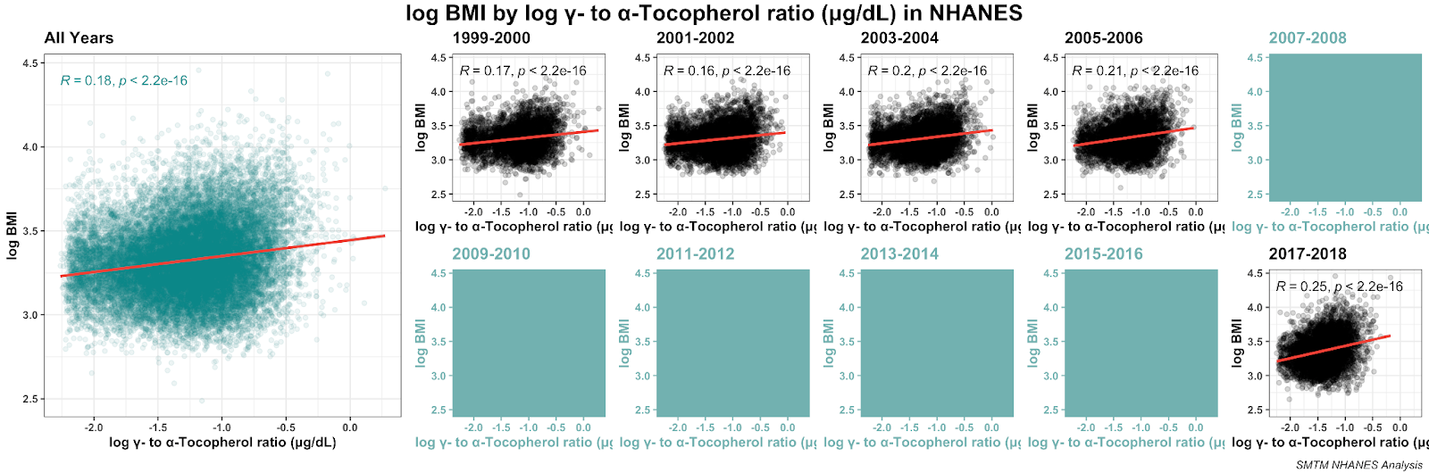
Here’s the distribution for those ratios in these years:

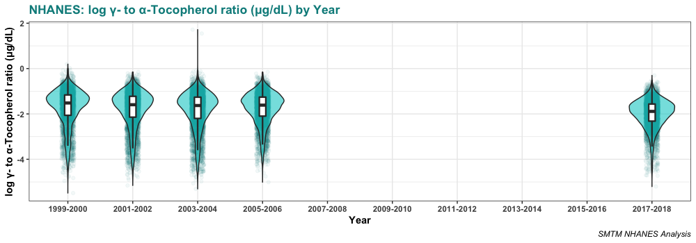
Again we want to note that the average ratio is going down over time. If the gamma-tocopherol:alpha-tocopherol ratio were causing obesity, you’d expect it to go up over time.

While the gamma-tocopherol:alpha-tocopherol ratio is significantly correlated with BMI, this correlation is smaller than the correlation between BMI and gamma-tocopherol by itself. Does the ratio actually add anything to the picture? 

Looks like yes. In a multiple regression predicting log BMI, both alpha- and gamma-tocopherol are significant predictors, and so is their interaction, all p-values extremely small. A model consisting of just alpha-tocopherol, gamma-tocopherol, and their interaction predicts about 7% of the variance in log BMI.

However, in this model both alpha- AND gamma-tocopherol have positive coefficients, meaning a higher serum level of either tocopherol predicts higher BMI. And their interaction has a negative coefficient, meaning that they are less than the sum of their parts.

That’s kind of weird. Here’s our best interpretation. Gamma-tocopherol is clearly associated with BMI. But alpha-tocopherol is barely associated with BMI at all, and while the correlation is sometimes significant, it’s much more tenuous. In a multiple regression, the interaction is negative. This means that the association between gamma-tocopherol and BMI is weaker as people have more alpha-tocopherol in their serum, so this is at least consistent with the idea that alpha-tocopherol has a protective effect against bad effects of gamma-tocopherol (more on causal inference in a moment).

If we include the gender effect we mentioned above, all these variables are still significant, all the interactions that were previously significant are still significant, and the alpha-tocopherol x gamma-tocopherol x gender three-way interaction is also significant. This model explains about 8% of the variance in BMI. 

mmm, pure tocopherols

Interpretation

Ok, what are we to make of this?

This review from 2001 is a good starting place for anyone interested in reading more about “the bioavailability, metabolism, chemistry, and nonantioxidant activities of γ-tocopherol and epidemiologic data concerning the relation between γ-tocopherol and cardiovascular disease and cancer.” Here are some quotes that we found especially relevant:

γ-Tocopherol is the major form of vitamin E in many plant seeds and in the US diet, but has drawn little attention compared with α-tocopherol, the predominant form of vitamin E in tissues and the primary form in supplements. However, recent studies indicate that γ-tocopherol may be important to human health and that it possesses unique features that distinguish it from α-tocopherol.

γ-Tocopherol is often the most prevalent form of vitamin E in plant seeds and in products derived from them (10). Vegetable oils such as corn, soybean, and sesame, and nuts such as walnuts, pecans, and peanuts are rich sources of γ-tocopherol (10). Because of the widespread use of these plant products, γ-tocopherol represents ≈70% of the vitamin E consumed in the typical US diet (10).

In humans, plasma α-tocopherol concentrations are generally 4–10 times higher than those of γ-tocopherol (13).

We can compare this to some other sources as well. Here’s an old USDA poster on nuts and seeds as sources of both alpha- and gamma-tocopherol. According to this source, “the highest sources of alpha-tocopherol in nuts and seeds are sunflower seeds, almonds/almond butter, hazelnuts, and pine nuts. The highest sources of gamma-tocopherol are black walnuts, sesame seeds, pecans, pistachios, English walnuts, flaxseed, and pumpkin seeds.”

This page from the NIH says, “most vitamin E in American diets is in the form of gamma-tocopherol from soybean, canola, corn, and other vegetable oils and food products.”

The Wikipedia page for “Tocopherol” says, 

α-tocopherol is the main source found in supplements and in the European diet, where the main dietary sources are olive and sunflower oils, while γ-tocopherol is the most common form in the American diet due to a higher intake of soybean and corn oil.

As far as we can tell, animal fats seem to be high in alpha-tocopherol, but we can’t find great sources on this. If you find one that looks reliable, please let us know. 

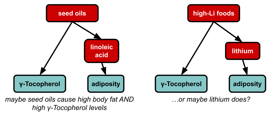
This seems like remarkably good news for the seed oil theorists, who think that the obesity epidemic comes from the fact that we started using lots of new food oils derived from plant seeds, like soybean, corn, and canola oils. We’ve previously looked into seed oils as an explanation and didn’t find much evidence in favor of the idea, but we don’t think it’s totally implausible.

Seed oil theorists usually pin the blame on linoleic acid as the reason seed oils might be making people obese, but maybe they’re wrong. Maybe it’s actually tocopherol ratios. Maybe they picked the right theory for the wrong reasons — it happens. Or maybe gamma-tocopherol is only correlated with BMI because it’s a proxy measure for how much seed oil you’re eating. Causal inference is hard y’all.

We don’t think that gamma-tocopherol causes obesity. If it did, then you would expect gamma-tocopherol levels (or the ratio with alpha-tocopherol) to increase over time. Instead, they have slightly decreased. And just in general, we don’t think it fits well with the shape of the obesity epidemic. There are big differences in obesity rates between different professions, and we don’t think auto mechanics are somehow getting hugely more gamma-tocopherol in their diet than teachers.

More likely, having more body fat makes you retain more gamma-tocopherol for an unrelated reason, possibly because vitamin E is a fat-soluble vitamin. 

You could maybe test this by looking at the serum tocopherol levels of a group that was gaining weight for a known reason, for example people who are starting olanzapine, an antipsychotic that often causes weight gain. If they gained weight but their tocopherol levels didn’t change, that would suggest that adiposity doesn’t have a direct effect on tocopherol levels.

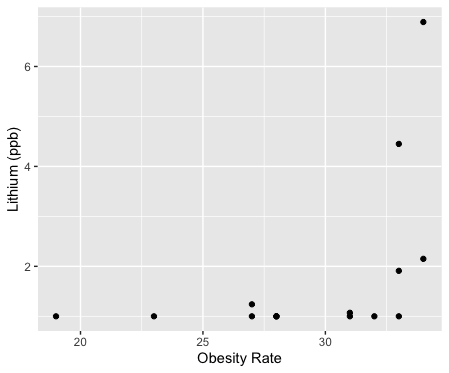
Or, the thing that is really causing the obesity epidemic also happens to increase gamma-tocopherol for unrelated reasons. For example, if linoleic acid is the cause of the obesity epidemic, then you would expect people who are obese to have high levels of gamma-tocopherol, because foods that are high in linoleic acid (like soybean oil) also tend to be high in gamma-tocopherol. Or if lithium is the cause of the obesity epidemic, then maybe people who are obese would have high levels of gamma-tocopherol, if the kinds of foods that accumulate lithium (perhaps pumpkin seeds?) also tend to be high in gamma-tocopherol.

But that said, it would be pretty straightforward to try to eat a diet that’s high in alpha-tocopherol and/or low in gamma-tocopherol, and see what happened. If you started losing weight immediately, that would be quite striking, and you could maybe back it up with blood tests to measure your serum tocopherol levels. 

So it’s worth considering if anyone has tried a high-alpha / low-gamma tocopherol (HALGT?) diet already. 

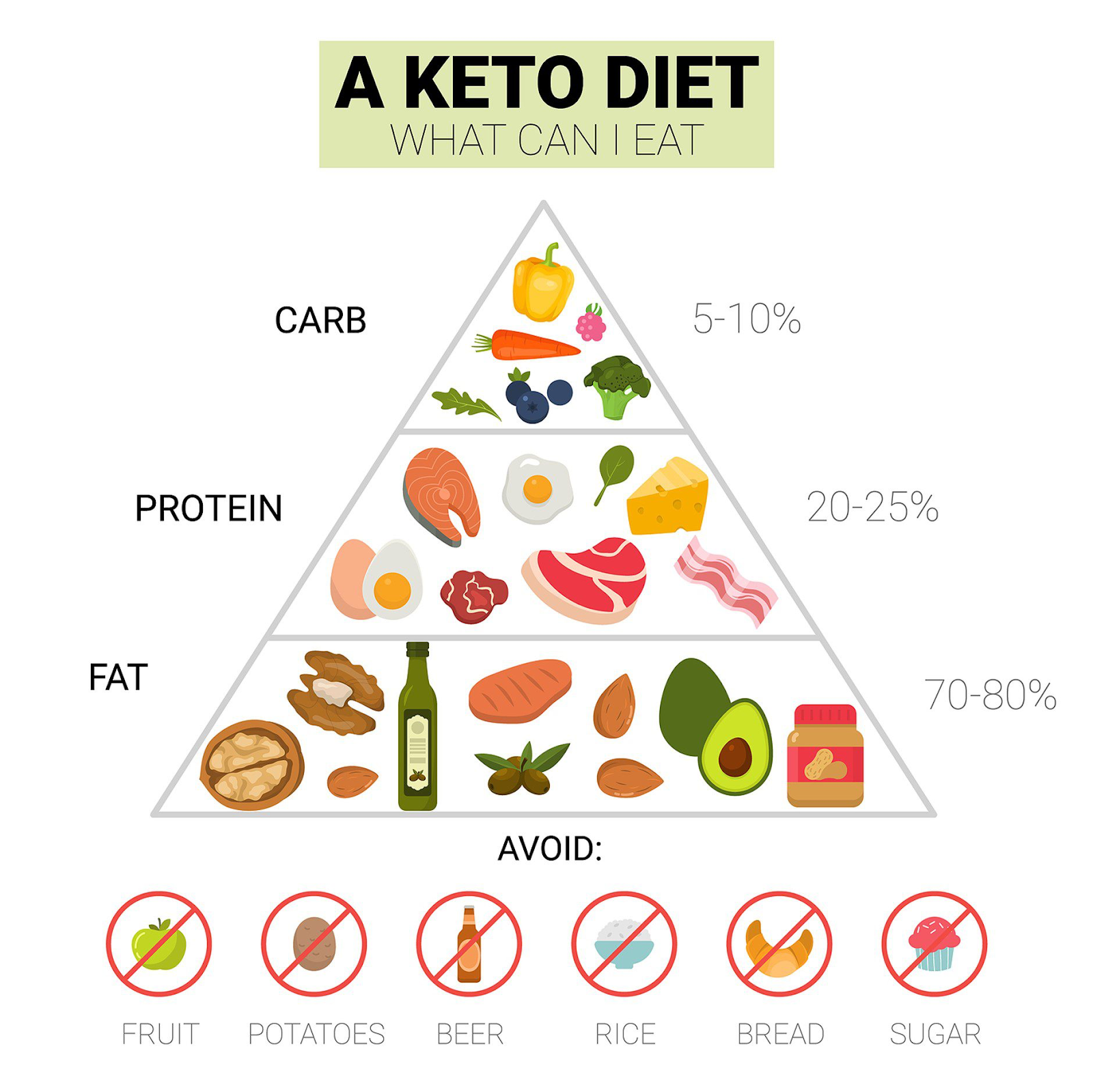
The ketogenic diet seems like it might sometimes be a HALGT diet, depending on the fats you use. If you focused on olive oil, almonds, and animal fats (for example), you would be getting a lot of alpha-tocopherol and not much gamma-tocopherol. But if you focused on fat from walnuts, peanut butter, and corn oil, you would be getting the opposite. This would kind of fit with the picture of how keto seems to have amazing effects for some people and basically no effect for others. 

consider

It would certainly fit with the Shangri-La diet. This is a “diet” that basically just involves taking two tablespoons of olive oil every morning. Seth Roberts, who developed this approach, claimed that this was enough to totally kill his appetite and make him lose weight, and this is backed up by some other anecdotes (here’s one example). 

Well, olive oil contains mostly alpha-tocopherol. Taking olive oil every morning would definitely increase your alpha-tocopherol intake, and depending on how much alpha-tocopherol and gamma-tocopherol you’re getting from the rest of your diet, this might be enough to change your ratio or whatever. But someone who was getting a lot of gamma-tocopherol from other sources might just have their gamma-tocopherol wipe out the alpha-tocopherol from the olive oil, and this might explain why the Shangri-La diet works for some people but not for other people

What about the croissant diet? We’re not sure. This diet involves getting a lot of fat from butter and other animal sources, so if it’s true that these are high in alpha-tocopherol, then the croissant diet might be a HALGT diet. It would also depend on how much gamma-tocopherol is in the other foods from this diet. The same logic would probably apply for many carnivore-style diets.

Ok, how about the potato diet? Potatoes contain a little vitamin E, and most sources strongly hint that this is mostly or entirely alpha-tocopherol. For example, the USDA says that 100g of potato contains 0.01 mg Vitamin E as alpha-tocopherol, and 0 mg of beta-, gamma-, and delta-tocopherol. Similarly, this U Rochester page says that potatoes contain 0.04 mg “Vitamin E (alpha-tocopherol)” per “1 Potato large”. 

This is not much vitamin E — the recommended dose is 15 mg a day. So if anything, the potato diet looks more like a vitamin E near-elimination diet. Maybe the elimination is the real factor, and it lets your body re-balance your tocopherol levels? But aside from that elimination, you are getting just a little vitamin E as alpha-tocopherol. And depending on the cooking oil you use, you might be getting more or less. This perspective suggests that the potato diet might work better with high-alpha-tocopherol fats like olive or sunflower oil and would work worse, or possibly not at all, with high-gamma-tocopherol fats like corn or soybean oil. That at least is an empirical prediction (assuming all these measurements of the tocopherol levels in foods are at all accurate). 

Even if the HALGT hypothesis is entirely accurate, though, there will always be lots of complications. Most of the variation in BMI between different people remains genetic. Tocopherols are destroyed by exposure to high temperatures, so the way you cook your foods and the methods used to process your cooking oils might make a huge difference. So maybe cold olive oil has 10x the effect of olive oil that was heated and used to cook food. If it isn’t this difference, it’s inevitably something else. So even if the real answer to obesity is as simple as the ratio of your alpha- to gamma-tocopherol, expect it to also be at least this complicated. 

So color us still skeptical but, there’s some evidence pointing in this direction.

N=1: Why the Gender Gap in Chronic Illness? 

Previously in this series:
N=1: Introduction
N=1: Single-Subject Research
N=1: Hidden Variables and Superstition

I. 

Many chronic illnesses are much more common in women than in men. IBS is about 2-2.5 times more common in women than in men; migraines are about 2-3 times more common; chronic fatigue is about 4 times more common. 

This is pretty weird, and more than a little mysterious. And it’s doubly weird that the ratio is pretty similar — each of these examples is about 3 times more common in women than in men.

Normally this gender gap, if it is addressed at all, is written off as a biochemical difference (e.g. here). But another possibility is that gender is just a proxy for body size (e.g. here). If some chronic illnesses are caused by exposure to irritants, heavy metals, or other contaminants, smaller people will generally have more of a response to the same level of exposure, and women on average are smaller than men.

If this is the case, it should be possible to detect if gender is a proxy for body size in some chronic illnesses. If body size is what really matters and gender is just a proxy, larger-than-average women will be underrepresented and smaller-than-average men will be overrepresented. Basically, once you know someone’s height and weight (and maybe % body fat), their gender shouldn’t give you any further information about their likelihood of getting sick.

II. 

We can show this with some simulations.

Here’s a simulation of 10,000 men and 10,000 women. The men have an average height of 69 inches with a standard deviation of 3 inches, and the women have an average height of 64 inches with a standard deviation of 3 inches. 

Let’s start by seeing what things look like if the greater prevalence of women is the result of something like hormone levels, and body size has nothing to do with it. In this case, the men all have a 1% chance of getting the illness, and the women have a 3% chance. Height doesn’t factor in at all. So when you look at the distribution of heights of men and women in the group of people with the chronic illness, it looks something like this:

As you can see, three times as many women have the illness as men do, but otherwise the distributions are quite generic. These are basically just subsets of the distributions for each gender. They should be normally distributed and should generally look similar to one another, except that there are more women than men and the two groups have different average heights.

Now in comparison, we can consider what the data would look like if gender is just acting as a proxy for height, and there are more women with chronic illness only because they are shorter on average. 

Here’s another simulation of 10,000 men and 10,000 women, with the same distributions for height. Without getting into the exact model,[1] this is what it looks like if height is the only thing that determines if you get sick, and shorter people are much more likely to get sick: 

Again we see that there are about three times more women than men, even though this time, gender doesn’t have a direct effect. In this simulation, height is the only thing influencing who gets the illness, but the difference in average height is enough to make it so that there are three times as many women as men. 

While it’s not clear from just eyeballing the distributions, there are signs in the data that height is driving this difference. For example, about 1% of women are 70 inches or taller in the height-based simulation (compared to about 2.2% in general) and about 9% of men are 63 inches or shorter (compared to about 2.2% in general). This seems like a clear sign that height is the actual thing that determines who gets sick.

III.

Since we don’t know what the real-world dynamics would look like, it’s not clear what you would see in real-world data. It could just be that people with the chronic illness would be shorter on average than people without — American women are about 64 inches tall on average, so it would be interesting if the average height on a chronic illness subreddit was just 61 inches (though you might want to account for age and ethnicity). If the effect was strong or nonlinear enough, there might be a noticeable skew in the data instead. Or you might see the underrepresentation of larger-than-average women and overrepresentation of smaller-than-average men that we describe above.

You could conceivably detect this kind of difference with normal survey methods, as long as you got a large enough sample size. To our mind, evidence that height (or possibly weight, you would want to collect both) explains why women are much more likely to have a chronic illness would be evidence that the chronic illness in question is caused by some kind of contaminant, since other causes shouldn’t be so sensitive to body size. If anyone wants to help collect this data for their community, please contact us.


[1]: The probability of a simulated person getting sick was proportional to 82 inches minus their height in inches, cubed. That is to say, in this model someone who is 56 inches tall was 17,576 times more likely to get sick than someone who is 81 inches tall. These numbers mean nothing, we pulled them out of our ass.

Say No to Neurotypification

People have minds. Everyone’s mind is different, because they have different mental traits. Some people are more or less confrontational; some people are more or less energetic; some people are more or less neurotic.

Most mental traits are normally distributed. For example, extraversion looks something like this. Some people are very extraverted, some people are very introverted, but most people are somewhere in the middle.

In this plot, the data are “normalized”, so the x-axis is by standard deviations. This is why it runs from negative to positive four — almost everyone falls within four standard deviations of the mean, which is represented as zero.

Most people have “typical” levels of extraversion. They like hanging out with friends but don’t go out and chase down strangers. They don’t want to live at the nightclub but they don’t want to go camp out in the library either. 

But a small number of people have atypically high or low levels of extraversion. In statistics, we often set the threshold for extreme values at plus or minus 2 standard deviations. We can do the same thing here to indicate people who are very introverted or very extroverted:

The cutoff is arbitrary — people who are 1.9 standard deviations above average are also very extraverted — but it lets us get a rough sense of how many people exist on both ends of the extremes. Because these traits are normally distributed, there isn’t going to be a point where people suddenly go from being typical to being very weird. People are just going to be progressively weirder and weirder as they get more extreme on each mental trait, and at some point we say, ok now they seem neurodivergent or whatever. 

Because these traits are normally distributed, we can use what we know about the normal distribution to make pretty accurate guesses about how many people are beyond these arbitrary thresholds. We know that about 2.3% (more precisely, 2.275013%) of a normal distribution is above or below two standard deviations, so that means about 2.3% of people are super introverted, and about 2.3% of people are super extraverted. 

(This is also where the idea of 95% confidence intervals comes from, which is the same thing as p = .05 — it’s just talking about things that are more or less than two SD away from some value.)  

Counting super introverted and super extraverted people as examples of being neurodivergent, this makes it look like 95.4% of the population is neurotypical, and only 4.6% is neurodivergent. But looking at one trait alone is misleading. 

People’s minds have more than just one trait, so a person’s mind can be unusual in more than one way. You might be very typical in terms of extraversion, smack dab in the middle of the distribution — you have 4.6 close friends, you go to a party every 22.3 days, and when you’re there, you always have 3.4 alcoholic drinks. But that doesn’t mean your mind is typical in other ways.

If you examine two mental traits, about 9% of the population will be at least two standard deviations from the mean on at least one of them. Here’s a simulation of 10,000 people with two totally unrelated, normally-distributed mental traits. People who are within two standard deviations of average for both traits are in teal, and anyone who is more than two standard deviations from the mean on either trait is in red:

With just one mental trait, only 4.6% of people have atypical minds. But with two traits, about 9% are atypical on either one trait or the other. Even so, most people won’t stand out for being total weirdos. Only 0.2% are atypical on both traits. 

It’s easy enough to extend this to more traits. In a group with three orthogonal (uncorrelated) mental traits, 14% would be extreme on at least one trait, and about 0.6% would be extreme on two or more. In a group with four orthogonal mental traits, 17% would be extreme on at least one trait, and about 1% would be extreme on two or more.

The Big Five personality traits (openness to experience, conscientiousness, extraversion, agreeableness, and neuroticism) are a set of mental traits covering the bulk of a person’s personality (at least in theory). They are, if not entirely uncorrelated, at least largely unrelated. Extending the previous analyses to a set of five mental traits suggests that about 21% of people are “abnormal” on at least one of their personality traits

According to our calculations, the crossing-over point is 14 mental traits. At 14 traits, just over 50% of the population is unusual (± 2 SD) on at least one mental trait, and 13% are unusual on two or more. This seems pretty conservative — probably there are more than 14 ways people’s minds can be different from one another.

We won’t bore you with every single simulation — let’s cut to the chase. If we make a model with 100 different mental traits, we find that 99% of people are unusual (± 2 SD) in at least one way, and most people are unusual in multiple ways — the median number of weird traits to have is 4. In this simulation, only 1% of people are totally “neurotypical”, having no mental traits more than two standard deviations from the population mean.

This is our beef with the term “neurotypical”. It’s true that some people’s minds are more typical than others’. But almost no one has a mind that is typical on all axes. In this model, only about 1% of the population is neurotypical (less than 2 SD from the mean) on all 100 traits. From this perspective, being “normal” is itself unusual. A full 23% of people have at least one trait that is EXTRA extreme, more than three standard deviations above or below the mean.

Physicians, bless them, already know about this one. Wulff, Pedersen, & Rosenberg, in their 1990 book Philosophy of Medicine: An Introduction, point out that the same thing happens any time you apply lots of tests to the same person: 

What most clinicians do when they receive a laboratory report is, of course, to look up the normal range for the tests in question. … Traditionally, a normal range is calculated in such a way that it includes 95% of the results found in a group of normal or healthy persons, and, consequently, there is a 5% risk that a healthy person will present with an abnormal laboratory result. Then, imagine that you do ten tests on a normal person. In that case the risk that at least one of these tests is abnormal is (1 – 0.9510) which amounts to 0.40 or 40%. If you do twenty-five tests (and that is not unusual in clinical practice), this chance is 72%! As Edmond A. Murphy puts it so aptly, ‘Therefore, a normal person is anyone who has not been sufficiently investigated.’ 

Correlated Traits

So far we’ve been assuming that all mental traits are totally uncorrelated, but we know that’s not true. Many mental traits are somewhat related (for example, anxiety and depression), so if you’re typical in one way, you are more likely to be typical in some other way as well. 

Even so, the pattern we saw before holds even when mental traits are correlated. If two mental traits are correlated at r = 0.30, the number of people that are unusual on at least one of them is still about 9%:

Even when two mental traits are correlated at r = 0.6, pretty high for a correlation in psychology, around 8% of people are unusual on at least one of the traits:

Calculations for a larger number of mental traits, all correlated with one another, is an exercise left to the reader.

On the Hunt for Ginormous Effect Sizes

A few people have asked us why we didn’t preregister the analysis for our potato diet study. We think this shows a certain kind of confusion about what preregistration is for, what science is all about, and why we ran the potato diet in the first place. 

The early ancestor of preregistration was registration in medical trials, which was introduced to account for publication bias. People worried that if a medical study on a new treatment found that the treatment didn’t work, the results would get memory-holed (and they were probably right). Their fix was to make a registry of medical studies so people could tell which studies got finished as planned and which ones were MIA. In this sense, our original post announcing the potato diet was a registration, because it would have been obvious if we never posted a followup. 

Pre-registration as we know it today was invented in response to the replication crisis. Starting around 2011, psychologists started noticing that big papers in their field didn’t replicate, and these uncomfortable observations slowly snowballed into a full-blown crisis (hence “replication crisis”). 

Researchers began to rally around a number of ideas for reform, and one of the most popular proposals was preregistration. At the time, many people saw preregistration as a way to save the foundering ship that was psychological science (and all the other ships that looked like they were about to spring a leak). 

Calls for preregistration can be found as early as 2013, in places like this open letter to The Guardian, and on the OSF, where people were already talking about encouraging the use of preregistration with snazzy badges like this one: 

But despite the early enthusiasm, preregistration is not a universal fix. It has a small number of use cases and those cases are specific. Part of being a good statistician is knowing how to preregister a study and knowing when preregistration applies, and it doesn’t apply all that broadly. We think preregistration has two specific benefits — one to the research team, and one to the audience. 

We’ve preregistered studies before, and in our experience, the biggest benefit for researchers is that preregistration encourages you to plan out your analysis in advance. When you do a study without thinking far enough ahead, you sometimes get the data back and you’re like oh shit how do I do this, I wish I had designed the study differently. But by then it’s too late. Preregistration helps with this problem because you have to lay out your whole plan beforehand, which helps you make sure you aren’t missing something obvious. This is pretty handy for the research team because it helps them avoid embarrassing themselves, but it doesn’t mean much for the reader.

The main benefit the audience gets from preregistration is that preregistration makes it clear which analyses were “confirmatory” and which were “exploratory”. Some analyses you plan to do all along (“confirmatory”; no it doesn’t make any sense to us either), and some you only do when you see the data and you’re like, what is this thing here (“exploratory”; you are Vasco da Gama). 

exploratory analyses

This is ok by itself because it does sort of help against p-hacking, which is one of the big causes of the replication crisis. When you do a project, you can analyze the data many different ways, and some of these analyses will look better than others. If you do enough analyses, you’re pretty much guaranteed to find some that look pretty good. This is the logic behind p-hacking, and preregistration makes it harder to p-hack because you theoretically have to tell people what analyses you planned to do from the get-go.

(This only works against p-hacking that comes about as the result of an honest mistake, which is possible. But there’s nothing keeping real fraudsters from collecting data, analyzing it, picking the analysis that looks best, THEN “pre”-registering it, and making it look like they planned those analyses all along. And of course the worst fraudsters of all can just fabricate data.)

But here’s something they don’t always tell you: p-hacking is only an issue if you’re doing research in the narrow range where inferential statistics are actually called for. No p-values, no p-hacking. And while inferential statistics can be handy, you want to avoid doing research in that range whenever possible. If you keep finding yourself reaching for those p-values, something is wrong. 

Statistics is useful when a finding looks like it could be the result of noise, but you’re not sure. Let’s say we’re testing a new treatment for a disease. We have a group of 100 patients who get the treatment and a control group of 100 people who don’t get the treatment. If 52/100 people recover when they get the treatment, compared to 42/100 recovering in the control group, it’s hard to tell if the treatment helped, or if the difference is just noise. You can’t tell with just a glance, but a chi-squared test can tell you that p = .013, meaning there’s only a 1.3% chance that we would see something like this from noise alone. In this case, statistics is helpful.

But it would be pointless to run a statistical test if we saw 43/100 people recover with the treatment, compared to 42/100 in the control group. You can tell that this is very consistent with noise (p > .50) just by looking at it. And it would be equally pointless to run a statistical test if we saw 98/100 people recover with the treatment, compared to 42/100 in the control group. You can tell that this is very inconsistent with noise (p < .00000000000001) just by looking at it. If something passes the interocular trauma test (the conclusion hits you between the eyes), you don’t need to pull out the statistics.

If you’re looking at someone else’s data, you may have to pull out the statistics to figure out if something is a real finding or if it’s consistent with just noise. If you’re working with large datasets collected for unrelated reasons, you may need techniques like multiple regression to try to disentangle complex relationships. Or if you specialize in certain methods where collecting data is expensive and/or time-consuming, like fMRI, you may be obliged to use statistics because of your small sample sizes.

But for the average experimentalist, you can get a sense of the effect size from pilot studies, and then you can pick whatever sample size you need to be able to clearly detect that effect. Most experimentalists don’t need p-values, period.

Better yet, you can try to avoid tiny effects, to study effects that are more than medium-sized, bigger than large even. You can choose to study effects that are, in a word, ginormous. 

I like my women like I like my coffee

And it’s not like we really care about a simple distinction between working and not-working. The Manhattan Project was an effort to build a ginormous bomb. If the bomb had gone off, but only produced the equivalent of 0.1 kilotons of TNT, it would have “worked”, but it would also have been a major disappointment. When we talk about something being ginormous, we mean it not just working, but REALLY working. On the day of the Trinity test, the assembled scientists took bets on the ultimate yield of the bomb:

Edward Teller was the most optimistic, predicting 45 kilotons of TNT (190 TJ). He wore gloves to protect his hands, and sunglasses underneath the welding goggles that the government had supplied everyone with. Teller was also one of the few scientists to actually watch the test (with eye protection), instead of following orders to lie on the ground with his back turned. He also brought suntan lotion, which he shared with the others.

Others were less optimistic. Ramsey chose zero (a complete dud), Robert Oppenheimer chose 0.3 kilotons of TNT (1.3 TJ), Kistiakowsky 1.4 kilotons of TNT (5.9 TJ), and Bethe chose 8 kilotons of TNT (33 TJ). Rabi, the last to arrive, took 18 kilotons of TNT (75 TJ) by default, which would win him the pool. In a video interview, Bethe stated that his choice of 8 kt was exactly the value calculated by Segrè, and he was swayed by Segrè’s authority over that of a more junior [but unnamed] member of Segrè’s group who had calculated 20 kt. Enrico Fermi offered to take wagers among the top physicists and military present on whether the atmosphere would ignite, and if so whether it would destroy just the state, or incinerate the entire planet.

The ultimate yield was around 25 kilotons. Again, ginormous.

Studying an effect that is truly ginormous makes p-hacking a non-issue. You either see it or you don’t. So does having a sufficiently large sample size. If you have both, fuggedaboudit. Studies like these don’t need pre-registration, because they don’t need inferential statistics. If the suspected effect is really strong, and the study is well-powered, then any finding will be clearly visible in the plots.

This is why we didn’t bother to preregister the potato diet. The case studies we started with suggested the effect size was, to use the current terminology, truly ginormous. Andrew Taylor lost more than 100 lbs over the course of a year. Chris Voigt lost 21 lbs over 60 days. That’s a lot.

If people don’t reliably lose several kilos on the potato diet, then in our minds, the diet doesn’t work. We are not interested in having a fight over a couple of pounds. We are not interested in arguing about if the p-value is .03 or .07 or whatever. If the potato diet doesn’t work huge, we don’t want it. Fortunately it does work huge

(We didn’t report a test of significance for the potato diet because we don’t think inferential statistics were needed, but if we had, the relevant p-value would be 0.00000000000000022)

What ever happened to looking for things that… work really well. No one has academic debates over whether or not sunscreen works. No one argues about penicillin or the polio vaccine. There was no question that cocaine was a great, exciting, very wonderful local anesthetic. When someone injects cocaine into your cerebrospinal fluid, you fucking know it. 

We pine for a time when spirits were brave, men were men, women were men, children were men, various species of moths were men, dogs were geese, and scientists tried to make discoveries that were ginormously effective. Somehow people seem to have forgotten. Why are we looking for things that don’t barely work?

Maybe statistics is to blame. After all, stats is only useful when you’re just on the edge of being able to see an effect or not. Maybe all this statistics training encourages people to go looking for literally the smallest effects that can be detected, since that’s all stats is really good for. But this was a mistake. Pre-statistics scientists had it right. Smoking and lung cancer, top work there, huge effect sizes.

We know not everything worth studying will have a big effect size. Some things that are important are fiddly and hard to detect. We should be on the lookout for drugs that will increase cancer survival rates by 0.5%, or relationships that only come out in datasets with 10,000 observations. We’re not against this; we’ve done this kind of work before and we’ll do it again if we have to. 

There’s no shame in tracking down a small effect when there’s nothing else to hunt. But your ancestors hunted big game whenever possible. You should too. 

Good hunting. 

A Series of Unfortunate Omelettes: Lithium in Food Review & Survey Proposal

One thing that makes lithium a plausible explanation for the obesity epidemic is that clinical doses of lithium cause weight gain as a side-effect. A clinical dose of lithium is in the range of 1000 mg (“300 mg to 600 mg … 2 to 3 times a day”), and people pretty reliably gain weight on doses this high. In a 1976 review of case records, about 60% of people gained weight on clinical doses, with an average weight gain of about 10 kg.

But those are clinical doses, and it seems like the doses you’re getting from the environment are generally much smaller. There’s usually some lithium in modern drinking water, and there’s more lithium in drinking water now than there used to be. It seems to get into the water supply from things like drilled water wells, fracking, and fossil fuel prospecting, transport, and disposal. But even with all these sources of contamination, the dose you’re getting from your drinking water is relatively low, probably not much more than 0.2 mg per day. If you live right downstream from a coal plant, or you’re chugging liter bottles of mineral water on the regular, you could maybe get 5 or 10 mg/day. But no one is getting 1000 mg/day or even 300 mg/day from their drinking water. 

So what gives? 

Effects of Trace Doses

One possibility is that small amounts of lithium are enough to cause obesity, at least with daily exposure.

This is plausible for a few reasons. There’s lots of evidence (or at least, lots of papers) showing psychiatric effects at exposures of less than 1 mg (see for example meta-analysis, meta-analysis, meta-analysis, dystopian op-ed). If psychiatric effects kick in at less than 1 mg per day, then it seems possible that the weight gain effect would also kick in at less than 1 mg. 

There’s also the case study of the Pima in the 1970s. The Pima are a group of Native Americans who live in the American southwest, particularly around the Gila River Valley, and they’re notable for having high rates of obesity and diabetes much earlier than other groups. They had about 0.1 mg/L in their water by the 1970s (which was 50x the national median at the time), for a dose of only about 0.2-0.3 mg per day, and were already about 40% obese. All this makes the trace lithium hypothesis seem pretty reasonable.

Unfortunately, no one knows where the weight gain effects of lithium kick in. As far as we can tell, there’s no research on this question. It might cause weight gain at doses of 10 mg, or 1 mg, or 0.1 mg. Maybe 0.5 mg a week on average is enough to make some people really obese. We just don’t know.

Some people in the nootropics community take lithium, often in the form of lithium orotate (they use orotate rather than other compounds because it’s available over-the-counter), as part of their stacks. Based on community posts like this, this, and this, the general doses nootropics enthusiasts are taking are in the range of 1-15 mg per day. 

We haven’t done a systematic review of the subreddit (but maybe you should, that would be a good project for someone) but they seem to report no effects or mild positive effects at 1 or 2 mg lithium orotate and brain fog and fatigue at 5 mg lithium orotate and higher. Some of them report weight gain, even on doses this low. The fact that a couple extra mg might be enough to push you over the line suggests that the weight gain tipping point is somewhere under 10 mg, maybe a lot under. And for what it’s worth, all of this is consistent with the only randomized controlled trial examining the effects of trace amounts of lithium which found results at just 0.4 mg a day. 

Clinical and Subclinical Doses

Another possibility is that people really ARE getting unintended clinical doses of lithium. We see two reasons to think that this might be possible.

#1: Doses in the Mirror may be…

The first is that clinical doses are smaller than they appear. 

When a doctor prescribes you lithium, they’re always giving you a compound, usually lithium carbonate (Li2CO3). Lithium is one of the lightest elements, so by mass it will generally be a small fraction of any compound it is part of. A simple molecular-weight calculation shows us that lithium carbonate is only about 18.7% elemental lithium. So if you take 1000 mg a day of lithium carbonate, you’re only getting 187.8 mg/day of the active ingredient.

The little purple orbs are the pharmacologically active lithium ions, everything else is non-therapeutic carbonate

For bipolar and similar disorders, lithium carbonate has become such a medical standard that people usually just refer to the amount of the compound. It’s very unusual for an ion to be a medication, so this nuance is one that some doctors/nurses don’t notice. It’s pretty easy to miss. In fact, we missed it too until we saw this reddit comment from u/PatienceClarence/, which begins, “First off we need to differentiate between the doses of lithium orotate vs elemental lithium. For example, my dosage was 130 mg orotate which would give me 5 mg ‘pure’ lithium…” 

Elemental lithium is what we really care about, and when we look at numbers from the USGS or serum samples or whatever, they’re all talking about elemental lithium. When we say people get 0.1 mg/day from their water, or when we talk about getting 3 mg from your food, that’s milligrams of elemental lithium. When we say that your doctors might give you 600 mg per day, that’s milligrams lithium carbonate — and only 112.2 milligrams a day of elemental lithium. With this in mind, we see that the dose of elemental lithium is always much lower than the dose as prescribed. 

A high clinical dose is 600 mg lithium carbonate three times a day (for a total of 1800 mg lithium carbonate or about 336 mg elemental lithium), but many people get clinical doses that are much smaller than this. Low doses seem to be more like 450 mg lithium carbonate per day (about 84 mg/day elemental lithium) or even as little as 150 mg lithium carbonate per day (about 28 mg/day elemental lithium).

Once we take the fact that lithium is prescribed as a compound into account, we see that the clinical dosage is really closer to something like 300 mg/day for a high dose and 30 mg/day for a low dose. So at this point we just need to ask, is it possible that people might occasionally be getting 30 mg/day or more lithium in the course of their everyday lives? Unfortunately we think the answer is yes.

#2: Concentration in Food

The other reason to think that modern people might be getting clinical or subclinical doses on the regular is that there’s clear evidence that lithium concentrates in some foods. 

Again, consider the Pima. The researchers who tested their water in the 1970s also tested their crops. While most crops were low in lithium, they found that one crop, wolfberries, contained an incredible 1,120 mg/kg.

By our calculations, you could easily get 15 mg of lithium in a tablespoon of wolfberry jelly. If the Pima ate one tablespoon a day, they would be getting around 100 times more lithium from that tablespoon than they were getting from their drinking water.

The wolfberries in question (Lycium californium) are a close relative of goji berries (Lycium barbarum or Lycium chinense). The usual serving size of goji berries is 30 grams, which if you were eating goji berries like the ones the Pima were eating, would provide about 33.6 mg of lithium. This already puts you into clinical territory, a little more than someone taking a 150 mg tablet of lithium carbonate.

If you had a hankering and happened to eat three servings of goji berries in one day, you would get just over 100 mg of lithium from the berries alone. We don’t know how much people usually eat in one go, but it’s easy enough to buy a pound (about 450 g) of goji berries online. We don’t have any measurements of how much lithium are in the goji berries you would eat for a snack, but if they contained as much lithium as the wolfberries in the Gila River Valley, the whole 1 lb package would contain a little more than 500 mg of lithium.

So. Totally plausible that some plants concentrate 0.1 mg/L lithium in water into 1,120 mg/kg in the plant, because Sievers & Cannon have measurements of both. Totally plausible that you could get 10 or even 100 mg if you’re eating a crop like this. So now we want to know, are there other crops that concentrate lithium? And if so, what are they?

In this review, we take a look at the existing literature and try to figure out how much lithium there is in different foods. What crops does it concentrate in? Is there any evidence that foods are further contaminated in processing or transport? There isn’t actually all that much work on these questions, but we’ll take a look at what we can track down.

Let’s not bury the lede: we find evidence of subclinical levels of lithium in several different foods. But most of the sources that report these measurements are decades old, and none of them are doing anything like an exhaustive search. That’s why at the end of this piece, we’re going to talk a little bit about our next project, a survey of lithium concentrations in foods and beverages in the modern American food supply.

Because of this, our goal is not to make this post an exhaustive literature review; instead, our goal is to get a reasonable sense of how much lithium is in the food supply, and where it is. When we do our own survey of modern foods, what should we look at first? This review is a jumping off point for our upcoming empirical work.

Context for the Search

But first, a little additional context. 

There are a few official estimates of lithium consumption we should consider (since these are in food and water, all these numbers should be elemental lithium). This review paper from 2002 says that “the U.S. Environmental Protection Agency (EPA) in 1985 estimated the daily Li intake of a 70 kg adult to range from [0.650 to 3.100 mg].” The source they cite for this is “Saunders, DS: Letter: United States Environmental Protection Agency. Office of Pesticide Programs, 1985”, but we can’t find the original letter. As a result we don’t really know how accurate this estimate is, but it suggests people were getting about 1-3 mg per day in 1985.

These numbers are backed up by some German data which appear originally to be from a paper from 1991, which we will discuss more in a bit: 

In Germany, the individual lithium intake per day on the average of a week varies between [0.128 mg/day] and [1.802 mg/day] in women and [0.139] and [3.424 mg/day] in men. 

The paper also includes histograms of those distributions: 

Both of these say “mg/day” but we’re pretty sure that’s 1000x too high and they should say “µg/day”. If it were mg/day we think many of these people would be dead?

We want to call your attention to the shape of both of these distributions, because the shape is going to be important throughout this review. Both distributions are pretty clearly lognormal, meaning they peak early on but then have a super long tail off to the right. For example, most German men in this study were getting only about 0.2 to 0.4 mg of lithium per day, but twelve of them were getting more than 1 mg a day, and five of them were getting more than 2 mg a day. At least one person got more than 3 mg a day. And this paper is looking at a pretty small group of Germans. If they had taken a larger sample, we would probably see a couple people who were consuming even more. You see a similar pattern for women, just at slightly lower doses.

We expect pretty much every distribution we see around food and food exposure to be lognormal. The amount people consume per day should usually be lognormally distributed, like we see above. The distribution of lithium in any foods and crops will be lognormal. So will the distribution of lithium levels in water sources. For example, lithium levels in that big USGS dataset of groundwater samples we always talk about are distributed like this:

With scatterplot because those outliers are basically invisible on the histogram

Again we see a clear lognormal distribution. Most groundwater samples they looked at had less than 0.2 mg/L lithium. But five had more than 0.5 mg/L and two had more than 1 mg/L.

This is worth paying close attention to, because when a variable is lognormally distributed, means and medians will not be very representative. For example, in the groundwater distribution you see above, the median is .0055 mg/L and the mean is .0197 mg/L. 

These sound like really tiny amounts, and they are! But the mean and the median do not tell anywhere close to the full story. If we keep the long tail of the distribution in mind, we see that about 4% of samples contain more than 0.1 mg/L, about 1% of samples contain more than 0.2 mg/L, and of course the maximum is 1.7 mg/L. 

This means that about 4% of samples contain more than 20x the median, about 1% of samples contain more than 40x the median, and the maximum is more than 300x the median.

Put another way, about 4% of samples contain more than 5x the mean, about 1% of samples contain more than 10x the mean, and the maximum is more than 80x the mean.

We should expect similar distributions everywhere else, and we should expect means and medians to consistently be misleading in the same way. So if we find a crop with 1 mg/kg of lithium on average, that suggests that the maximum in that crop might be as high as 80 mg/kg! If this math is even remotely correct, you can see why crops that appear to have a low average level of lithium might still be worth empirically testing.

Another closely related point: that USGS paper only found those outliers because it’s a big survey, 4700 samples. Small samples will be even more misleading. Let’s imagine the USGS had taken a small number of samples instead. Here are some random sets of 6 observations from that dataset:

0.044, 0.007, 0.005, 0.036, 0.001, 0.002

0.002, 0.028, 0.005, 0.001, 0.009, 0.001

0.003, 0.006, 0.002, 0.001, 0.001, 0.006

We can see that small samples ain’t representative. If we looked at a sample of six US water sources and found that all of them contained less than 0.050 mg/L of lithium, we would miss that some US water sources out there contain more than 0.500 mg/L. In this situation, there’s no substitute for a large sample size (or, the antidote is to be a little paranoid about how long the tail is).

So if we looked at a sample of (for example) six lemons, and found that all of them contained less than 10 mg/kg of lithium, we might easily be missing that there are lemons out there that contain more than 100 mg/kg.

In any case, the obvious lognormal distribution fits really well with the kind of bolus-dose explanation we discussed with JP Callaghan, who said: 

My thought was that bolus-dosed lithium (in food or elsewhere) might serve the function of repeated overfeeding episodes, each one pushing the lipostat up some small amount, leading to overall slow weight gain. … I totally vibe with the prediction that intake would be lognormally distributed. … lognormally distributed doses of lithium with sufficient variability should create transient excursions of serum lithium into the therapeutic range.

In the discussion with JP Callaghan, we also said:

Because of the lognormal distribution, most samples of food … would have low levels of lithium — you would have to do a pretty exhaustive search to have a good chance of finding any of the spikes. So if something like this is what’s happening, it would make sense that no one has noticed. 

What we’re saying is that even if people aren’t getting that much lithium on average, if they sometimes get huge doses, that could be enough to drive their lipostat upward. If we take that model seriously, the average amount might not not be the real driver, and we should focus on whether there are huge lithium bombs out there, and how often you might encounter them. Or it could be even more complicated! Maybe some foods give you repeated moderate doses, and others give you rare megadoses. 

Two final notes before we start the review: 

First, if two sources disagree — one says strawberries are really high in lithium and the other says that strawberries are really low in lithium, or something — we should keep in mind that disagreement might mean something like “the strawberries were grown in different conditions (i.e. one batch was grown in high-lithium soil and the other batch wasn’t)” or even “apparently identical varieties of strawberries concentrate lithium differently”. There isn’t a simple answer to simple-sounding questions like “how much lithium is in a strawberry” because reality is complicated and words make it easy to hide that complexity without thinking about it.

Second, we want to remind you that whatever dose causes obesity, lithium is also a powerful sedative with well-known psychiatric effects. If you’re getting doses up near the clinical range, it’s gonna zonk you out and probably stress your kidneys. 

Ok. What crops concentrate lithium?

Lithium Concentration

Unfortunately we couldn’t find several of the important primary sources, so in a number of places, we’ve had to rely on review papers and secondary sources. We’re not going to complain “we couldn’t find the primary source” every time, but if you’re ever like “why are they citing a review paper instead of the original paper?” this is probably why.

We should warn you that these sources can be a little sloppy. Important tables are labeled unclearly. Units are often given incorrectly, like those histograms above that say mg/day when they should almost certainly say µg/day. When you double-check their citations, the numbers don’t always match up. For example, one of the review papers said that a food contained 55 mg/kg of lithium. But when we double-checked, their source for that claim said just 0.55 mg/kg in that food. So we wish we were working with all the primary sources but we just ain’t. Take all these numbers with a grain of salt.

Particularly important modern reviews include Lithium toxicity in plants: Reasons, mechanisms and remediation possibilities by Shahzad et al. (2016), Regional differences in plant levels and investigations on the phytotoxicity of lithium by Franzaring et al. (2016), and Lithium as an emerging environmental contaminant: Mobility in the soil-plant system by Robinson et al. (2018). Check those out if you finish this blog post and you want to know more.

It’s worth noting just how concerned some of these literature reviews sound. Shahzad et al. (2016) say in their abstract, “The contamination of soil by Li is becoming a serious problem, which might be a threat for crop production in the near future. … lack of considerable information about the tolerance mechanisms of plants further intensifies the situation. Therefore, future research should emphasize in finding prominent and approachable solutions to minimize the entry of Li from its sources (especially from Li batteries) into the soil and food chain.”

Older reviews include The lithium contents of some consumable items by Hullin, Kapel, and Drinkall — a 1969 paper which includes a surprisingly lengthy review of even older sources, citing papers as far back as 1917. Sadly we weren’t able to track down most of these older sources, and the ones we could track down were pretty vague. Papers from the 1930s just do not give all that much detail. Still, very cool to have anything this old. 

There’s also Shacklette, Erdman, Harms, and Papp (1978), Trace elements in plant foodstuffs, a chapter from (as far as we can tell) a volume called “Toxicity of Heavy Metals in the Environment”, which is part of a series of reference works and textbooks called “HAZARDOUS AND TOXIC SUBSTANCES”. It was sent to us by a very cool reader who refused to accept credit for tracking it down. If you want to see this one, email us.

A bunch of the best and most recent information comes from a German fella named Manfred Anke, who published a bunch of papers on lithium in food in Germany in the 1990s and 2000s. He did a ton of measurements, so you will keep seeing his name throughout. Unfortunately the papers we found from Anke mostly reference measurements from earlier work he did, which we can’t find. Sadly he is dead so we cannot ask him for more detail.

From Anke, in case anyone can track them down, we’d especially like to see a couple papers from the 1990s. Here they are exactly as he cites them:  

Anke’s numbers are very helpful, but we think they are a slight underestimation of what is in our food today. We’re pretty sure lithium levels in modern water are higher than levels in the early 1990s, and we’re pretty sure lithium levels are higher in US water than in water in Germany. In a 2005 paper, Anke says: “In Germany, the lithium content of drinking water varies between 4 and 60 µg/L (average : 10 µg/L).” Drinking water in the modern US varies between undetectable and 1700 µg/L (1.7 mg/L), and even though that 1700 is an outlier, about 8% of US groundwater samples contain more than 60 µg/L, the maximum Anke gives for Germany. The mean for US groundwater is 19.7 µg/L, compared to the 10 µg/L Anke reports.

So the smart money is that Anke’s measurements are probably all lower than the levels in modern food, certainly lower than the levels in food in the US.

Here’s another thing of interest: in one paper Anke estimates that in 1988 Germany, the average daily lithium intake for women was 0.373 mg, and the average daily lithium intake for men was 0.432 mg (or something like that; it REALLY looks like he messed up labeling these columns, luckily the numbers are all pretty similar). By 1992, he estimates that the average daily lithium intake for women was 0.713 mg, and the average daily lithium intake for men was 1.069 mg. He even explicitly comments, saying, “the lithium intake of both sexes doubled after the reunification of Germany and worldwide trade.”

That last bit about trade suggests he is maybe blaming imported foods with higher lithium levels, but it’s not really clear. He does seem to think that many foreigners get more lithium than Germans do, saying, “worldwide, a lithium intake for adults between [0.660 and 3.420 mg/day] is calculated.”

Anyways, on to actual measurements.

Beverages

Beverages are probably not giving you big doses of lithium, with a few exceptions.

Most drinking water doesn’t contain much lithium, rarely poking above 0.1 mg/L. Some beverages contain more, but not a lot more. The big exception, no surprise, is mineral water.

As usual, Anke and co have a lot to say. The Anke paper from 2003 says, “cola and beer deliver considerable amounts of lithium for humans, and this must be taken into consideration when calculating the lithium balance of humans.” The Anke paper from 2005 says that “amounts of [0.002 to 5.240 mg/L] were found in mineral water. Like tea and coffee, beer, wine and juices can also contribute to the lithium supply.” But the same paper reports a range of just 0.018 – 0.329 mg/L in “beverages”. Not clear where any of these numbers come from, or why they mention beer in particular — the citation appears to be the 1995 Anke paper we can’t find. 

In fact, Anke seems to disagree with himself. The 2005 paper mentions tea and coffee contributing to lithium exposure. But the 2003 paper says, “The total amount in tea and coffee, not their water-soluble fraction in the beverage, was registered. Their low lithium content indicates that insignificant amounts of lithium enter the diet via these beverages.”

This 2020 paper, also from Germany, finds a weak relationship for beer and wine and a strong relationship for tea with plasma concentrations for lithium. We think there are a lot of problems with this method (the serum samples are probably taken fasted, and lithium moves through the body pretty quickly) but it’s interesting.

Franzaring et al. (2016), one of those review papers, has a big figure summarizing a bunch of other sources, which has this to say about some beverages: 

For water, 1 ppm is approximately 1 mg/L

So obviously mineral water can contain a lot — if you drank enough, you could probably get a small clinical dose from mineral water alone. On the other hand, who’s drinking a liter of mineral water? Germans, apparently.

We think their sources for wine are Classification of wines according to type and region based on their composition from 1987 and Classification of German White Wines with Certified Brand of Origin by Multielement Quantitation and Pattern Recognition Techniques from 2004. The 1987 paper reports average levels of lithium in Riesling and Müller-Thurgau wines in the range of about 0.010 mg/L, and a maximum of only 0.022 mg/L. The 2004 paper looks at several German white wines, and reports a maximum of 0.150 mg/L. This is pretty unsystematic but does seem to indicate an increase. 

This paper from 2000 similarly finds averages of 0.035 and 0.019 mg/L in red wines from northern Spain. This 1994 paper and this 1997 paper both report similar values. We also found this 1988 paper looking at French red wines which suggests a range from 2.61 to 17.44 mg/L lithium. Possibly this was intended to be in µg/L instead of in mg/L? “All results are in milligrams per liter except Li, which is in micrograms per liter” is a disclaimer we’ve seen in more than one of these wine papers.

So it might be good to check, but overall we don’t think you’ll see much more than 0.150 mg/L in your wine, and most of you are hopefully drinking less than a full liter at a time.

She’s just so happy!

The most recent and most comprehensive source for beverages, however, is a 2020 paper called Lithium Content of 160 Beverages and Its Impact on Lithium Status in Drosophila melanogaster. Forget the Drosophila, let’s talk about all those beverages. This is yet another German paper, and they analyzed “160 different beverages comprising wine and beer, soft and energy drinks and tea and coffee infusions … by inductively coupled plasma mass spectrometry (ICP-MS).” And unlike other sources, they give all the numbers — If you want to know how much lithium they found in Hirschbraeu/Adlerkoenig, “Urtyp, hell” or the cola known as “Schwipp Schwapp”, you can look that up. 

They find that, aside from mineral water, most beverages in Germany contain very little lithium. Concentration in wine, beer, soft drinks, and energy drinks was all around 0.010 mg/L, and levels in tea and coffee barely ever broke 0.001 mg/L.

The big outlier is the energy drink “Acai 28 Black, energy”, which contained 0.105 mg/L. This is not a ton in the grand scheme of things — it’s less than some sources of American drinking water — but it’s a lot compared to the other beverages in this list. They mention, “it has been previously reported that Acai pulp contains substantial concentrations of other trace elements, including iron, zinc, copper and manganese. In addition to acai extract, Acai 28 black contains lemon juice concentrate, guarana and herb extracts, which possibly supply Li to this energy drink.”

BEWARE

We want to note that beverages in America may contain more lithium, just because American drinking water contains more lithium than German drinking water does. But it’s doubtful that people are getting much exposure from beverages beyond what they get from the water it’s made with. 

Basic Foods

We also have a few leads on what might be considered “basic” or “component” foods.

Anke mentions sugars a bit, though doesn’t go into much detail, saying, “honey and sugar are also extremely poor in lithium…. The addition of sugar apparently leads to a further reduction of the lithium content in bread, cake, and pastries.“ At one point he lists the range of “Sugar, honey” as being 0.199 – 0.527 mg/kg, with a mean of 0.363 mg/kg. That’s pretty low.

We also have a little data from the savory side. This paper from 1969 looked at levels in various table salts, finding (in mg/kg):

On the one hand, those are relatively high levels of lithium. On the other hand, who’s eating a kilogram of salt? Even if table salt contains 3 mg/kg, you’re just never gonna get even close to getting 1 mg from your salt.

Plant-Based Foods

It’s clear that plants can concentrate lithium, and some plants concentrate lithium more than others. It’s also clear that some plants concentrate lithium to an incredible degree. This last point is something that is emphasized by many of the reviews, with Shahzad et al. (2016) for example saying, “different plant species can absorb considerable concentration [sic] of Li.” 

Plant foods have always contained some lithium. The best estimate we have for preindustrial foods is probably this paper that looked at foods in the Chocó rain forest around 1970, and found (in dry material): 3 mg/kg in breadfruit; 1.5 mg/kg in cacao, 0.4 mg/kg in coconut, 0.25 mg/kg in taro, 0.4 mg/kg in yam, 0.6 mg/kg in cassava, 0.5 mg/kg in plantain fruits, 0.1 mg/kg in banana, 0.3 mg/kg in rice, 0.01 mg/kg in avocado, 0.5 mg/kg in dry beans, and 0.05 mg/kg in corn grains. Not nothing, but pretty low doses overall.

There are a few other old sources we can look at. Shacklette, Erdman, Harms, and Papp (1978) report a paper by Borovik-Romanova from 1965, in which she “reported the Li concentration in many plants from the Soviet Union to range from 0.15 to 5 [mg/kg] in dry material; she reported Li in food plants as follows ([mg/kg] in dry material): tomato, 0.4; rye, 0.17; oats, 0.55; wheat, 0.85; and rice, 9.8.” That’s a lot in rice, but we don’t know if that’s reliable, and we haven’t seen any other measurements of the levels in rice. We weren’t able to track the Borovik-Romanova paper down, unfortunately.

From here, we can try to narrow things down based on the better and more modern measurements we have access to.

Cereals

We haven’t seen very much about levels in cereals / grains / grass crops, but what we have seen suggests very low levels of accumulation.

Hullin, Kapel, and Drinkall (1969) mention an earlier review which found that the Gramineae (grasses) were especially “poor in lithium”, giving a range of 0.47-1.07 mg/kg. 

Borovik-Romanova reported, in mg/kg, “rye, 0.17; oats, 0.55; wheat, 0.85; and rice, 9.8” in 1965 in the USSR. Most of these concentrations are very low. Again, rice is abnormally high, but this measurement isn’t at all corroborated. And since we haven’t been able to find this primary source, there’s a good chance it should read 0.98 instead.

Anke, Arnhold, Schäfer, & Müller (2005) report levels from 0.538 to 1.391 mg/kg in “cereal products”, and in a 2003 paper, say “the different kinds of cereals grains are extremely lithium-poor as seeds.” Anke reports slightly lower levels in derived products like “bread, cake”. 

There’s also this unusual paper on corn being grown hydroponically in solutions containing various amounts of lithium. They find that corn is quite resistant to lithium in its water, actually growing better when exposed to some lithium, and only seeing a decline at concentrations around 64 mg/L. (“the concentration in solution ranging from 1 to 64 [mg/L] had a stimulating effect, whereas a depression in yielding occurred only at the concentrations of 128 and 256 [mg/L].”) But the plant also concentrates lithium — even when only exposed to 1 mg/L in its solution, the plant ends up with an average of about 11 mg/kg in dry material. Unfortunately they don’t seem to have measured how much ends up in the corn kernels, or maybe they didn’t let the corn develop that far. Seems like an oversight. (Compare also this similar paper from 2012.)

Someone should definitely double-check those numbers on rice to be safe, and corn is maybe a wildcard, but for now we’re not very worried about cereal crops.

Leafy Vegetables

A number of sources say that lithium tends to accumulate in leaves, suggesting lithium levels might be especially high in leafy foods. While most of us are in no danger of eating kilograms of cabbage, it’s worth looking out for. 

In particular, Robinson et al. (2018) observed significant concentration in the leaves of several species as part of a controlled experiment. They planted beetroot, lettuce, black mustard, perennial ryegrass, and sunflower in controlled environments with different levels of lithium exposures. “When Li was added to soil in the pot experiment,” they report, “there was significant plant uptake … with Li concentrations in the leaves of all plant species exceeding 1000 mg/kg (dry weight) at Ca(NO3)2-extractable concentrations of just 5 mg/kg Li in soil, representing a bioaccumulation coefficient of >20.” For sunflowers in particular, “the highest Li concentrations occurred in the bottom leaves of the plant, with the shoots, roots and flowers having lower concentrations.”

Obviously this is reason for concern, but these are plants grown in a lab, not grown under normal conditions. We want to check this against actual measurements in the food supply. 

Hullin, Kapel, and Drinkall (1969) report that an earlier source, Bertrand (1943), “found that the green parts of lettuce contained 7.9 [mg/kg] of lithium.” They wanted to follow up on this surprisingly high concentration, so they tested some lettuce themselves, finding: 

This pretty clearly contradicts the earlier 7.9 mg/kg, though the fact that lettuce can contain up to 2 mg/kg is still a little surprising. This could be the result of lettuce being grown in different conditions, the lognormal distribution, etc., but even so it’s reassuring to see that not all lettuce in 1969 contained several mg per kg.

In this study from 1990, the researchers went and purchased radish, lettuce and watercress at the market in Brazil, and found relatively high levels in all of them:

Let’s also look at this modern table that reviews a couple more recent sources, from Shahzad et al.:

FW = Fresh Weight and DM = Dry Matter, we think? 

None of these are astronomical, but it’s definitely surprising that spinach contains more than 4 mg/kg and celery and chard both contain more than 6 mg/kg, at least in these measurements.

So not to sound too contrarian but, maybe too many leafy greens are bad for your health. 

Fruits & Non-Leafy Veggies

Anke, Arnhold, Schäfer, & Müller (2005) say that “fruits and vegetables supply 1.0 to 7.0 mg Li/kg,” and report levels from 0.383 to 6.707 mg/kg in fruits. 

This is a wide range, and a pretty high ceiling. But as usual, Anke is much vaguer than we might hope. He gives some weird hints, but no specific measurements. In the 2003 paper, Anke says, “as a rule, fruits contain less lithium than vegetative parts of plants (vegetables). Lemons and apples contained significantly more lithium, with about 1.4 mg/kg dry matter, than peas and beans.”

More specific numbers have been hard to come by. We’ve found a pretty random assortment, like how Shahzad et al. report that “in a hydroponic experiment, Li concentration in nutrient solution to 12 [mg/L], increased cucumber fruit yield, fruit sugar, and ascorbic acid levels, but Li did not accumulate in the fruit (Rusin, 1979).” It’s interesting that cucumbers survive just fine in water containing up to 12 mg/L, and that suggests that lithium shouldn’t accumulate in cucumbers under any realistic water levels. But cucumbers are not a huge portion of the food supply.

What we do see all the time is sources commenting on how citrus plants are very sensitive to lithium. Anke says, “citrus trees are the most susceptible to injury by an excess of lithium, which is reported to be toxic at a concentration of 140–220 p.p.m. in the leaves.” Robinson et al. (2018) say, “citing numerous sources, Gough et al. (1979) reported a wide variation in plant tolerance to Li; citrus was found to be particularly sensitive, whilst cotton was more tolerant.” Shahzad et al. say, “Bradford (1963) found reduced and stunted growth of citrus in southern California, U.S.A., with the use of highly Li-contaminated water for irrigation. …  Threshold concentrations of Li in plants are highly variable, and moderate to severe toxic effects at 4–40 mg Li kg−1 was observed in citrus leaves (Kabata-Pendias and Pendias, 1992).” This Australian Water Quality Guidelines for Fresh and Marine Waters document says, “except for citrus trees, most crops can tolerate up to 5 mg/L in nutrient solution (NAS/NAE 1973). Citrus trees begin to show slight toxicity at concentrations of 0.06–0.1 mg/L in water (Bradford 1963). Lithium concentrations of 0.1–0.25 mg/L in irrigation water produced severe toxicity symptoms in grapefruit … (Hilgeman et al. 1970)”.

All tantalizing, but we can’t get access to any of those primary sources. For all we know this is a myth that’s been passed around the agricultural research departments since the 1960s.

The citrus is tantalizing, get it? 

Even if citrus trees really are extra-sensitive to lithium, it’s not clear what that means for their fruits. Maybe it means that citrus fruits are super-low in lithium, since the tree just dies if it’s exposed to even a small amount. Or maybe it means that citrus fruits are super-high in lithium — maybe citrus trees absorb lithium really quickly and that’s why lithium kills them at relatively low levels.

So it’s interesting but at this point, the jury is out on citrus.

Nightshades

Multiple sources mention that the Solanaceae family, better known as nightshades, are serious concentrators of lithium. Hullin, Kapel, and Drinkall mention that even in the 1950s, plant scientists were aware that nightshades are often high in lithium. Anke, Schäfer, & Arnhold (2003) mention, “Solanaceae are known to have the highest tolerance to lithium. Some members of this family accumulate more than 1000 p.p.m. lithium.” Shacklette, Erdman, Harms, and Papp (1978) even mention a “stimulating effect of Li as a fertilizer for certain species, especially those in the Solanaceae family.”

Shahzad et al. (2016) say, “Schrauzer (2002) and Kabata-Pendias and Mukherjee (2007) noted that plants of Asteraceae and Solanaceae families showed tolerance against Li toxicity and exhibited normal plant growth,” and, “some plants of the Solanaceae family, when grown in an acidic climatic zone accumulate more than 1000 mg/kg Li.” We weren’t able to track down most of their sources for these claims, but we did find Schrauzer (2002). He mentions that Cirsium arvense (creeping thistle) and Solanum dulcamara (called things like fellenwort, felonwood, poisonberry, poisonflower, scarlet berry, and snakeberry; probably no one is eating these!) are notorious concentrators of lithium, and he repeats the claim that some Solanaceae accumulate more than 1000 mg/kg lithium, but it’s not clear what his source for this was.

Hullin, Kapel, and Drinkall mention in particular one source from 1952 that found a range of 1.8-7.96 [mg/kg] in members of the Solanaceae. 7.9 mg/kg in some nightshades is enough to be concerned, but they don’t say which species this measurement comes from. 

The finger seems to be pointing squarely at the Solanaceae — but which Solanaceae? This family is huge. If you know anything about plants, you probably know that potatoes and tomatoes are both nightshades, but you may not know that nightshades also include eggplants, the Capsicum (including e.g. chili peppers and bell peppers), tomatillos, some gooseberries, the goji berry, and even tobacco. 

We’ve already seen how wolfberries / goji berries can accumulate crazy amounts under the right circumstances, which does make this Solanaceae thing seem even more plausible. 

Anke, Schäfer, & Arnhold (2003) mention potatoes in particular in one section on vegetable foods, saying: “All vegetables and potatoes contain > 1.0 mg lithium kg−1 dry matter.” There isn’t much detail, but the paper does say, “peeling potatoes decreases their lithium content, as potato peel stores more lithium than the inner part of the potato that is commonly eaten.”

That same paper that tries to link diet to serum lithium levels does claim to find that a diet higher in potatoes leads to more serum lithium, but we still think this paper is not very good. If you look at table 4, you see that there’s not actually a clear association between potatoes and serum levels. Table 5 says that potatoes come out in a regression model, but it’s a bit of an odd model and they don’t give enough detail for us to really evaluate it. And again, these serum concentrations were taken fasted, so they didn’t measure the right thing.

It’s much better to just measure the lithium in potatoes directly. Anke seems to have done this in the 1990s, but he’s not giving any details. We’ll have to go back all the way to 1969, when Hullin, Kapel, and Drinkall included three varieties of potatoes in their study (numbers in mg/kg):

These potatoes, at least, are pretty low in lithium. The authors do specifically say these were peeled potatoes, which may be important in the light of Anke’s comment about the peels. These numbers are pretty old, and modern potatoes probably are exposed to more lithium. But even so, these potatoes do not seem to be mega-concentrators, and Hullin, Kapel, and Drinkall did find some serious concentrators even back in 1969. 

This is especially interesting to us because it provides a little support for the idea that the potato diet might cause weight loss by reducing your lithium intake and forcing out the lithium already in your system with a high dose of potassium, or something. At the very least, it looks like you’d get less lithium in your diet if you lived on only potatoes than if you somehow survived on only lettuce (DO NOT TRY THE LETTUCE DIET).

Apparently the nightshade family’s tendency to accumulate lithium does not include the potatoes (unless the peeling made a huge difference?). This suggests that the high levels might have come from some OTHER nightshade. Obviously we have already seen huge concentrations in the goji berry (or at least, a close relative). But what about other nightshades, like tomatoes, eggplant, or bell peppers? 

Hullin, Kapel, and Drinkall do frustratingly say, “[The lithium content] of the tomato will be reported elsewhere.” But they don’t discuss it beyond that, at least not in this paper. We’ll have to look to other sources.

Shacklette et al. report: “Borovik-Romanova reported the Li concentration in [dry material] … tomato, 0.4 [mg/kg].” This is not much, though these numbers are from 1965, and from the USSR.

A stark contrast can be found in one of Anke’s papers, where they state, “Fruits and vegetables supply 1.0 to 7.0 mg Li/kg food DM. Tomatoes are especially rich in Li (7.0 mg Li/kg DM).” 

This is a lot for a vegetable fruit! It occurs to us that tomatoes are pretty easy to grow hydroponically, and you could just dose distilled water with a known amount of lithium. If any of you are hydroponic gardeners and want to try this experimentally, let us know! 

But tomatoes are obviously beaten out by wolfberries/goji berries, and they also can’t compare to this dark horse nightshade: tobacco.

SURPRISE

That’s right — Hullin, Kapel, and Drinkall (1969) also measured lithium levels in tobacco. They seem to have done this not because it’s another nightshade, but because previous research from the 1940s and 1950s had found that lithium concentrations in tobacco were “extraordinarily high”. For their own part, Hullin and co. found (mg/kg in ash): 

This is a really interesting finding, and in a crop we didn’t expect people to examine, since tobacco isn’t food.

At the same time, measuring ash is kind of cheating. Everything organic will be burned away in the cigarette or pipe, so the level of any salt or mineral will appear higher than it was in the original substance. As a result, we don’t really know the concentration in the raw tobacco. This is also the lithium that’s left over in the remnants of tobacco after it’s been smoked, so these measurements are really the amount that was left unconsumed, which makes it difficult to know how much might have been inhaled. Even so, the authors think that “the inhalation of ash during smoking could provide a further source of this metal”. 

This is also interesting in combination with the fact that people with psychiatric disorders often seem to self-medicate with tobacco. Traditionally schizophrenics are the ones drawn to being heavy smokers, but smoking is disproportionately common in bipolar patients as well. Researchers have generally tried to explain this in terms of nicotine, which we think of as being the active ingredient in tobacco, but given these lithium levels, maybe psychiatric patients smoke so much because they’re self-medicating with the lithium? Or maybe lithium exposure through the lungs causes schizophrenia and bipolar disorder? (For comparison, see Scott Alexander discussing a similar idea.)  

We didn’t find measurements for any other nightshades, but we hope to learn more in our own survey.

Animal-Based Foods

Pretty much everything we see suggests that animal products contain more lithium on average than plant-based foods. This makes a lot of general sense because of biomagnification. It also makes particular sense because many food animals consume huge quantities of plant stalks and leaves, and as we’ve just seen, stalks and leaves tend to accumulate more lithium than other parts of the plants.

toxic waste make bear sad

But the bad news is that, like pretty much everything else, levels in animal products are poorly-documented and we have to rely heavily on Manfred Anke again. He’s a good guy, we just wish — well we wish we had access to his older papers.

It’s like he’s toying with us!!!

Meat

Meat seems to contain a consistently high level of lithium. Apparently based on measurements he took in the 1990s, Anke calculates that meat products contain an average of about 3.2 mg/kg, and he gives a range of 2.4 to 3.8 mg/kg. 

In Anke, Arnhold, Schäfer, & Müller (2005) he elaborates just a little, saying, “Poultry, beef, pork and mutton contain lithium concentrations increasing in that order.”

In place of more detailed measurements, Anke, Schäfer, & Arnhold (2003) give us this somewhat difficult paragraph: 

On average, eggs, meat, sausage, and fish deliver significantly more lithium per kg of dry matter than most cereal foodstuffs. Eggs, liver, and kidneys of cattle had a mean lithium content of 5 mg/kg. Beef and mutton contain more lithium than poultry meat. Green fodder and silage consumed by cattle and sheep are much richer in lithium than the cereals largely fed to poultry. Sausage and fish contain similar amounts of lithium to meat. 

Beyond this, we haven’t found much detail to report. And even Anke can’t keep himself from mentioning how meat plays second fiddle to something else:

… Poultry, beef, pork and mutton contain lithium concentrations increasing in that order. Most lithium is delivered to humans by eggs and milk (> 7000 µg/kg DM). 

This is backed up by Hullin, Kapel, and Drinkall (1969), who said: 

Among foods of animal origin, those which have been found to contain lithium include eggs (Press, 1941) and milk (Wright & Papish, 1929; Drea, 1934).

So let’s leave meat behind for now and look at the real heavy-hitters.

Dairy

The earliest report we could find for milk was this 1929 Science publication mentioned by Hullin, Kapel, and Drinkall. But papers this old are pretty terse. It’s only about three-quarters of a page, and the only information they give about lithium is that it is included in the “elements not previously identified but now found to be present” in milk. 

Anke can do one better, and estimates an average for “Milk, dairy products” of 3.6 mg/kg with a range of 1.1 to 7.5 mg/kg. This suggests that the concentration in dairy products is pretty high across the board, but also that there’s considerable variation.

Anke explains this in a couple ways. First of all, he says that there were, “significant differences between the lithium content of milk”, and he suggests that milk sometimes contained 10 mg/kg in dry matter. This seems to contradict the range he gives above, but whatever. 

He also points out that other dairy products contain less lithium. For example, he says that butter is “lithium-poor”, containing only about 1.2 mg/kg dry matter, which seems to be the bottom of the range for dairy. “In contrast to milk,” he says, “curd cheese and other cheeses only retain 20–55% of lithium in the original material available for human nutrition. The main fraction of lithium certainly leaves cheese and curd cheese via the whey.”

This is encouraging because we love cheese and we are glad to know it is not responsible for poisoning our brains — at least, not primarily. It’s also interesting because 20-55% is a pretty big range; we’d love to know if some cheeses concentrate more than others, or if this is just an indication of the wide variance he mentioned earlier in milk. Not that we really need it, but if you have access to the strategic cheese reserve, we’d love to test historical samples to see if lithium levels have been increasing. 

What he suggests about whey is also pretty intriguing. Whey is the main byproduct of turning milk into cheese, so if cheese is lower in lithium than milk is, then whey must be higher. Does this mean whey protein is super high in lithium?

Whey protein display in The Hague, flanked by boars

Eggs

The oldest paper we could find on lithium in eggs is a Nature publication from 1941 called “Spectrochemical Analysis of Eggs”, and it is half a page of exactly that and nothing else. They do mention lithium in the eggs, but unfortunately the level of detail they give is just: “Potassium and lithium were also present [in the eggs] in fair quantity.”

Anke gives his estimate as always, but this time, it’s a little different: 

Anke gives an average (we think; he doesn’t label this column anywhere) of 7.3 mg/kg in eggs. This is a lot, more than any other food category he considers. And instead of giving a range, like he does for every other food category, he gives the standard deviation, which is 6.5 mg/kg.

This is some crazy variation. Does that mean some eggs in his sample contained more than 13.8 mg/kg lithium? That’s only one standard deviation above the average, two standard deviations would be 20.3 mg/kg. A large egg is about 50 g, so at two standard deviations above average, you could be getting 1 mg per egg. 

That does seem to be what he’s suggesting. But if we assume the distribution of lithium in eggs is normal, we get negative values quickly, and an egg can’t contain a negative amount of lithium.

Because lithium concentrations can’t be negative, and because of the distributions we’ve seen in all the previous examples, we assume the distribution of lithium in eggs must be lognormal instead.

A lognormal distribution with parameters [1.7, .76] has a mean and sd of very close to 7.3 and 6.5, so this is a reasonable guess about the underlying distribution of eggs in Germany in 1991.

Examination of the lognormal distribution with these parameters suggests that the distribution of lithium in eggs (at least in Germany in 1991) looks something like this: The modal egg in this distribution contains about 3 mg/kg lithium. But about 21% of the eggs in this distribution contain more than 10 mg/kg lithium. About 4% contain more than 20 mg/kg. About 1% contain more than 30 mg/kg. About 0.4% contain more than 40 mg/kg. And two out of every thousand contain 50 mg/kg lithium or more. 

That’s a lot of lithium for just one egg. What about the lithium in a three-egg omelette? 

ACHTUNG

To answer this Omelettenproblem, we started by taking samples of three eggs from a lognormal distribution with parameters [1.7, .76]. That gives us the concentration in mg/kg for each egg in the omelette.

Again, a large egg is about 50 grams. In reality a large egg is slightly more, but we’ll use 50 g because some restaurants might use medium eggs, and because it’s a nice round number. 

So we multiply each egg’s mg/kg value by .05 (because 50 g out of 1000 g for a kilogram) to get the lithium it contains in mg, and we add the lithium from all three eggs in that sample together for the total amount in the omelette.

We did this 100,000 times, ending up with a sample of 100,000 hypothetical omelettes, and the estimated lithium dose in each. Here’s the distribution of lithium in these three-egg omelettes in mg as a histogram: 

And here it is as a scatterplot in the style of The Economist

As you can see, most omelettes contained less than 3 mg lithium. In fact, most contained between 0.4 and 1.6 mg.

This doesn’t sound like a lot, but we think it’s pretty crazy. A small clinical dose is something like 30 mg, and it’s nuts to see that you can get easily like 1/10 that dose from a single omelette. Remember that in 1985, the EPA estimated that the daily lithium intake of a 70 kg US adult ranged from 0.650 to 3.1 mg — but by 1991 Germany, you can get that whole dose in a single sitting, from a single dish! 

Even Anke estimated that his German participants were getting no more than 3 mg a day from their food. But this model suggests that you can show up at a cafe and say “Kellner, bringen Sie mir bitte ein Omelette” and easily get that 3 mg estimate blown out of the water before lunchtime.

Even this ignores the long tail of the data. The omelettes start to peter out at around 5 mg, but the highest dose we see in this set of 100,000 hypothetical breakfasts was 11.1 mg of lithium in a single omelette.

The population of Germany in 1990 was just under 80 million people. Let’s say that only 1 out of every 100 people orders a three-egg omelette on a given day. This means that every day in early 1990s Germany, about 800,000 people were rolling the dice on an omelette. Let’s further assume that the distribution of omelettes we generated above is correct. If all these things are true, around 8 unlucky people every day in 1990s Germany were getting smacked with 1/3 a clinical dose of lithium out of nowhere. It’s hard to imagine they wouldn’t feel that. 

Processed Food

One thing we didn’t see much of in this literature review was measurements of the lithium in processed food.

We’re very interested in seeing if processing increases lithium. But no one seems to have measured the lithium in a hamburger, let alone a twinkie. 

There are a few interesting things worth mentioning, however — all from Anke, Schäfer, & Arnhold (2003), of course.

Mostly Anke and co find that processed foods are not extreme outliers. “Ready-to-serve soups with meat and eggs were [rich] in lithium,” they say, “whereas various puddings, macaroni, and vermicelli usually contained < 1 mg lithium/kg dry matter. Bread, cake, and pastries are usually poor sources of lithium. On average, they contained less lithium than wheat flour. The addition of sugar apparently leads to a further reduction of the lithium content in bread, cake, and pastries.”

Even in tasty treats, they don’t find much. We don’t know how processed German chocolate was at the time, but they say, “the lithium content of chocolates, chocolate candies, and sweets amounted to about 0.5 mg/kg dry matter. Cocoa is somewhat richer in lithium. The addition of sugar in chocolates reduces their lithium content.”

The only thing that maybe jumps out as evidence of contamination from processing is what they say about mustard. “Owing to the small amounts used in their application,” they begin, “spices do not contribute much lithium to the diet. It is surprising that mustard is relatively lithium-rich, with 3.4 mg/kg dry matter, whereas mustard seed contains extremely little lithium.” Mustard is generally a mixture of mustard seed, water, vinegar, and not much else. We saw in the section on beverages that wine doesn’t contain much lithium, so vinegar probably doesn’t either. Maybe the lithium exposure comes from processing?

Misc

We notice that for many categories of food, we seem to have simply no information. How much lithium is in tree nuts? Peanuts? Melons? Onions? Various kinds of legumes? How much is in major crops like soy? This is part of why we need to do our own survey, to fill these gaps and run a more systematic search.

It’s interesting, though not surprising, to see such a clear divide between plant and animal foods. In fact, we wonder if this can explain why vegetarian diets seem to lead to a little weight loss and vegan diets seem to lead to a little more, and also why neither of them work great.

Meat seems to contain a lot of lithium, but honestly not that much more than things like tomatoes and goji berries. Vegetarians will consume less lithium when they stop eating meat, but if they compensate for not eating meat by eating more fruit, they might actually be worse off. If they compensate by eating more eggs, or picking up whey protein, they’re definitely worse off! 

Vegans have it a little better — just by being vegan, they’ll be cutting out the three most reliable sources of lithium in the general diet. As long as they don’t increase their consumption of goji berries to compensate, their total exposure should go down. Hey, it makes more sense than “not eating dairy products gives you psychic powers because otherwise 90% of your brain is filled with curds and whey.”

But even so, a vegan can get as much lithium as a meat-eater if they consume tons of nightshades, so even a vegan diet is not a sure ticket to lithium removal. Not to mention that we have basically no information on plant-based protein sources (legumes, nuts) so we don’t know how much lithium vegans might get from that part of their diet.

In Conclusion

There’s certainly lithium in our food, sometimes quite a bit of lithium. It seems like most people get at least 1 mg a day from their food, and on many days, there’s a good chance you’ll get more.

That said, most of the studies we’ve looked at are pretty old, and none of them are very systematic. Sources often disagree; sample sizes are small; many common foods haven’t been tested at all. The overall quality is not great. We don’t think any of this data is good enough to draw strong conclusions from. Personally we’re avoiding whey protein and goji berries for right now, but it’s hard to get a sense of what might be a good idea beyond that. So as the next step in this project, we’re gonna do our own survey of the food supply.

The basic plan is pretty simple. We’re going to go out and collect a bunch of foods and beverages from American grocery stores. As best as we can, we will try to get a broad and representative sample of the sorts of foods most people eat on a regular basis, but we’ll also pay extra-close attention to foods that we suspect might contain a lot of lithium. Samples will be artificially digested (if necessary) and their lithium concentration will be measured by ICP-MS. All results will be shared here on the blog.

Luckily, we have already secured funding for the first round of samples, so the survey will proceed apace. If you want to offer additional support, please feel free to contact us — with more funding, we could do a bigger survey and maybe even do it faster. We could also get a greenhouse and run some hydroponic studies maybe.

If you’re interested in getting involved in other ways, here are a few things that would be really helpful:

1. If you would be willing to go out and buy an egg or whatever and mail it in to be tested, so we could get measurements from all over the country / the world, please fill out this form.

2. If you work at the FDA or a major food testing lab or Hood Milk or something, or if you’re a grad student with access to the equipment to test your breakfast for lithium and an inclination to pitch in, contact phil@whylome.org to discuss how you might be able to contribute to this project.

Peer Review: Obesity II – Establishing Causal Links Between Chemical Exposures and Obesity

A new paper, called Obesity II: Establishing Causal Links Between Chemical Exposures and Obesity, was just published in the journal Biochemical Pharmacology (available online as of 5 April 2022). Authors include some obesity bigwigs like Robert H. Lustig, and it’s really long, so we figured it might be important. 

The title isn’t some weird Walden II reference — there’s a Part I and Part III as well. Part I reviews the obesity epidemic (in case you’re not already familiar?) and argues that obesity “likely has origins in utero.”

“The obesity epidemic is Kurt Cobain’s fault” is an unexpected but refreshing hypothesis

Part III basically argues that we should move away from doing obesity research with cells isolated in test tubes (probably a good idea TBH) and move towards “model organisms such as Drosophila, C. elegans, zebrafish, and medaka.” Sounds fishy to us but whatever, you’re the doctor.

This paper, Part II, makes the case that environmental contaminants “play a vital role in” the obesity epidemic, and presents the evidence in favor of a long list of candidate contaminants. We’re going to stick with Part II today because that’s what we’re really interested in.

For some reason the editors of this journal have hidden away the peer reviews instead of publishing them alongside the paper, like any reasonable person would. After all, who could possibly evaluate a piece of research without knowing what three anonymous faculty members said about it? The editors must have just forgotten to add them. But that’s ok — WE are these people’s peers as well, so we would be happy to fill the gap. Consider this our peer review:

This is an ok paper. They cite some good references. And they do cite a lot of references (740 to be exact), which definitely took some poor grad students a long time and should probably count for something. But the only way to express how we really feel is:

Seriously, 43 authors from 33 different institutions coming together to tell you that “ubiquitous environmental chemicals called obesogens play a vital role in the obesity pandemic”? We could have told you that a year ago, on a budget of $0. 

This wasted months, maybe years of their lives, and millions of taxpayer dollars making this paper that is just like, really boring and not very good. Meanwhile we wrote the first draft of A Chemical Hunger in a month (pretty much straight through in October 2020) and the only reason you didn’t see it sooner was because we were sending drafts around to specialists to make sure there wasn’t anything major that we overlooked (there wasn’t).

We don’t want to pick on the actual authors because, frankly, we’re sure this paper must have been a nightmare to work on. Most of the authors are passengers of this trainwreck — involved, but not responsible. We blame the system they work under.

We hope this doesn’t seem like a priority dispute. We don’t claim priority for the contamination hypothesis — here are four papers from 2008, 2009, 2010, and 2014, way before our work on the subject, all arguing in favor of the idea that contaminants cause obesity. If the contamination hypothesis turns out to be right, give David B. Allison the credit, or maybe someone even earlier. We just think we did an exceptionally good job making the case for the hypothesis. Our only original contributions (so far) are arguing that the obesity epidemic is 100% (ok, >90%) caused by contaminants, and suggesting lithium as a likely candidate. 

So we’re not trying to say that these authors are a bunch of johnny-come-latelies (though they kind of are, you see the papers up there from e.g. 2008?). The authors are victims here of a vicious system that has put them in such a bad spot that, for all their gifts, they can now only produce rubbish papers, and we think they know this in their hearts. It’s no wonder grad students are so depressed! 

So to us, this paper looks like a serious condemnation of the current academic system, and of the medical research system in particular. And while we don’t want to criticize the researchers, we do want to criticize the paper for being an indecisive snoozefest.

Long Paper is Long

The best part of this paper is that comes out so strongly against “traditional wisdom” about the obesity epidemic:  

The prevailing view is that obesity results from an imbalance between energy intake and expenditure caused by overeating and insufficient exercise. We describe another environmental element that can alter the balance between energy intake and energy expenditure: obesogens. … Obesogens can determine how much food is needed to maintain homeostasis and thereby increase the susceptibility to obesity. 

In particular we like how they point out how, from the contaminant perspective, measures of how much people eat are just not that interesting. If chemicals in your carpet raise your set point, you may need to eat more just to maintain homeostasis, and you might get fat. This means that more consumption, of calories or anything else you want to measure, is consistent with contaminants causing obesity. We made the same point in Interlude A. Anyways, don’t come at us about CICO unless you’ve done your homework. 

We also think the paper’s heart is in the right place in terms of treatment: 

The focus in the obesity field has been to reduce obesity via medicines, surgery, or diets. These interventions have not been efficacious as most people fail to lose weight, and even those who successfully lose substantial amounts of weight regain it. A better approach would be to prevent obesity from occurring in the first place. … A significant advantage of the obesogen hypothesis is that obesity results from an endocrine disorder and is thus amenable to a focus on prevention. 

So for this we say: preach, brothers and sisters.

The rest of the paper is boring to read and inconclusive. If you think we’re being unfair about how boring it is, we encourage you to go try to read it yourself.

Specific Contaminants

The paper doesn’t even do a good job assessing the evidence for the contaminants it lists. For example, glyphosate. Here is their entire review:

Glyphosate is the most used herbicide globally, focusing on corn, soy and canola [649]. Glyphosate was negative in 3T3-L1 adipogenic assays [650], [651]. Interestingly, three different formulations of commercial glyphosate, in addition to glyphosate itself, inhibited adipocyte proliferation and differentiation from 3T3-L1 cells [651]. There are also no animal studies focusing on developmental exposure and weight gain in the offspring. An intriguing study exposed pregnant rats to 25mg/kg/day during days 8-14 of gestation [652]. The offspring were then bred within the lineage to generate F2 offspring and bread to generate the F3 progeny. About 40% of the males and females of the F2 and F3 had abdominal obesity and increased adipocyte size revealing transgenerational inheritance. Interestingly, the F1 offspring did not show these effects. These results need verification before glyphosate can be designated as an obesogen.

For comparison, here’s our review of glyphosate. We try to, you know, come to a conclusion. We spend more than a paragraph on it. We cite more than four sources.

We cite their [652] as well, but we like, ya know, evaluate it critically and in the context of other exposure to the same compound. We take a close look at our sources, and we tell the reader we don’t think glyphosate is a major contributor to the obesity epidemic because the evidence doesn’t look very strong to us. This is bare-bones due diligence stuff. Take a look: 

The best evidence for glyphosate causing weight gain that we could find was from a 2019 study in rats. In this study, they exposed female rats (the original generation, F0) to 25 mg/kg body weight glyphosate daily, during days 8 to 14 of gestation. There was essentially no effect of glyphosate exposure on these rats, or in their children (F1), but there was a significant increase in the rates of obesity in their grandchildren (F2) and great-grandchildren (F3). There are some multiple comparison issues, but the differences are relatively robust, and are present in both male and female descendants, so we’re inclined to think that there’s something here. 

There are a few problems with extending these results to humans, however, and we don’t just mean that the study subjects are all rats. The dose they give is pretty high, 25 mg/kg/day, in comparison to (again) farmers working directly with the stuff getting a dose closer to 0.004 mg/kg.

The timeline also doesn’t seem to line up. If we take this finding and apply it to humans at face value, glyphosate would only make you obese if your grandmother or great-grandmother was exposed during gestation. But glyphosate wasn’t brought to market until 1974 and didn’t see much use until the 1990s. There are some grandparents today who could have been exposed when they were pregnant, but obesity began rising in the 1980s. If glyphosate had been invented in the 1920s, this would be much more concerning, but it wasn’t.

Frankly, if they aren’t going to put in the work to engage with studies at this level, they shouldn’t have put them in this review. 

If this were a team of three people or something, that would be one thing. But this is 43 specialists working on this problem for what we assume was several months. We wrote our glyphosate post in maybe a week?

Some of the reviews are better than this — their review of BPA goes into more detail and cites a lot more studies. But the average review is pretty cruddy. For example, here’s the whole review for MSG:

Monosodium glutamate (MSG) is a flavor enhancer used worldwide. Multiple animal studies provided causal and mechanistic evidence that parenteral MSG intake caused increased abdominal fat, dyslipidemia, total body weight gain, hyperphagia and T2D by affecting the hypothalamic feeding center [622], [623], [624]. MSG increased glucagon-like peptide-1 (GLP-1) secretion from the pGIP/neo: STC-1 cell line indicating a possible action on the gastrointestinal (GI) tract in addition to its effects on the brain [625]. It is challenging to show similar results in humans because there is no control population due to the ubiquitous presence of MSG in foods. MSG is an obesogen.

Seems kind of extreme to unequivocally declare “MSG is an obesogen” on the basis of just four papers. On the basis of results that seem to be in mice, rats, mice, and cells in a test tube, as far as we can tell (two of the citations are review articles, which makes it hard for us to know what studies they specifically had in mind). Somehow this is enough to declare MSG a “Class I Obesogen” — Animal evidence: Strong. In vitro evidence: Strong. Regulatory action: to be banned. Really? 

Instead, we support the idea of — thinking about it for five minutes. For example, MSG occurs naturally in many foods. If MSG were a serious obesogen, tomatoes and dashi broth would both make you obese. Why are Italy and Japan not more obese? The Japanese first purified MSG and they love it so much, they have a factory tour for the stuff that is practically a theme park — “there is a 360-degree immersive movie experience, a diorama and museum of factory history, a peek inside the fermentation tanks (yum!), and finally, an opportunity to make and taste your own MSG seasoning.” Yet Japan is one of the leanest countries in the world.

As far as we can tell, Asia in general consumes way more MSG than any other part of the world. “Mainland China, Indonesia, Vietnam, Thailand, and Taiwan are the major producing countries in Asia.” Why are these countries not more obese? MSG first went on the market in 1909. Why didn’t the obesity epidemic start then? We just don’t think it adds up. 

(Also kind of weird to put this seasoning invented in Asia, and most popular in Asia, under your section on “Western diet.”)

Adapted from Fig. 3

Let’s also look at their section on DDT. This one, at least, is several paragraphs long, so we won’t quote it in full. But here’s the summary: 

A 2017 systematic review of in vitro, animal and epidemiological data on DDT exposures and obesity concluded the evidence indicated that DDT was “presumed” to be obesogenic for humans [461]. The in vitro and animal data strongly support DDT as an obesogen. Based on the number of positive prospective human studies, DDT is highly likely to be a human obesogen. Animal and human studies showed obesogenic transmission across generations. Thus, a POP banned almost 50 years ago is still playing a role in the current obesity pandemic, which indicates the need for caution with other chemical exposures that can cause multigenerational effects.

We’re open to being convinced otherwise, but again, this doesn’t really seem to add up. DDT was gradually banned across different countries and was eventually banned worldwide. Why do we not see reversals or lags in the growth of obesity in those countries those years? They mention that DDT is still used in India and Africa, sometimes in defiance of the ban. So why are obesity rates in India and Africa so low? We’d love to know what they think of this and see it contextualized more in terms of things like occupation and human exposure timeline.

Review Paper

With a long list of chemicals given only the briefest examination, it’s hard not to see this paper as overly inclusive to the point of being useless. It makes the paper feel like a cheap land grab to stake a claim to being correct in the future if any of the chemicals on the list pan out.

Maybe their goal is just to list and categorize every study that has ever been conducted that might be relevant. We can sort of understand this but — why no critical approach to the material? Which of these studies are ruined by obvious confounders? How many of them have been p-hacked to hell? Seems like the kind of thing you would want to know! 

You can’t just list papers and assume that it will get you closer to understanding. In medicine, the reference for this problem is Ioannidis’s Why Most Published Research Findings Are False. WMPRFAF was published in 2005, you don’t have an excuse for not thinking critically about your sources.

Despite this, they don’t even mention lithium, which seems like an oversight. 

Oh right, Kurt Cobain IS responsible for the obesity epidemic

We wish the paper tried to provide a useful conclusion. It would have been great to read them making their best case for pretty much anything. Contaminants are responsible for 50% of the epidemic. Contaminants are responsible for no more than 10% of the epidemic. Contaminants are responsible for more than 90% of the epidemic. We think phthalates are the biggest cause. We think DDT is the biggest cause. We think it’s air pollution and atrazine. Make a case for something. That would be cool.

What is not cool is showing up being like: Hey we have a big paper! The obesity epidemic is caused by chemicals, perhaps, in what might possibly be your food and water, or at work, though if it’s not, they aren’t. This is a huge deal if this is what caused the epidemic, possibly, unless it didn’t. The epidemic is caused by any of these several dozen compounds, unless it’s just one, or maybe none of them. What percentage of the epidemic is caused by these compounds? It’s impossible to say. But if we had to guess, somewhere between zero and one hundred percent. Unless it isn’t. 

Effect Size

The paper spends almost no time talking about effect size, which we think is 1) a weird choice and 2) the wrong approach for this question. 

We don’t just care about which contaminants make you gain weight. We care about which contaminants make you gain a concerning amount of weight. We want to know which contaminants have led to the ~40 lbs gain in average body weight since 1970, not which of them can cause 0.1 lbs of weight gain if you’re inhaling them every day at work. These differences are more than just important, they’re the question we’re actually interested in!

For comparison: coffee and airplane travel are both carcinogens, but they increase your risk of cancer by such a small degree that it’s not even worth thinking about, unless you’re a pilot with an espresso addiction. When the paper says “Chemical ABC is an obesogen”, it would be great to see some analysis of whether it’s an obesogen like how getting 10 minutes of sunshine is a carcinogen, or whether it’s an obesogen like how spending a day at the Chernobyl plant is a carcinogen. Otherwise we’re on to “bananas are radioactive” levels of science reporting — technically true, but useless and kind of misleading.

The huge number of contaminants they list does seem like a mark in favor of a “the obesity epidemic is massively multi-causal” hypothesis (which we discussed a bit in this interview), but again it’s hard to tell without seeing a better attempt to estimate effect sizes. The closest thing to an estimate that we saw was this line: “Population attributable risk of obesity from maternal smoking was estimated at 5.5% in the US and up to 10% in areas with higher smoking rates”.

Stress Testing

Their conclusion is especially lacking. It’s one thing to point out that what we’re studying is hard, but it’s another thing to deny the possibility of victory. Let’s look at a few quotes:

“A persistent key question is what percent of obesity is due to genetics, stress, overnutrition, lack of exercise, viruses, drugs or obesogens? It is virtually impossible to answer that question for any contributing factors… it is difficult to determine the exact effects of obesogens on obesity because each chemical is different, people are different, and exposures vary regionally and globally.”

Imagine going to an oncology conference and the keynote speaker gets up and says, “it is difficult to determine the exact effects of radiation on cancer because each radiation source is different, people are different, and exposures vary regionally and globally”. While much of this is true, oncologists don’t say this sort of thing (we hope?) because they understand that while the problem is indeed hard, it’s important, and hold out hope that solving that problem is not “virtually impossible”. Indeed, we’re pretty sure it’s not. 

They’re pretty pessimistic about future research options:

“We cannot run actual ‘clinical trials’ where exposure to obesogens and their effects are monitored over time. Thus, we focus on assessing the strength of the data for each obesogen.”

Assessing the strength of the data is a good idea, but this is leaving a lot on the table. Natural experiments are happening all the time, and you don’t need clinical trials to infer causality. We’d like to chastise this paper with the following words:

[Before] we set about instructing our colleagues in other fields, it will be proper to consider a problem fundamental to our own. How in the first place do we detect these relationships between sickness, injury and conditions of work? How do we determine what are physical, chemical and psychological hazards of occupation, and in particular those that are rare and not easily recognized?

There are, of course, instances in which we can reasonably answer these questions from the general body of medical knowledge. A particular, and perhaps extreme, physical environment cannot fail to be harmful; a particular chemical is known to be toxic to man and therefore suspect on the factory floor. Sometimes, alternatively, we may be able to consider what might a particular environment do to man, and then see whether such consequences are indeed to be found. But more often than not we have no such guidance, no such means of proceeding; more often than not we are dependent upon our observation and enumeration of defined events for which we then seek antecedents.

… However, before deducing ‘causation’ and taking action we shall not invariably have to sit around awaiting the results of the research. The whole chain may have to be unraveled or a few links may suffice. It will depend upon circumstances.

Sir Austin Bradford Hill said that, and we’d say he knows a little more about clinical trials than you do, pal, because HE INVENTED THEM. And then he perfected them so that no living physician could best him in the Ring of Honor– 

So we think the “no clinical trials” thing is a non-issue. Sir Austin Bradford Hill and colleagues were able to discover the connection between cigarette smoking and lung cancer without forcing people to smoke more than they were already smoking. You really can do medical research without clinical trials.

They did not do this

But even so, the paper is just wrong. We can run clinical trials. People do occasionally lose weight, sometimes huge amounts of weight. So we can try removing potential obesogens from the environment and seeing if that leads to weight loss. If we do it in a controlled manner, we can get some pretty strong evidence about whether or not specific contaminants are causing obesity.

Defeatism

Our final and biggest problem with this paper is that it is so tragically defeatist. It leaves you totally unsure as to what would be informative additional research. It doesn’t show a clear path forward. It’s pessimistic. And it’s tedious as hell. All of this is bad for morale. 

The paper’s suggestions seem like a list of good ways to spend forever on this problem and win as many grants as possible. This seems “good” for the scientists in the narrow sense that it will help them keep their tedious desk jobs, jobs which we think they all secretly hate. It’s “good” in that it lets you keep playing what Erik Hoel describes as “the Science Game” for as long as possible:

When you have a lab, you need grant money. Not just for yourself, but for the postdoctoral researchers and PhDs who depend on you for their livelihoods. … much of what goes on in academia is really the Science Game™. … varying some variable with infinite degrees of freedom and then throwing statistics at it until you get that reportable p-value and write up a narrative short story around it.

Think of it like grasping a dial, and each time you turn it slightly you produce a unique scientific publication. Such repeatable mechanisms for scientific papers are the dials everyone wants. Playing the Science Game™ means asking a question with a slightly different methodology each time, maybe throwing in a slightly different statistical analysis. When you’re done with all those variations, just go back and vary the original question a little bit. Publications galore.

If this is your MO, then “more research is needed” is the happiest sound in the world. Actually solving a problem, on the other hand, is kind of terrifying. You would need to find a new thing to investigate! It’s much safer to do inconclusive work on the same problem for decades.

This is part of why we find the suggestion to move towards research with “model organisms such as Drosophila, C. elegans, zebrafish, and medaka” so suspicious. Will this solve the obesity epidemic? Probably not, and certainly not any time this decade. Will it allow you to generate a lot of different papers on exposing Drosophila, C. elegans, zebrafish, and medaka to slightly different amounts of every chemical imaginable? Absolutely.

(As Paul Graham describes, “research must be substantial– and awkward systems yield meatier papers, because you can write about the obstacles you have to overcome in order to get things done. Nothing yields meaty problems like starting with the wrong assumptions.’”)

With all due respect to this approach, we do NOT want to work on obesity for the rest of our lives. We want to solve obesity in the next few years and move on to something else. We think that this is what you want to happen too! Wouldn’t it be nice to at least consider that we might make immediate progress on serious problems? What ever happened to that? 

Political Scientist Adolph Reed Jr. once wrote that modern liberalism has no particular place it wants to go. “Its métier,” he said, “is bearing witness, demonstrating solidarity, and the event or the gesture. Its reflex is to ‘send messages’ to those in power, to make statements, and to stand with or for the oppressed. This dilettantish politics is partly the heritage of a generation of defeat and marginalization, of decades without any possibility of challenging power or influencing policy.“

In this paper, we encounter a scientific tradition that no longer has any place it wants to go (“curing obesity? what’s that?”), that makes stands but has a hard time imagining taking action, that is the heir to a generation of defeat and marginalization. All that remains is a reflex of bearing witness to suffering. 

We think research can be better than this. That it can be active and optimistic. That it can dare to dream. That it can make an effort to be interesting. 

Why do we keep complaining about this paper being boring? Why does it matter? It matters because when the paper is boring, it suggests that the idea that obesity is caused by contaminants isn’t important enough to bother spending time on the writing. It suggests people won’t be interested to read the paper, that no one cares, that no care should be taken in the discussion. That nothing can be gained by thinking clearly about these ideas. It suggests that the prospect of curing obesity isn’t exciting. But we think that the prospect of curing obesity is very exciting, and we hope you do too!

Philosophical Transactions: Lithium in Scottish Drinking Water with Al Hatfield

Previous Philosophical Transactions:

Al Hatfield is a wannabe rationalist (his words) from the UK who sent us some data about water sources in Scotland. We had an interesting exchange with him about these data and, with Al’s permission, wanted to share it with all of you! Here it is:


Hi,

I know you’re not that keen on correlations and I actually stopped working on this a few months ago when you mentioned that in the last A Chemical Hunger post, but after reading your post today I wanted to share it anyway, just in case it does help you at all. 

It’s a while since I read all of A Chemical Hunger but I think this data about Scottish water may support a few things you said:

– The amount of Lithium in Scottish water is in the top 4 correlations I found with obesity (out of about 40 substances measured in the water)

– I recall you predicted the top correlation would be about 0.5, the data I have implies it’s 0.55, so about right.

– I recall you said more than one substance in the water may contribute to obesity, my data suggested 4 substances/factors had correlations of more than 0.46 with obesity levels and 6 were more than 0.41.

Method

– Scottish Water test and record how much of up to 43 substances is in each reservoir/water source in Scotland https://www.scottishwater.co.uk/your-home/your-water/water-quality/water-quality

– their data is in pdf format but I converted it to Excel

– Scottish Water don’t publish Lithium levels online but I did a Freedom of Information request and they emailed it to me and I added it to the spreadsheet.

– I used the website to get the water quality data for a reservoir for every city/big town in Scotland and lined it up in the spreadsheet.

– I used Scottish Health Survey – Local Area Level data to find out what percentage of people are obese in each area of Scotland and then matched it as well as I could to a reservoir/water source.

– I then used the Data Analytics add-on in Excel to work out the correlations between the substances in the water and obesity.

Correlations with obesity (also in attachment)

Conductivity 0.55

Chloride 0.52

Boron 0.47

Lithium 0.47

Total Trihalomethanes 0.42

Sodium 0.42

Sulphate 0.38

Fluoride 0.37

Colony Counts After 3 Days At 22øc 0.34

Antimony 0.33

Gross Beta Activity 0.33

Total organic carbon 0.31

Gross Alpha Activity 0.30

Cyanide 0.26

Iron 0.26

Residual Disinfectant – Free 0.23

Arsenic 0.23

Pesticides – Total Substances 0.23

Coliform Bacteria (Total coliforms) 0.23

Copper 0.19

PAH – Sum Of 4 Substances 0.19

Nitrite 0.17

Colony Counts After 48 Hours At 37øc 0.16

Nickel 0.13

Nitrite/Nitrat e formula 0.13

Nitrate 0.12

Cadmium 0.11

Turbidity 0.08

Bromate 0.08

Colour 0.06

Lead -0.10

Manganese -0.12

Hydrogen ion (pH) -0.12

Aluminium -0.15

Chromium -0.15

Ammonium (total) -0.22

2_4-Db -0.25

Residual Disinfectant – Total -0.36

2_4-D -0.42

Dicamba -0.42

MCPB -0.42

MCPP(Mecoprop) -0.42

Scottish Water definition of Conductivity

Conductivity is proportional to the dissolved solids content of the water and is often used as an indication of the presence of dissolved minerals, such as calcium, magnesium and sodium.

Anyway, not sure if that’s any help to you at all but I enjoy your blog and thought I would send it in. Let me know if you have any questions.

Thanks 

Al


Hi Al,

Wow, thanks for this! We’ll take a look and do a little more analysis if that’s all right, and get back to you shortly. 

Do you know the units for the different measurements here, especially for the lithium? We’d be interested in seeing the original PDFs as well if that’s not too much hassle.

Thanks! 

SMTM


Hi,

You’re welcome! That’s great if you can analyse it as I am very much an amateur. 

The units for the Lithium measurements are µgLi/l. I’ve attached the Lithium levels Scottish Water sent me. I think they cover every water source they test in Scotland (though my analysis only covered about 15 water sources).

Sorry I don’t have access to the original pdfs as they’re on my other computer and I’m away at the moment. But I have downloaded a couple of pdfs online. Unfortunately the online versions have been updated since I did my analysis in late November, but hopefully you can get the idea from them and see what measurements Scottish Water use.

Let me know if you’d like anything else.

Thanks,

Al


Hey Al,

So we’ve taken a closer look at the data and while everything is encouraging, we don’t feel that we’re able to draw any strong conclusions.

We also get a correlation of 0.47 between obesity and lithium levels in the water. The problem is, this relationship isn’t significant, p = 0.078. Basically this means that the data are consistent with a correlation anywhere between -0.06 and 0.79, and since that includes zero (no relationship), we say that it’s not significant.

This still looks relatively good for the hypothesis — most of the confidence interval is positive, and these data are in theory consistent with a correlation as high as 0.79. But on the whole it’s weak evidence, and doesn’t meet the accepted standards.

The main reason this isn’t significant is that there are only 15 towns in the dataset. As far as sample sizes go, this is very small. That’s just not much information to work with, which is why the correlation isn’t significant. For similar reasons, we haven’t done any more complicated analyses, because we won’t be able to find much with such a small sample to work with. 

Another problem is that correlation is designed to work with bivariate normal distributions — two variables, both of them approximately normally distributed, like so: 

Usually this doesn’t matter a ton. Even if you’re looking at a correlation where the two variables aren’t really normally distributed, it’s usually ok. And sometimes you can use transformations to make the data more normal before doing your analysis. But in this case, the distribution doesn’t look like a bivariate normal at all:  

Only four towns in the dataset have seriously elevated lithium levels, and those are the four fattest towns in the dataset. So this is definitely consistent with the hypothesis.

But the distribution is very strange and very extreme. In our opinion, you can’t really interpret a correlation you get from data that looks like this, because while you can calculate a correlation coefficient, correlation was never intended to describe data that are distributed like this.

On the other hand, we asked a friend about this and he said that he thinks a correlation is fine as long as the residuals are normal (we won’t get into that here), and they pretty much are normal, so maybe a correlation is fine in this case? 

A possible way around this problem is nonparametric correlation tests, which don’t assume a bivariate normal distribution in the first place. Theoretically these should be kosher to use in this scenario because none of their assumptions are violated, though we admit we don’t use nonparametric methods very often. 

Anyways, both of the nonparametric correlation tests we tried were statistically significant — Kendall rank correlation was significant (tau = 0.53, p = .015), and so was the Spearman rank correlation (rho = 0.64, p = .011). Per these tests, obesity and lithium levels are positively correlated in this dataset. The friend we talked to said that in his opinion, nonparametric tests are the more conservative option, so the fact that these are significant does seem suggestive. 

We’re still hesitant to draw any strong conclusions here. Even if the correlations are significant, we’re working with only 15 observations. The lithium levels only go up to 7 ppb in these data, which is still pretty low, at least compared to lithium levels in many other areas. So overall, our conclusion is that this is certainly in line with the lithium hypothesis, but not terribly strong evidence either way.

A larger dataset of more than 15 towns would give us a bit more flexibility in terms of analysis. But we’re not sure it would be worth your time to put it together. It would be interesting if the correlation were still significant with 30 or 40 towns, and we could account for some of the other variables like Boron and Chloride. But, as we’ve mentioned before, in this case there are several reasons that a correlation might appear to be much smaller than it actually is. And in general, we think it can sometimes be misleading to use correlation outside the limited set of problems it was designed for (for example, in homeostatic systems).

That said, if you do decide to expand the dataset to more towns, we’d be happy to do more analysis. And above all else, thank you for sharing this with us!

SMTM

[Addendum: In case anyone is interested in the distribution in the full lithium dataset, here’s a quick plot of lithium levels by Scottish Unitary Authority: 

]


Thanks so much for looking at it. Sounds like I need to brush up on my statistics! Depending how bored I get I may extend it to 40 towns some time, but for now I’ll stick with experimenting with a water filter.

All the best,

Al

Control and Correlation

I.

A thermostat is a simple example of a control system. A basic model has only a few parts: some kind of sensor for detecting the temperature within the house, and some way of changing the temperature. Usually this means it has the ability to turn the furnace off and on, but it might also be able to control the air conditioning. 

The thermostat uses these abilities to keep the house at whatever temperature a human sets it to — maybe 72 degrees. Assuming no major disturbances, the control system can keep a house at this temperature indefinitely.

In the real world, control systems are all over the place.

Imagine that a car is being driven across a hilly landscape.

A man is operating this car. Let’s call him Frank. Now, Frank is a real stickler about being a law-abiding citizen, and he always makes sure to go exactly the speed limit. 

On this road, the speed limit is 35 mph. So Frank uses the gas pedal and the brake pedal to keep the car going the speed limit. He uses the gas to keep from slowing down when the road slopes up, and to keep the car going a constant speed on straightaways. He uses the brake to keep from speeding up when the road slopes down.

The road is hilly enough that frequent use of the gas and brake are necessary. But it’s well within Frank’s ability, and he successfully keeps the needle on 35 mph the whole time. 

Together, Frank and the car form a control system, just like a thermostat, that keeps the car at a constant speed. You could also replace Frank’s brain with the car’s built-in cruise control function, if it has one, and that might provide an even more precise form of control. But whatever is doing the calculations, the entire system functions more or less the same way. 

Surprisingly, if you graph all the variables at play here — the angle of the road, the gas, the brake, and the speed of the car at each time point — speed will not be correlated with any of the other variables. Despite the fact that the speed is almost entirely the result of the combination of gas, brake, and slope (plus small factors like wind and friction), there will be no apparent correlation, because the control system keeps the car at a constant 35 mph. 

High precision technical diagram

Similarly, if you took snapshots of many different Franks, driving on many different roads at different times, there would be no correlation between gas and speed in this dataset either.

We understand something about the causal system that is Frank and his car, and how this system responds to local traffic regulations, so we understand that gas and brake and angle of the road ARE causally responsible for that speed of 35 mph. But if an alien were looking at a readout of the data from a bunch of cars, their different speeds, and the use of various drivers’ implements as they rattle along, it would be hard pressed to figure out that the gas makes the car speed up and the brake makes it slow down. 

II. 

We see that despite being causally related, gas and brake aren’t correlated with speed at all.

This is a well-understood, if somewhat understated, problem in causal inference. We’ve all heard that correlation does not imply causation, but most of us assume that when one thing causes another thing, those two things will be correlated. Hotter temperatures cause ice cream sales; and they’re correlated. Fertilizer use causes bigger plants; correlated. Parental height causes child height; you’d better believe it, they’re correlated. 

But things that are causally related are not always correlated. Here’s another example from a textbook on causal inference

Weirdly enough, sometimes there are causal relationships between two things and yet no observable correlation. Now that is definitely strange. How can one thing cause another thing without any discernible correlation between the two things? Consider this example, which is illustrated in Figure 1.1. A sailor is sailing her boat across the lake on a windy day. As the wind blows, she counters by turning the rudder in such a way so as to exactly offset the force of the wind. Back and forth she moves the rudder, yet the boat follows a straight line across the lake. A kindhearted yet naive person with no knowledge of wind or boats might look at this woman and say, “Someone get this sailor a new rudder! Hers is broken!” He thinks this because he cannot see any relationship between the movement of the rudder and the direction of the boat.

Let’s look at one more example, from the same textbook: 

[The boat] sounds like a silly example, but in fact there are more serious versions of it. Consider a central bank reading tea leaves to discern when a recessionary wave is forming. Seeing evidence that a recession is emerging, the bank enters into open-market operations, buying bonds and pumping liquidity into the economy. Insofar as these actions are done optimally, these open-market operations will show no relationship whatsoever with actual output. In fact, in the ideal, banks may engage in aggressive trading in order to stop a recession, and we would be unable to see any evidence that it was working even though it was!

III.

There’s something interesting that all of these examples — Frank driving the car, the sailor steering her boat, the central bank preventing a recession — have in common. They’re all examples of control systems.

Like we emphasized at the start, Frank and his car form a system for controlling the car’s speed. He goes up and down hills, but his speed stays at a constant 35 mph. If his control is good enough, there will be no detectable variation in the speed at all. 

The sailor and her rudder are acting as a control system in the face of disturbances introduced by the wind. Just like Frank and his car, this control system is so good that to an external observer, there appears to be no change at all in the variable being controlled.

The central bank is doing something a little more complicated, but it is also acting as a control system. Trying to prevent a recession is controlling something like the growth of the economy. In this example, the growth of the economy continues increasing at about the same rate because of the central bank’s canny use of open-market operations, bonds, liquidity, etc. in response to some kind of external shock that would otherwise cause economic growth to stall or plummet — that would cause a recession. And “insofar as these actions are done optimally, these open-market operations will show no relationship whatsoever with actual output.”

The same thing will happen with a good enough thermostat, especially if it has access to both heating and cooling / air conditioning. The thermostat will operate its different interventions in response to external disturbances in temperature (from the sun, wind, doors being left open, etc.), and the internal temperature of the house will remain at 72 degrees, or whatever you set it at.

If you looked at the data, there would be no correlation between the house’s temperature and the methods used to control that temperature (furnace, A/C, etc.), and if you didn’t know what was going on, it would be hard to tell what was causing what.

In fact, we think this is the case for any control system. If a control system is working right, the target — the speed of Frank’s car, the direction of the boat, the rate of growth in the economy, the temperature of the house — will remain about the same no matter what. Depending on how sensitive your instruments are, you may not be able to detect any change at all. 

If control is perfect — if Frank’s car stays at exactly 35 mph — then the system is leaking literally no information to the outside world. You can’t learn anything about how the system works because any other variable plotted against MPH, even one like gas or brake, will look something like this: 

This is true even though gas and brake have a direct causal influence on speed. In any control system that is functioning properly, the methods used to control a signal won’t be correlated with the signal they’re controlling. 

Worse, there will be several variables that DO show relationships, and may give the wrong impression. You’re looking at variables A, B, C, and D. You see that when A goes up, so does B. When A goes down, C goes up. D never changes and isn’t related to anything else — must not be important, certainly not related to the rest of the system. But of course, A is the angle of the road, B is the gas pedal, C is the brake pedal, and D is the speed of the car. 

If control isn’t perfect, or your instruments are sensitive enough to detect when Frank speeds up or slows down by fractions of an mph, then some information will be let through. But this doesn’t mean that you’ll be able to get a correlation. You may be able to notice that the car speeds up a little on the approach to inclines and slows down when it goes downhill, and you may even be able to tie this to the gas and brake. But it shouldn’t show up as a correlation — you would have to use some other analysis technique, but we’re not sure if such a technique exists.

And if you don’t understand the rest of the environment, you’ll be hard pressed to tell which variation in speed is leaked from the control system and which is just noise from other sources — from differences in friction across the surface of the road, from going around curves, from imperfections in the engine, from Frank being distracted by birds, etc.

IV.

This seems like it might be a big problem, because control systems are found all over biology, medicine, and psychology.

Biology is all about homeostasis — maintaining stability against constant outside disturbances. Lots of the systems inside living things are designed to maintain homeostatic control over some important variable, because if you don’t have enough salt or oxygen or whatever, you die. But figuring out what controls what can be kind of complicated. 

(If you’re getting ready to lecture us on the difference between allostasis and homeostasis, go jump in a pond instead.)

Medicine is the applied study of one area of biology (i.e. human biology, for the most part), so it faces all the same problems biology does. The human body works to control all sorts of variables important to our survival, which is good. But if you look at a signal relevant to human health, and want to figure out what controls that signal, chances are it won’t be correlated with its causes. That’s… confusing. 

Lots of people forget that psychology is biological, but it obviously is. The brain is an organ too; it is made up of cells; it works by homeostatic principles. This is an under-appreciated perspective within psychology itself but some people are coming around; see for example this recent paper.

If you were to ask us what field our book A Chemical Hunger falls under, we would say cognitive science. Hunger is pretty clearly regulated in the brain as a cognitive-computational process and it’s pretty clearly part of a number of complicated homeostatic systems, systems that are controlling things like body weight and energy. So in a way, this is psychology too.

It’s important to remember that statistics was largely developed in fields like astronomy, demography, population genetics, and agriculture, which almost never deal with control systems. Correlation as you know it was introduced by Karl Pearson (incidentally, also a big racist; and worse, a Sorrows of Young Werther fan), whose work was wide-ranging but largely focused on genetic inheritance. While correlation was developed to understand things like barley yields, and can do that pretty well, it just wasn’t designed with control systems in mind. It may be unhelpful, or even misleading, if you point it at the wrong problem.

For a mathematical concept, correlation is not even that old, barely 140 years. So while correlation has captured the modern imagination, it’s not surprising that it isn’t always suited to scientific problems outside the ones it was invented to tackle.

Philosophical Transactions: JP Callaghan on Lithium Pharmacokinetics

In the beginning, scientific articles were just letters. Scholars wrote to each other about whatever they were working on, celebrating their discoveries or arguing over minutiae, and ended up with great stacks of the things. People started bringing interesting letters to meetings of the Royal Society to read aloud, then scientists started addressing their letters to the Royal Society directly, and eventually Henry Oldenburg started pulling some of these letters together and printing them as the Philosophical Transactions of the Royal Society, the first scientific journal.

In continuance of this hallowed tradition, in this blog post we are publishing some philosophical transactions of our own: correspondence with JP Callaghan, an MD/PhD student at a large Northeast research university going into anesthesia. He has expertise in protein statistical mechanics and kinetic modeling, so he reached out to us with several ideas and enlightened criticisms.

With JP Callaghan’s help we have lightly edited the correspondence for clarity, turning the multi-threaded format of the email exchange into something more linear. We found the conversation very informative, and we hope you do as well! So without further ado: 


JP Callaghan:  Hi guys, great work on A Chemical Hunger

I’m sure someone already suggested this but the Fulbright program executes the “move abroad” experiment every year. In fact, they do the reverse experiment as well, paying foreigners to move to the US. The Phillipines Fulbright program seems especially active.

(The Peace Corps is already doing this experiment as well, but that’s probably probably more confounded since people are often living in pretty rustic locations.)

You could pretty easily imagine paying these folks a little extra money to send you their weight once a month or whatever.

SLIME MOLD TIME MOLD:  Thank you! Yeah, we’ve been trying to figure out the best way to pursue this one, using existing data if possible. Fulbright is a good idea, especially US <–––> Philippines, and especially because we suspect young people will show weight changes faster. We’ve also thought about trying to collect a sample of expats, possibly on reddit, since there are a lot of anecdotes of weight loss in those communities.

The tricky thing is finding someone who has an in with one of these groups. We probably can’t just cold call Fulbright and ask how much all their scholars weigh, though we’ll start asking around. 

JPC: Unfortunately my connection with the Fulbright was brief, superficial, and many years ago. I can ask around at my university, though. I’m not filled with unmitigated optimism, but the worst they can do is say no/ignore me.

Also, I wanted to mention that lithium level measurements are extremely common measurements in clinical practice. It’s used to monitor therapeutic lithium (for e.g. bipolar folks). (Although I will concede usually they are measuring .5 – 1.5 mmol/L which would be way higher than serum levels due to contamination.) Also, it’s interesting that the early pharmacokinetic studies also measured urine lithium (see e.g. Barbara Ehrlich’s seminal 1980 paper) so there’s precedent for that as well. I’m led to understand from my lab medicine colleagues that it’s a relatively straightforward (aka cheap) electrochemical assay, at least in common clinical practice.

SMTM:  We’ve looked into measurement a bit. We’re concerned that serum levels aren’t worth measuring, since lithium seems to accumulate in the brain and we suspect that would be the mechanism (a commenter suggested it might also be accumulation in bone). But if we were to do clinical measurements, we’d probably measure lithium in urine or maybe even in saliva, since there’s evidence they’re good proxies for one another and for the levels in serum, and they’re easier to collect. Urine might be especially important if lithium clearance rate ends up being a piece of the puzzle, which it seems like it might. 

JPC: It is definitely true that lithium accumulates inside cells (definitely rat neurons and human RBCs, probably human neurons, but maybe not human muscle; see e.g. that Ehrlich paper I mentioned). The thing is, lithium kinetics seem to be pretty fast. Since it’s an ion, it doesn’t partition into fat the way other long-lasting medications and toxins do, and so it’s eliminated fairly quickly by the kidneys. (THC is a classic example of a hydrophobic “contaminant”; this same physical chemistry explains why a long-time pothead will test positive for THC for months, but you can stop using cocaine and, 72 hours later, screen negative.)

It might be worth your time to look at some of the lithium washout experiments that have been done over the years (e.g. Hunter, 1988 where they see lithium levels rapidly decline after stopping lithium therapy that had been going on for a month).

I suppose, though, that I’m not aware of any data that specifically excludes the possibility that there is a very slow “third compartment” where lithium can deposit (such as, as your commenter suggested, bone; although I don’t know much about whether or not lithium can incorporate into the hydroxyapatite matrix in bone. It’s mostly calcium phosphate and I’m not sure if lithium could “find a place” in that crystalline matrix).

Anyway, though, my understanding is that lithium kinetics in the brain are relatively fast. (For instance, see Ebadi, et al where they measure [Li] in rat brains over time.) So even if you have a highly accumulated slow bone compartment, the levels of lithium you’d get in the brain would still be super low, because it equilibrates with the blood quickly and therefore is subject to rapid elimination by the kidneys.

However, I don’t think you need to posit accumulation for your hypothesis. If you’re exposed to constant, low levels of lithium, you reach an equilibrium. There’s some super low serum concentration, some rather-higher intracellular concentration, and it’s all held in steady state by the constant intake via the GI tract (say, in the water) and constant elimination by the kidneys. Perhaps this is what you’re getting at when you say the rate of elimination might be very important?

Instead, consider some interesting pharmacodynamics: low-level (or maybe widely fluctuating, since lithium is also quickly cleared?) exposure to lithium messes with the lipostat. This process is probably really slow, maybe because weight change is slow or maybe because of some kind of brain adaptation process or whatever. We have good reason to suspect low-level lithium has neurological effects already anyway through some of the population-level suicide data I’m sure you’re aware of.

Urine and serum levels of lithium are only good proxies for one another at steady state. I really strongly suggest you guys look at that Ehrlich paper. She measures serum, intra-RBC, and urine [Li] after a dose of lithium carbonate (the most common delayed-release preparation of pharmaceutical lithium).

Another good one is Gaillot et al which demonstrates how important the form of lithium (lithium carbonate vs LiCl) is to the kinetics. (As an aside, this might be a reason for lithium grease to be so bad; lithium grease is apparently some kind of weird soap complex with fatty acids, maybe it gets trapped in the GI tract or something.)

SMTM: The rat studies are interesting but don’t rats seem like a bad comparison for determining something like rate of clearance? Besides just not being human, their metabolisms are something like 6-8x faster than ours and their lifespans are about 20 times shorter. Also human brains are huge. What do you think?

JPC: Certainly I agree that rats are not people and are bad models in many ways. I think that renal function is the key parameter you’d want to compare. The most basic measure of kidney function is the GFR (glomerular filtration rate), which basically measures how much fluid gets pushed through the “kidney filter” per unit time. Unfortunately in people we measure it in volume/time/body surface area and in rats volume/time/mass which makes a comparison less obvious than I was hoping. To be honest, I am not sure how well rat kidney function and human kidney function is comparable. (Definitely more comparable than live and dead human kidney function, though 😉.)

What do you mean by ”their metabolisms are something like 6-8x faster than ours”? Like, calories/mass/time? Usually when I think about “metabolic rate” I am thinking of energy usage. When we think about drug elimination, the main things that matter are 1) liver function (for drugs that are hepatically metabolized) 2) various tissue enzyme function (e.g. plasma esterases for something like esmolol) and 3) renal function. I don’t generally think about basal metabolic rate as being a pertinent factor, really, except perhaps in cases where it’s a proxy for hepatic metabolism.

Lithium is eliminated (“cleared”) almost exclusively by the kidney and it undergoes no metabolic transformations, so I wouldn’t worry about anything but kidney function for its clearance.

You’re right, though, the 20x lifespan difference could be an issue. If we are worried about accumulation on the timescale of years, then obviously a shorter rat life is a problem. But (if I read your blog posts right) rats as experimental animals are also getting fatter so presumably the effect extends to them on the timescale of their life? (Did you have data in rats? I don’t remember.)

Indeed, if it’s actually just that there a constant low-level “infusion” of lithium via tapwater, grease exposure at work, etc giving rise to a low steady-state lithium (rather than actual bioaccumulation) this would explain why the effect does extend to these short-lived experimental animals.

SMTM: You make good points about laboratory animals. There are data on rats and they do seem to be getting heavier. Let’s stick a pin in this one for a now, you may find this next bit is relevant to the same questions:

In your opinion, are the studies you cite consistent or inconsistent with the findings of Amdisen et al. 1974 and Shoepfer et al. 2021? Also potentially relevant is Amidsen 1977. We describe their findings near the end of this section — basically they seem to suggest that Li accumulates preferentially in the bones, thyroid, and parts of the brain. The total sample size is small but it seems suggestive. We agree accumulation may not be essential to the theory but doesn’t this look like evidence of accumulation? We’ve attached copies of Amdisen et al. 1974 and Amdisen 1977 as PDFs in case you want to take a closer look. [SMTM’s Note: If anyone else wants to see these papers, you can email us.]

Especially interesting that Ebadi et al. say, “it has been shown that sodium intake exerts a significant influence on the renal elimination of lithium (Schou, 1958b)”, somewhat in line with our speculation here. We’ll have to look into that. 

Brains

JPC: Thanks for the papers. As you predicted, I’m finding them super interesting.

Shoepfer et al, 2021 is a lovely, very interesting paper (complete with some adorable Deutsch-English). I was aware of it but had not taken the time to read it yet.

By my read, it is primarily seeking to establish this new, nuclear fission based approach to measuring lithium in pathology tissue. After spending some time with it, I don’t really know how to interpret their findings. The main reason I am not sure what to do with this paper is that the results are in dead peoples’ brains. Indeed, they specifically note in their ‘limitations’ section: “The lithium distribution patterns so far obtained with the NIK method, thus in no way contradicting given literature references, are based on post mortem tissue.” The reason this is pertinent is that there is a lot of active transport of other monovalent cations (K, Na) and so I would worry that this is true for lithium as well and (obviously) this is almost certainly disrupted in dead people.

The second thing is that the tissue was fixed in (presumably) formalin and stained with hematoxylin and eosin before measuring lithium, which then comes out in units of mass/mass. Obviously in living tissue there’s lots of water and whatnot, and the mass-density of water and formalin is going to be pretty different.

So, as the authors say, I would say it’s neither consistent nor inconsistent with other data.

SMTM: It’s true that all the brain samples we have in humans are in dead brain tissue, but this seems like an insurmountable issue, right? Looking at dead tissue is the only way to get even a rough estimate of how much lithium is in the brain, since as far as we know there’s no way to test the levels in a living human brain, or if there is, no one has taken those measurements and it’s outside our current budget. 

In any case, the most relevant findings from these studies, at least in our opinion, are 1) that lithium definitely reaches brain tissue and sticks around for a while, and 2) regardless of absolute levels, there seems to be relatively more lithium in parts of the brain that regulate appetite and weight gain. These conclusions seem likely to hold even given all the reasonable concerns about dead tissue. What do you think?  

JPC: I agree. In my mind, the main question is whether or not lithium persists in the brain after cessation of lithium therapy. Put more rigorously, what is the rate of exchange between the “brain compartment” and (probably) the “serum compartment.” (I guess it could also be eliminated by CSF too maybe? Or “glymphatics”? idk I guess nobody really understands the brain.)

The main issue I have is this: if you’re exposed, say, to 20 ppb lithium and your serum has 20 ppb lithium and so does the cytoplasm in your neurons, this is actually the null hypothesis (that lithium is an inert substance that just flows down its concentration gradient). It’s obviously false (we know lithium concentrates in RBCs of healthy subjects, for instance), but this paper doesn’t help me decide if lithium 1) passively diffuses throughout the body 2) is actively concentrated in neurons, or even 3) is actively cleared from cells, simply because I don’t really know what to do with the number.

The second issue is the preparation. Maybe formalin fixation washes lithium away, or when it fixes cell membranes maybe the lithium is allowed to diffuse out. Maybe it poorly penetrates myelin sheaths, and has a tendency to concentrate the lithium inside cells by making the extracellular environment more hydrophobic (nature abhors an unsolvated ion).

Another reason I am so skeptical of the “slow lithium kinetics” hypothesis is just the physical chemistry of lithium. It’s a tiny, charged particle. Keeping these sorts of ions from moving around and distributing evenly is actually really hard in most cases. There are a few cases of ionic solids in the human body (various types of kidney stones, bones, bile stones] but for the most part these involve much less soluble ions than lithium and everything is dissolved and flows around at its whim except where it’s actively pumped.

SMTM: This is a good point, and in addition, the fact that tourists and expats seem to lose weight quickly does seem to be a point in favor of fast lithium over slow lithium. If those anecdotes bear out in some kind of more systematic study, “slow lithium kinetics” starts looking really unlikely. Another possibility, though, is that young people are the only ones who lose weight quickly on foreign trips, and there’s something like a “weight gain in the brain, reservoir in the bone” system where people remain dosed for a long time once enough has built up in their bones (or some other reservoir).

JPC: Very possible. Also young people generally have better renal function. There are tons of people walking around with their kidneys at like 50% or worse who don’t even know it.

A third and distant issue what I mentioned about the active transport of Na and K that happens in neurons (IIRC something like 1/3 of your calories are spent doing this) ceasing when you’re dead. This is also a fairly big deal, though, since there are various cation leak channels in cell membranes (for electrical excitability reasons, I think; ask an electrical engineer or a different kind of biophysicist) through which Li might also escape. (Since, after all, a reasonable hypothesis for the mechanism of action is that Li uses Na channels.)

Between these three difficulties, I do actually see this as borderline insurmountable for ascertaining how much lithium is in an alive brain based on these data. Basically, it comes down to “I don’t know how much lithium I should expect there to be in these experiments.”

However, “relatively more lithium in parts of the brain that regulate appetite and weight gain” is a good point. I think that this is something you actually can reasonably say: it seems like there is more lithium in these areas than other areas. The within-experiment comparisons definitely seem more sound. It would also be consistent with the onset of hunger/appetite symptoms below traditionally-accepted therapeutic ranges.

I do also want to clarify what I mean by “no accumulation.” There is of course a sort of accumulation for all things at all times. You take a dose of some enteral medication, it leaches into your bloodstream from your gut, accumulating first in the serum. It then is distributed throughout the body and accumulates in other compartments (brain, liver, kidney, bone, whatever). Assuming linear pharmacokinetics, there’s some rate that the drug goes in to and out of each of these compartments. 

If you keep taking the drug and the influx rate (from the serum into a compartment) is higher than the efflux rate (back to the serum from the compartment), the steady state in the compartment will be higher than the serum at steady state. In some sense, this could be called “accumulation.” But in another sense, if both these rates are fast, your accumulation is transient and quickly relaxes to zero if you clear the serum compartment of drug (which we know happens in normal individuals in the case of lithium). Although the concentration in the third compartment is indeed higher than in the serum, if you stop taking the drug, it will wash out (first from the serum then, more slowly, from the accumulating compartment).

SMTM: Thanks, this clarification is helpful. To make sure we understand, “accumulation” to you means that a contaminant goes to a part of the body, stays there, and basically never leaves. But you’re open to “a sort of accumulation” where 50 units go into the brain every day and only 10 units are cleared, leading to a more-or-less perpetual increase in the levels. Is that right? 

JPC: Yes. I would frame this in terms of rates, though. So 5 x brain concentration units go to the brain and 1 x brain concentration units go out of the brain per unit time, such that you get a steady state concentration difference between the serum in the brain of in_rate / out_rate (in this case).

You guys seem mathy so I’ll add: for an arbitrary number of compartments this is just a first-order ODE. You can represent this situation as rate matrix K where element i, j represents the rate (1/time) that material flows from compartment i to j (or maybe j to i, I can never remember). Anyway this usually just boils down to something looking like an eigenvector problem to get the stationary distribution of things. (Obviously things get more complicated when you have pulsatile influx.)

The key question, though, is what effect does this high concentration in the accumulating compartment have on the actual physiology? If we have slowly-resolving, high concentration in the brain, then I think we could call this clinical (ie neuropharmacologically significant) accumulation. However, I think the case in the brain is that you have higher-than-serum concentrations, but that these concentrations quickly resolve after cessation of lithium therapy. My reasoning for this is that lithium pharmacokinetics are classically well-modeled with two- and three-compartment models, which mostly have pretty fast kinetics (rate parameters with half lives in the hours range).

SMTM: This is interesting because our sense is sort of the opposite! Specifically, our understanding is that most people who go off clinical doses of lithium do not lose much weight and tend to keep most of the weight they gained as a side effect (correct us if we’re wrong, we haven’t seen great documentation of this). 

This seems at least suggestive that relatively high levels of lithium persist in the brain for a long time. On the other hand, clinical doses are really, really huge compared to trace doses, so maybe there is just so much in the brain compartment that it sometimes takes decades to clear. Ok we may not actually disagree, but it seemed like an interesting minor point of departure that might be worth considering.

JPC: I don’t know about this! I agree that slower (months to years) kinetics of lithium in the brain could explain this. An alternative (relatively parsimonious) explanation would be that, as Guyenet proposes, there simply is no mechanism for shedding excess adiposity. So if you gain weight as the result of any circumstance, if it stays on long enough for the lipostat to habituate to it, you just have a new, higher adiposity setpoint and have great difficulty eliminating that weight. That is, not being able to get the weight off after lithium-related weight gain might just be normal physiology.

The idea that clinical doses are just huge is sort of interesting. Normally, we think of the movement of ions in these kinetics models as having first-order kinetics (i.e. flux is proportional to concentration), but if you have truly shitboats of lithium in the brain, you could imagine that efflux might saturate (i.e. there are only so many transporters for the lithium to get out, since I imagine the cell membrane itself is impenetrable to Li+). This could be interesting. Not sure how you’d investigate it though. Probably patch-clamp type studies in ex vivo neurons? These are unfortunately expensive and extremely technical.

Amidsen

JPC: I see Amdisen et al. 1974 describes a fatal dose of lithium, which is very different pharmacokinetically from therapeutic doses. Above about 2.0 mmol/L (~2x therapeutic levels), lithium kinetics become nonlinear—that is, the pharmacokinetics are no longer fixed and the drug begins to influence its own clearance. In the case of lithium, high doses of lithium reduce clearance, leading to a vicious cycle of toxicity. This is a big deal clinically, often leading to the need for emergent hemodialysis.

So this is consistent with the papers I mentioned earlier (Ehrlich et al, Galliot et al) in the sense that cannot really conflict because they are reporting on two very different pharmacokinetic regimes.

You can’t directly compare the lithium kinetics in this patient to those in healthy people. You can see in figure 1 that the patient’s “urea” (I assume what we’d call BUN today?) explodes, which is a result of renal failure. It sounds like the patient wasn’t making any urine, i.e. has zero lithium clearance.

Figure 1 from Amdisen et al. 1974

SMTM: True, it’s hard to tell. But FWIW lithium also seems to be cleared through other sources like sweat, so even renal failure doesn’t mean zero lithium clearance, just severely reduced. (Though not sure the percent. 50% through urine? 80%? 99%?)

JPC: Yes this is true, of course. My intuition would be that it’s closer to 99% or even like 99.9%. The kidney’s “function” (I guess you have to be a bit careful not to anthropomorphize/be teleological about the kidney here, but you know what I mean) is to eliminate stuff from the blood via urine, which it does very well, whereas sweat and other excreta have other functions.

Let’s assume for a second that lithium and sodium are the same and that the body doesn’t distinguish (obviously false; all models are wrong but some are useful) and let’s do some math.

In the ICU we routinely track “ins and outs” very carefully. Generally normal urine output is 0.5 – 1.5 mL/kg body weight/hr. In a 70 kg adult call it >800 mL/day. But because we also know how much fluid is going in, we know how much we lose to evaporation (sweat, spitting, coughing up gunk, etc), which we call “insensible losses.” This is usually 40-800 mL/day.

A normal sweat chloride (which we use to check for cystic fibrosis) is <29 mM. Because sweat doesn’t have a static charge, we know there’s some positive counterion. Let’s assume it’s all sodium. So call it 30 mM NaCl, and calculate 800 mL x 30 mM = 24 mmol NaCl and 40 mL x 30 mM = 1.2 mmol. These are collected using (I think) topical pilocarpine to stimulate sweat production, so this would be an upper bound probably. It’s pretty close to what they find here which is in athletes during training (full disclosure I didn’t read the whole thing), which seems like it would be similar to the pilocarpine case (i.e. unlikely to be sustained throughout the day).

We also measure 24-hour sodium elimination when investigating disorders of the kidney. A first-reasonabe-google-hit normal range is 40-220 mmol Na/24 hours. (Of course, this is usually done when fluid-restricting the patient, so this would be on the low end of normal. If you go to Shake Shack and eat a giant salty burger your urine urea and Na are going to skyrocket. If you’re in a desert, your urine will be WAY concentrated, but maybe lower volume. It’s hard to generalize so this is at best a Fermi estimation type of deal.)

Anyhow, we’re looking at somewhere between 2x and 250x more sodium eliminated in the urine. Again my guess is that we’d be closer to the 250x number and not the 2x number for some of the reasons I mention above. Also I worry you can’t just multiply insensible losses * sweat [Na] because as water evaporates it gets drawn out of the body as free water to re-hydrate the Na, or something.

In writing this up, I also found this paper which also does some interesting quantification of sweat electrolytes (again we get a mean sweat [Na] of 37 and [Cl] of 34), but in some of the later plots (Figure 2) we can see that [Na] and [Cl] go way low and that the average seems to be being pulled up by a long tail of high sweat electrolytes.

So not sure what to take away from that but I thought I’d share my work anyway. 🙂

Bone

JPC: In the case of bone, however, there might be something here! You could imagine the bone being a large but slowly-exchanging depot of lithium. I’d be interested to see if anyone has measured bone lithium levels in folks who were, say, on chronic therapeutic lithium. I’m not aware of anything like that.

SMTM: It seems to fit Amdisen et al. 1974. That case study is of a woman who was on clinical levels of lithium for three years, and had relatively high concentrations in her bones. Like you say, a fatal dose of lithium is very different pharmacokinetically from therapeutic doses, but the rate at which lithium deposits in bone is presumably (?) much slower than for other tissues, so this may be a reasonable estimate of how much had made it into her bones from three years of clinical treatment. Sample size of one, etc., but like you say there doesn’t seem to be any other data on lithium in bones. 

JPC: I think it’s hard to say for sure if high concentration in her bones is due to the chronic therapy or the overdose. However, they note higher (0.77 vs 0.59 mmol/kg) in dense bone (iliac crest) than in spongey bone (vertebral body; there’s a better name than spongey… maybe cumulus? I don’t remember.). That’s interesting because it suggests to me (assuming that the error in the measurement is << 0.77-0.59) there is more concentrating effect in mineralized bone than all the cellular components (osteoclasts, osteoblasts, hematopoietic cells etc). 

Anyway it’s suggestive that maybe there is deposition in bone. I wouldn’t hang my hat on it, but it is definitely consistent with it. I also agree that bone mineralization/incorporation seems like it ought to be on a longer timescale than cellular transport, so that is consistent as well. Obviously n=1, etc etc, but it’s kind of cute.

SMTM: Maybe we should see if we could do a study, there must be someone out there with a… skeleton bank? What do you call that? 

JPC: A cadaver lab? I think most medical schools have them (ours does). In an academic medical setting, I would just get an IRB to collect bone samples from all the cadavers or maybe everyone who gets an autopsy that’s sufficiently extensive to make it easy to collect some bone. This would be a convenience sample, of course, but it would be interesting. Correlate age, zip code, renal function if known?

Because the patient is dead, there’s no risk of harm, and because they’re already doing the autopsy/dissection/whatever it should be relatively straightforward to collect in most cases (I mean, they remove organs and stuff to weigh and examine them so grabbing a bit of bone is easy). Unfortunately all these people got sick and died so you have a little bit of a problem there. For example, if someone had cancer and was cachectic, what can you learn from that? Idk.

In vivo bone biopsies are also a relatively common procedure done by interventional radiology under CT guidance (it’s SUPER COOL). You also have the problem that people are getting their biopsies for a reason, and usually the reason boils down to “we think that this bone looks weird,” so your samples would be almost by definition abnormal.

SMTM: Great! Maybe we can find someone with a cadaver lab and see if we can make it happen. This is a very cool idea.

Control Systems

SMTM: Earlier you mentioned the idea that the body’s set point can only be raised, but it seems really unlikely to us that there’s no mechanism for shedding excess adiposity. 

JPC: Hmm. You guys are definitely better read on this subject than I am, but do I fear I have oversimplified the Guyenet hypothesis somewhat. My recollection is that it is more that there’s no driving force for the lipostat setpoint to return to a healthy level if it has habituated to a higher level of adiposity.

I like the analogy to iron. (I don’t think that Guyenet makes this connection, but I read The Hungry Brain years ago so I’m not sure.) It turns out that the body has no way of directly eliminating iron, so when iron levels get high, the body just turns off the “get more iron” system. Eventually, iron slowly makes its way out of the body because bleeding, entropy, etc etc and the iron-absorption system clicks back on. (This is relevant because patients who receive frequent transfusions, such as those with sickle cell, get iron overload due to their inability to eliminate the extra iron.)

I guess, by analogy, it would be that the mechanism for shedding adiposity would be “turn off the big hunger cues.” It’s not no mechanism, it’s just a crappy, passive, poorly-optimized mechanism. (Presumably because, like how nobody got transfusions prior to the 20th century, there was never an unending excess of trivially-accessible and highly palatable food in our evolutionary history.)

SMTM: Well, overfeeding studies raise people’s weights temporarily but they quickly go back to where they were before. Anecdotally, a lot of people who visit lean countries lose decent amounts of weight in just a few weeks. And occasionally people drop a couple hundred pounds for no apparent reason (if the contamination hypothesis is correct, this probably happens in rare cases where a person serendipitously eliminates most of their contamination load all at once). And people do have outlets like fidgeting that seem to be a mechanism beyond just “turn off the big hunger cues.” All this seems to suggest that weight is controlled in both directions.

JPC: Proponents of the above hypothesis would explain this by saying that the lipostat doesn’t have time to habituate to the new setpoint during the timescale of an overfeeding study, and so they lose the weight by having their “acute hunger cues” turned off. Whereas as weight creeps up year after year, the lipostat slowly follows the weight up. You do bring up a good point about fidgeting, though.

My thought was that bolus-dosed lithium (in food or elsewhere) might serve the function of repeated overfeeding episodes, each one pushing the lipostat up some small amount, leading to overall slow weight gain. 

I think combining the idea that the brain concentrates lithium with an “up only” lipostat might give you this effect? If we say 1) lithium probably concentrates first in areas controlling hunger and thirst, leading to an effect on this at lower-than-theraputic serum concentrations, you might see weeks of weight-gain effect from a bolus 2) that we know that weight gain can occur on this timescale and then not revert (see the observation, which I read about in Guyenet, that most weight is gained between thanksgiving and NYE). What do you think?

SMTM: To get a little more into the weeds on this (because you may find it interesting), William Powers says in some of his writing (can’t recall where) that control systems built using neurons will have separate systems for “push up” and “push down” control. If he’s right, then there are separate “up lipostats” and “down lipostats”, and presumably they function or fail largely separately. This suggests that a contaminant that breaks one probably doesn’t break the other, and also suggests that the obesity epidemic would probably be the result of two or more contaminants.

JPC: Yes! Super interesting. There are lots of places in the brain where this kind of push-pull system is used. I remember very clearly a neuroscience professor saying, while aggressively waving his hands, that “engineers love this kind of thing and that’s probably why the brain does it too.” I wonder if he was thinking of Powers’ work when he said that.

SMTM: Let’s say that contaminant A raises the set point of the “down lipostat”, and contaminant B raises the set point of the “up lipostat”. Someone exposed to just A doesn’t necessarily get fatter, but they can drift up to the new set point if they overeat. At the same time, with exercise and calorie restriction, there’s nothing keeping them from pushing their weight down again. 

Someone exposed to both A and B does necessarily get fatter, because they are being pushed up, and they have to fight the up lipostat to lose any weight, which is close to impossible. (This might explain why calorie restriction seems to work as a diet for some people but doesn’t work generally.) 

Someone exposed to just B, or who has a paradoxical reaction to A, sees their up and down lipostats get in a fight, which looks like cycles of binging and purging and intense stress. This might possibly present as bulimia.

There isn’t enough evidence to tell to this level of detail, but a plausible read based on this theoretical perspective is that we might see something like, lithium raises the set point of the down lipostat and PFAS raise the set point of the up lipostat, and you only get really obese if you get exposed to high doses of both. 

JPC: Very interesting! It’s definitely appealing on a theoretical level. (See: your recent post on beauty in science.) I just don’t know anything about the state of the evidence in the systems neuroscience of obesity to say if it’s consistent or inconsistent with the data. (Same is of course true of the lipostat-creep hypothesis above.)

I’m not sure about why you think the two systems would function separately? Certainly, for us to see a change, there would have to be a failure of one or the other population preferentially but I’m not sure why this would be less common than one effect or the other. They’d be likely anatomical neighbors, and perhaps even developmentally related. I guess it would all depend on the actual physiology. I’m thinking, for instance, of how the eye creates center-surround receptive fields using the same photoreceptors in combination with some (I think) inhibitory interneurons (neural NOT gates). The same photoreceptor, hooked up a different way, acts to activate or inhibit different retinal ganglion cells (the cells that make up the optic nerve… I think. It’s been a while.). Another example might be the basal ganglia, which (allegedly) functions to select between different actions, but mostly our drugs act to “do more actions” by being pro-dopaminergic (for instance to treat Parkinsons) or “do fewer actions” by being antidopaminergic (as in antipsychotics like haloperidol).

SMTM: Yeah good points and good question! We have reasons to believe that these systems (and other paired systems) do function more or less separately, but it might be too long to get into here. Long story short we think they are computationally separate but probably share a lot of underlying hardware. 

Dynamics

SMTM: What do you think of a model based on peak lithium exposure? Our concern is that most sources of exposure are going to be lognormally distributed. Most of the time you get small doses, but very rarely you get a really really large dose. Most food contains no lithium grease, but every so often some grease gets on your hamburger during transport and you eat a big glob of it by accident. 

Lognormal Distribution

Or even more concerning: you live downriver from a coal power plant, and you get your drinking water from the river. Most of the time the river contains only 10-20 ppb Li+, nothing all that impressive. But every few months they dump a new load of coal ash in the ash pond, which leaches lithium into the river, and for the next couple of days you’re drinking 10,000 ppb of lithium in every glass. This leads to a huge influx, and your compartments are filled with lithium. 

This will deplete over time as your drinking water goes back to 10 ppb, but if it happens frequently enough, influx will be net greater than efflux over the long term and the general lithium levels in your compartments will go up and up. But anyone who comes to town to test your drinking water or your serum will find that levels in both are pretty low, unless they happen to show up on one of the very rare peak exposure days. So unless you did exhaustive testing or happened to be there on the right day, everything would look normal.

JPC: I totally vibe with the prediction that intake would be lognormally distributed. From a classic pharmacokinetic perspective, I would expect lognormally-distributed lithium boluses to actually be buffered by the fact that renal clearance eliminates lithium in proportion to its serum concentration–that is, it gets faster as lithium concentrations go up.

But I’m a big believer that you should shut up and calculate so I coded up a three compartment model (gut -> serum <-> tissue), made up some parameters* that seemed reasonable and gave the qualitative behavior I expected). Then either gave the model either 300 mg lithium carbonate three times a day (a low-ish dose of the the preparation given clinically), or three-times-a-day doses drawn from a lognormal distribution with two parameter sets (µ=1.5 and σ=1.5 or σ=2.5; this corresponds to a median dose of about 4.4 mg lithium carbonate in both cases, since the long tail doesn’t influence the median very much).

* k_gut->serum = 0.01 per minute

* k_serum->brain = 0.01 per minute

* k_brain->serum = 0.0025 per minute

* k_serum->urine = 0.001 per minute

* V_d,serum = 16 L

In my opinion, this gives us the following hypothesis: lognormally distributed doses of lithium with sufficient variability should create transient excursions of serum lithium into the therapeutic range.

Because this model includes that slow third compartment, we can also ask what the amount of lithium in that compartment is:

My interpretation of this is that the third compartment smooths the very spiky nature of the serum levels and, in that third compartment, you get nearly therapeutic levels of lithium in the third compartment for whole weeks (days ~35-40) after these spikes, especially if you get two spikes back to back. (Which it seems to me would be likely if you have, like, a coal ash spill or it’s wolfberry season or whatever.)

There clearly are a ton of limitations here: the parameters are made up by me, real kinetics are more like two slow compartments (this has one), lithium carbonate is a delayed preparation that almost certainly has different kinetics from food-based lithium, and I have no idea how realistic my lognormal parameters are, to name a few. However, I think the general principle holds: the slow compartment “smooths” the spikes, and so doing seems to be able to sustain highish [Li] even when the kidney is clearing it by feasting when Li is plentiful and retaining it during famine periods.

I’m not sure if this supports your hypothesis or not (do you need sustained brain [Li] above some threshold to get weight gain? I don’t think anyone knows…) but I thought the kinetics were interesting and best discussed with actual numbers and pictures than words. What do you guys think? Is this what you expected?

SMTM: Yes! Obviously the specifics of the dynamics matter a lot, but this seems to be a pretty clear demonstration of what we expected — that it’s theoretically possible to get therapeutic levels in the second compartment (serum) and sometimes in the third compartment (brain?), even if the median dose is much much lower than a therapeutic dose. 

And because of the lognormal distribution, most samples of food or serum would have low levels of lithium — you would have to do a pretty exhaustive search to have a good chance of finding any of the spikes. So if something like this is what’s happening, it would make sense that no one has noticed. 

It would be interesting to make a version of this model that also includes low-level constant exposure from drinking water (closer to 0.1 mg per day) and looks at dynamics over multiple years, getting an impression of what lifetime accumulation might look like, but that sounds like a project for another time.

Thyroid

JPC: Another thought is that thyroid concentrations may also matter. If lithium induces a slightly hypothyroid effect, people will gain weight that way too, since common (even classic) symptoms of hypothyroidism are weight gain and decreased activity. (It also proposes an immediate hypothesis [look at T3 vs TSH] and intervention [give people just a whiff of levothyroxine and see if it helps].) There’s also some thought that lithium maybe impacts thirst (full disclosure have not read this article except the abstract)?

SMTM: Also a good note, and yes, we do see signs of thyroid concentration. Some sort of thyroid sample would also be less invasive than a brain sample, right? 

JPC: Yes. We routinely biopsy thyroid under ultrasound guidance for the evaluation of thyroid nodules (i.e. malignant vs benign). These biopsies might be a source of tissue you could test for lithium, but I’m not sure. The pathologists may need all the tissue they get for the diagnosis, they may not. Doing it on healthy people might be hard because it’s expensive (you need a well-trained operator) and more importantly it’s not a risk free procedure: the thyroid is highly vascular and if you goof you can hit a blood vessel and “brisk bleeding into the neck” is a pretty bad problem (if rare).

That said, it is definitely less invasive than a brain biopsy, and actually safer than the very low bar of “less invasive than a brain biopsy” implies.

Clinical

SMTM: Do you have clinical experience with lithium? 

JPC: Minimal but non-zero. I had a couple of patients on lithium during my psychiatry rotation and I think one case of lithium toxicity on my toxicology rotation. I do know a lot of doctors, though, so I could ask around if they’re simple questions.

SMTM: Great! So, trace doses might be the whole story, but we’re also concerned about possible lithium accumulation in food (like we saw in the wolfberries in the Gila River Valley). We wonder if people are getting subclinical or even clinical doses from their food. We do plan to test for lithium in food, but it also occurred to us that a sign of this might be cases of undiagnosed lithium toxicity. 

Let’s make up some rough numbers for example. Let’s say that a clinical dose is 600,000 µg and lithium toxicity happens at 800,000 µg. Let’s also say that corn is the only major crop that concentrates lithium, and that corn products can contain up to 200,000 µg, though most contain less. Most of the time you eat fewer than four of these products a day and get a subclinical dose of something like 50,000 – 300,000 µg. But one day you eat five corn products that all happen to be high in lithium, and you suddenly get 1,000,000 µg. You’ve just had an overdose. If common foods concentrate lithium to a high enough level, this should happen, at least on occasion. 

If someone presents at the ER with vomiting, dizziness, and confusion, how many docs are going to suspect lithium toxicity, especially if the person isn’t on prescription lithium for bipolar? Same for tremor, ataxia, nystagmus, etc. We assume (?) no one is routinely checking the lithium blood levels of these patients for lithium, that no one would think to order this blood test. Even if they did, there’s a pretty narrow time window for blood levels detecting this spike, as far as we understand. 

So our question is something like, if normal people are occasionally presenting with lithium toxicity, would the medical system even notice? Or would these cases be misdiagnosed as heavy metal exposure / dementia / ischemic stroke / etc.? If so, is there any way we can follow up with this? Ask some ER docs to start ordering lithium tests in any mystery cases they see? Curious to know what you think, if this seems at all plausible or useful.

JPC: I have a close friend who is an ED doc! She and I talked about it and here’s our vibe:

With a presentation as nonspecific as vomiting, dizziness, and confusion, my impression is that most ED docs would be unlikely to check a lithium level, especially if the patient is well enough to say convincingly “no I didn’t take any pills and no I don’t take lithium.” At some point, you might send off a lithium level as a hail-Mary, but there are so many things that cause this that a very plausible story would be: patient comes to ED with nausea/vomiting, dizziness, and altered mental status. The ED gives maybe fluids, checks some basic labs, does an initial workup, and doesn’t find anything. Admits the patient. The next day the admitting team does some more stuff, checks some other things, and comes up empty. The patient gets better after maybe 24-48h, nobody ever thinks to check a lithium level, and since the patient is feeling better they’re discharged without ever knowing why.

Another version would go: patient is super sick, maybe their vomiting and diarrhea get them super dehydrated and give them an AKI (basically temporary kidney failure). People think “wow maybe it’s really bad gastritis or some kind of primary GI problem or something?” The patient is admitted to the ICU with some kind of gross electrolyte imbalance because they’re in kidney failure and they pooped out all their potassium, someone decides they need hemodialysis, and this clears the lithium. Again the patient gets better, and everyone is none the wiser.

Tremor, ataxia, nystagmus, etc. are more focal signs and even if someone doesn’t have a history of lithium use, and in this case our impression is that people would be more likely to check a lithium level. We also think it wouldn’t always happen. Even in classic presentations of lithium toxicity, sometimes people miss the diagnosis. (Emergency medicine is hard; people aren’t like routers where they blink the link light red when the motherboard is fried or power light goes orange if the AC is under voltage. Things are often vague and complicated and mysterious.)

Something you’d have to explain is how this isn’t happening CONSTANTLY to people with really borderline kidney function. Perhaps one explanation might be that acute lithium intoxication (i.e. not against a background of existing lithium therapy) generally presents late with the neuro stuff (or so I hear).

We think that this is plausible if it is relatively uncommon or almost always pretty mild. If we were having an epidemic of this kind of thing (like on the scale of the obesity epidemic) I think it would be weird that nobody has noticed. Unless of course it’s a pretty mild, self-resolving thing. Then, who knows! AFAIK still nobody really knows why sideaches happen—figuring it out just isn’t a priority.

On occasion, the medical-scientific community also has big misses. There’s an old line that “half of what you learn in medical school is false, you just don’t know which half.” We were convinced until 1982 that ulcers were caused by lifestyle and “too much acid”; turns out that’s completely wrong and actually it’s bacteria. I saw a paper recently that argued that pretty much all MS might be due to EBV infection (no idea if it’s any good).

I think you could theoretically “add on” a lithium level to anybody that’s getting a head CT with the indication being “altered mental status.” “Add on” just means that the lab will just take the blood they already have from the patient and run additional testing, if they have enough in the right kind of tube. The logic is that patients with new-onset, dramatic, and unexplained mental status changes often get head CTs to rule out a bleed or other intracranial badness, so a head CT ordered this way could be a sign that the ordering doc may be feeling stumped.

If you wanted to get fancy, you could try to come up with a lab signature of “nausea/vomiting/diarrhea of unclear origin” (maybe certain labs being ordered that look like a fishing expedition) and add on a lithium there as well. 

SMTM: Good point, but, isn’t it possible that it IS happening constantly to people with really borderline kidney function? The symptoms of loss of kidney function have some overlap with the symptoms of lithium intoxication, maybe people with reduced kidney function really do have this happen to one degree or another whenever they draw the short straw on dietary lithium exposure for the day. Lots of people have mysterious ailments that lead to symptoms like nausea and dizziness, seemingly at random.

Or we could look at it from the other angle — lithium can cause kidney damage, kidney disease is (very roughly) correlated with obesity at the state level, and as far as we can tell, rates of kidney disease are going up, right? Is it possible that many cases interpreted as chronic kidney disease are “actually” chronic lithium intoxication?

JPC: I guess it’s definitely possible. The “canonical” explanation to this would be that diabetes (which is obviously linked to obesity) destroys your kidneys. But, if it’s all correlated together as a vicious cycle (lithium → obesity → CKD → lithium) that’s kind of appealing too. I bet a lot is known about the obesity-diabetes-kidney disease link though and my bet without looking into it would be that there’s some problem with that hypothesis.

My thought here was that if people with marginal/no kidney function are getting mild cases, I would expect people with normal kidney function to be basically immune. Or, if people with normal kidney function get mild cases, people with marginal kidneys should get raging cases. This is because serum levels of stuff are related to the inverse of clearance. The classic example is creatinine, which is filtered by the kidney and used as a (rough) proxy for renal function.

SMTM: This is super fascinating/helpful. For a long time now we’ve been looking for a “silver bullet” on the lithium hypothesis — something which, if the hypothesis is correct, should be possible and would bring us from “plausible” to “pretty likely” or even “that’s probably what’s going on”. For a long time we thought the only silver bullet would be actually curing obesity in a sample population by making sure they weren’t consuming any lithium, but that’s a pretty tall order for a variety of reasons, not least because (as we’ve been discussing) the kinetics remain unclear! But recently we’ve realized there might be other silver bullets. One would be finding high levels of lithium in food products, but there are a lot of different kinds of foods out there, and since the levels are probably lognormal distributed you might need an exhaustive search. 

But now we think that finding people admitted to the ER with vague symptoms and high serum lithium, despite not taking it clinically, could be a silver bullet too. Even a single case study would be pretty compelling, and we could use any cases we found to try to narrow down which foods we should look at more closely. Or if we can’t find any of these cases, a study of lithium levels in thyroid or in bone could potentially be another silver bullet, especially if levels were correlated with BMI or something. 

JPC: I’m always hesitant to describe any single experiment as a silver bullet, but I agree that even a single case report, under the right conditions, of high serum lithium in someone not taking lithium would be pretty suspicious. You’d have to rule out foul play and primary/secondary gain (i.e. lying) but it would definitely be interesting. As far as finding lithium in bone or thyroid (of someone not taking lithium), I’d want to see some kind of evidence that it’s doing something, but again it’d definitely be supportive.

SMTM: Absolutely. We also don’t really believe in definitive experiments. The goal at this stage is to look for places where there might be evidence that could promote this idea from “plausible” to “likely”.

A Chemical Hunger – Interlude F: Demographics

[PART I – MYSTERIES]
[PART II – CURRENT THEORIES OF OBESITY ARE INADEQUATE]
[PART III – ENVIRONMENTAL CONTAMINANTS]
[INTERLUDE A – CICO KILLER, QU’EST-CE QUE C’EST?]
[PART IV – CRITERIA]
[PART V – LIVESTOCK ANTIBIOTICS]
[INTERLUDE B – THE NUTRIENT SLUDGE DIET]
[PART VI – PFAS]
[PART VII – LITHIUM]
[INTERLUDE C – HIGHLIGHTS FROM THE REDDIT COMMENTS]
[INTERLUDE D – GLYPHOSATE (AKA THE ACTIVE INGREDIENT IN ROUNDUP)]
[INTERLUDE E – BAD SEEDS]
[PART VIII – PARADOXICAL REACTIONS]
[PART IX – ANOREXIA IN ANIMALS]

Income

The stereotype is that poor people are more obese than rich people, but rich countries are definitely more obese on average than poor countries:

This same trend of wealth being related to obesity is also mirrored within many countries. In poor countries, upper-class people are generally more likely to be obese than lower-class people. For example, in India rich people are fatter than poor people.

We see that the general pattern between countries is that wealth is associated with obesity, and we see the pattern within most poor countries is also that wealth is associated with obesity. Given this, it would be kind of surprising if the relationship ran the other way around in wealthy countries. 

Still, common-sense beliefs say that — in America at least — poor people are more obese than rich people, maybe a lot more obese. But evidence for this idea is pretty elusive. 

The National Health and Nutrition Examination Survey (NHANES) is an ongoing project by the CDC where every year they take a nationally representative sample of about 5,000 Americans and collect a bunch of information about their health and lifestyle and so on. In 2010 a NCHS team led by Cynthia Ogden examined the NHANES data from 2005-2008. They wanted to find out if there was any relationship between socioeconomic status and obesity, the exact same question we have in this post.

The results of their analysis were mixed, but there certainly wasn’t a strong relationship between socioeconomic status and obesity. Their key findings were: 

Among men, obesity prevalence is generally similar at all income levels, however, among non-Hispanic black and Mexican-American men those with higher income are more likely to be obese than those with low income.

Higher income women are less likely to be obese than low income women, but most obese women are not low income.

There is no significant trend between obesity and education among men. Among women, however, there is a trend, those with college degrees are less likely to be obese compared with less educated women.

Between 1988–1994 and 2007–2008 the prevalence of obesity increased in adults at all income and education levels.

Cynthia Ogden got to do it again in 2017, this time looking at the NHANES data from 2011-2014, trying to figure out the same thing. Again the picture was complicated — in some groups there is a relationship between socioeconomic status and obesity, but it sure ain’t universal. This time her team concluded:

Obesity prevalence patterns by income vary between women and men and by race/Hispanic origin. The prevalence of obesity decreased with increasing income in women (from 45.2% to 29.7%), but there was no difference in obesity prevalence between the lowest (31.5%) and highest (32.6%) income groups among men. Moreover, obesity prevalence was lower among college graduates than among persons with less education for non-Hispanic white women and men, non-Hispanic black women, and Hispanic women, but not for non-Hispanic Asian women and men or non-Hispanic black or Hispanic men. The association between obesity and income or educational level is complex and differs by sex, and race/non-Hispanic origin.

If you don’t trust us but do trust the Washington Post, here’s their 2018 article on Ogden’s work.

The studies that do find a relationship between income and obesity tend to qualify it pretty heavily. For example, this paper from 2018 finds a relationship between obesity and income in data from 2015, but not in data from 1990. This suggests that any income-obesity connection, if it exists, is pretty new, and this matches the NHANES analysis above, which found some evidence for a connection 2011-2014 but almost no evidence 2005-2008. Here’s a pull quote and relevant figure:

Whereas by 2015 these inverse correlations were strong, these correlations were non-existent as recently as 1990. The inverse correlations have evolved steadily over recent decades, and we present equations for their time evolution since 1990.

Another qualifier can be found in this meta-analysis from 2018. This paper argues that while there seems to be a relationship between income and obesity, it’s not that being poor makes you obese, it’s that being obese makes you poor. “Obesity is considered a cause for lower income,” they say, “when obese people drift into lower-income jobs due to labour–market discrimination and public stigmatisation.” 

Anyone who is familiar with how we treat obese people should find this theory plausible. But we don’t even have to bring discrimination into it — being obese can lead to fatigue and health complications, both of which might hurt your ability to find or keep a good job. 

This may explain why Cynthia Ogden found a relationship between income and obesity for women but not for men. It’s not that rich women tend to stay thin; it’s that thin women tend to become rich. A thin woman will get better job offers, is more likely to find a wealthy partner, is more likely to find a partner quickly, etc. Meanwhile, there’s a double standard for how men are expected to look, and so being overweight or even obese hurts a man’s financial success much less. This kind of discrimination could easily lead to the differences we see.

But the biggest qualifier is the relationship between race and income. If you’re at all familiar with race in America, you’ll know that white people make more money, have more opportunities, etc. than black people do. Black Americans also have slightly higher rates of obesity. The NHANES data we mentioned earlier contain race data and are publicly available, so we decided to take a look. In particular, we now have complete data up to 2017-2018, so we decided to update the analysis.

Sure enough, when we look at the correlation between BMI and household income, we see a small negative relationship, where people with more income weigh less. But we have to emphasize, this relationship is MEGA WEAK, only r = -.037. Another way to put this is that household income explains only one-tenth of a percent of the variance in BMI! Because the sample size is so huge, this is statistically significant — but not by much, p = .011. And as soon as we control for race, the effect of income disappears entirely.

We see the same thing with the relationship between BMI and family income. A super weak relationship of only r = -.031, explaining only 0.07% of the variance in BMI, p = .032. As soon as we control for race, the effect of income disappears.

We see the same thing with the relationship between BMI and education. Weak-ass correlation, r = -032, p = .022, totally vanishes as soon as we control for race. 

Any income effect needs to take into account the fact that African-Americans have higher BMIs and make less than whites do, and the fact that Asian-Americans have lower BMIs and make slightly more than whites do.

We don’t see much of a connection between income and obesity. If there is a link, it’s super weak and/or super idiosyncratic. Even if the connection exists, it could easily be that being obese makes you poorer, not that being poor makes you obese. 

Race

Race actually doesn’t explain all that much about BMI either. A simple model shows that in the 2017-2018 data at least, race/ethnicity explains only 4.5% of the variance in BMI. The biggest effect isn’t that African-Americans are heavier than average, it’s that Asian-Americans are MUCH leaner than everyone else. In this sample, 42% of whites are obese (BMI > 30), 49% of African-Americans are obese, but only 16% of Asian-Americans are obese! 

On the topic of race, some readers have tried to argue that race can explain the altitude and/or watershed effects we see in the Continental United States. But we don’t think that’s the case, so let’s take a closer look. Here’s the updated map based on data from 2019:

US Adults

This map is for all adults, and things have not changed much in 2019. Colorado is still the leanest state; the states along the Mississippi river are still among the most obese. Now, it’s true that a lot of African-Americans do live in the south. But race can’t explain this because the effect is pretty similar for all races. 

For non-hispanic white Americans, Colorado is still one of the leanest states (second-leanest after Hawaii) and states like Mississippi are still the most obese:

Non-Hispanic White Adults

For non-hispanic black Americans, Colorado is still one of the leanest states, and while you can’t see it on this map because the CDC goofed with the ranges, states like Mississippi and Alabama are still the most obese: 

Non-Hispanic Black Adults

In fact, here’s a hasty photoshop with extended percentile categories: 

Non-Hispanic Black Adults

If the overall altitude pattern were the result of race, we wouldn’t see the same pattern for both white and black and Americans — but we do, so it isn’t.


[Next Time: Li+]